Healthy.io, 2020-2023
Closing the Clinical Loop
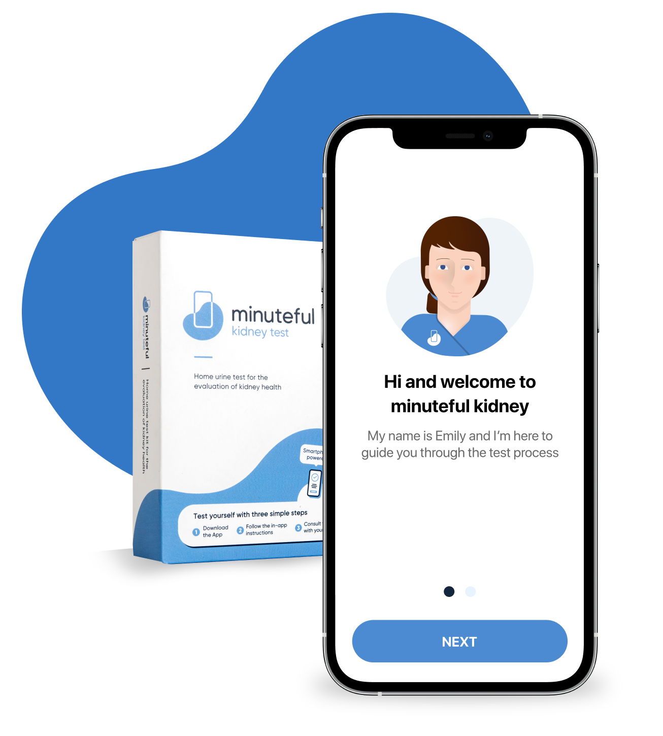
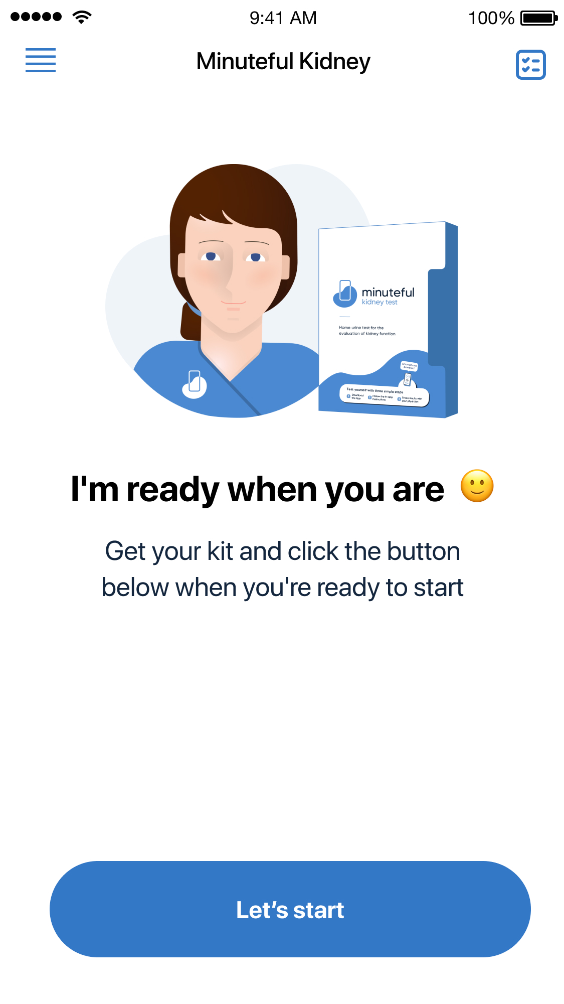
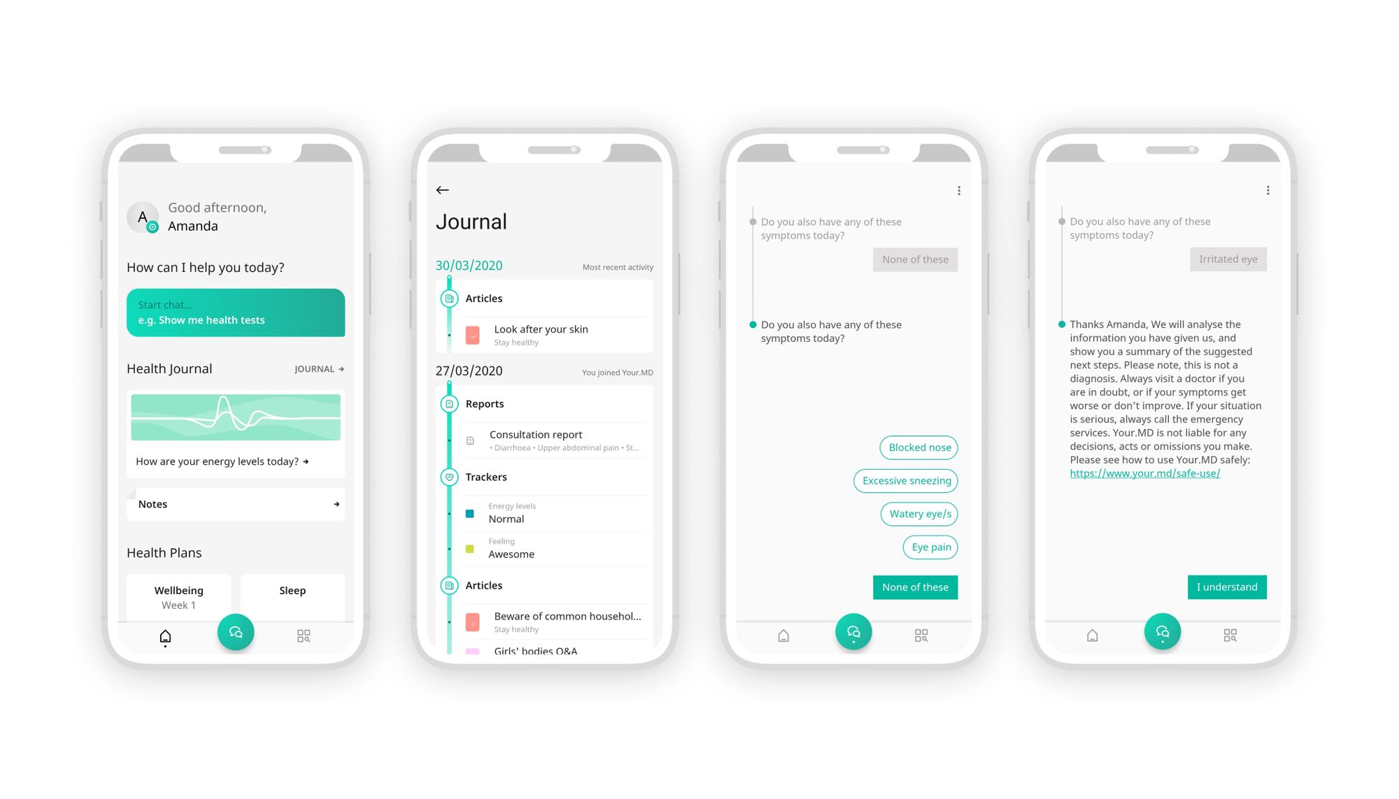
Minuteful Kidney is an FDA-cleared home urine test that enables patients to check their kidney health using their smartphone and a physical test kit. The app guides users through the process step by step, and the results can be easily shared with their doctor.
This was Healthy.io’s flagship app, and I led its product design, through all its iterations, usability research and feature launches.
Background & research
Minuteful Kidney evolved from our earlier service, Kidney Check, which was validated through multi-year pragmatic trials in the US during the years 2018-2021. These included:
- Extensive user interviews across the US
- Hands-on usability testing
- Continuous algorithm performance evaluation
These trials shaped our clinical and UX requirements, leading to FDA approval in 2022.
Target audience
Our primary users were older adults (60+), managing chronic conditions like diabetes or hypertension, high blood pressure, certain heart conditions and other risk factors which could potentially harm their kidney health and cause CKD (Chronic Kidney Disease).
Most users had basic digital literacy and required high clarity, reassurance, and minimal friction.
98% of users who started the test completed it successfully and received their results.
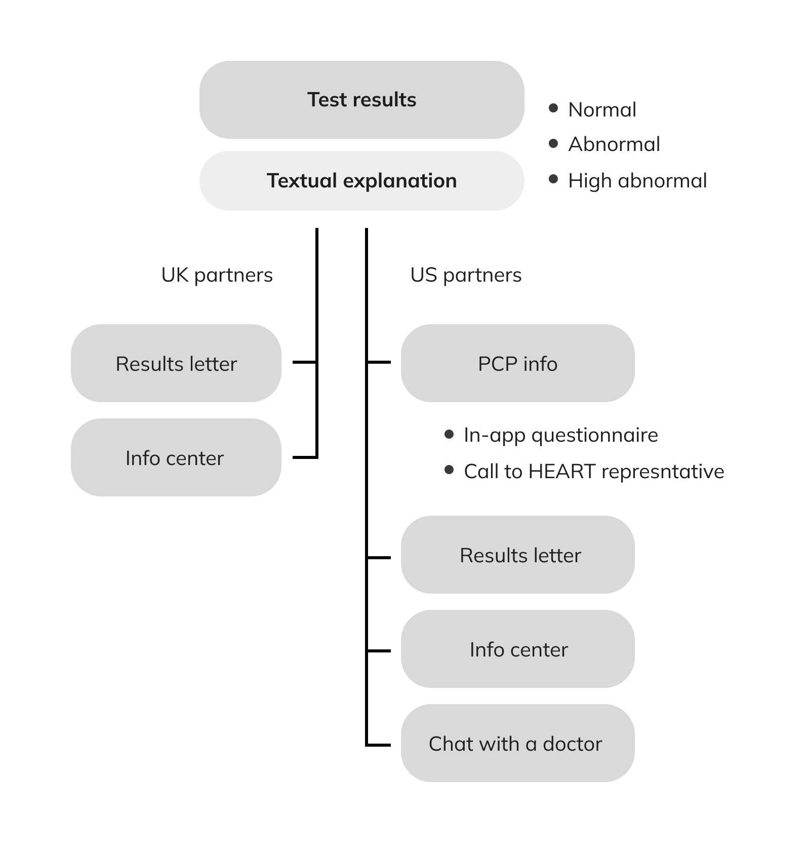
User flow chart
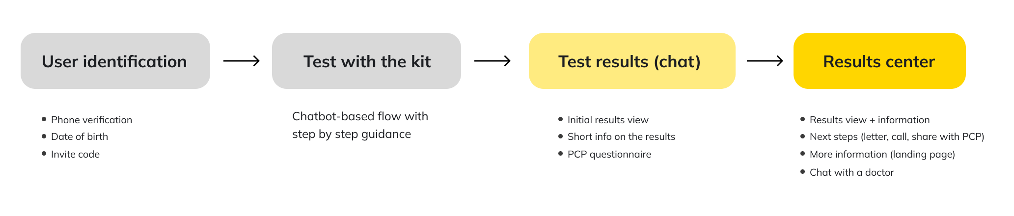
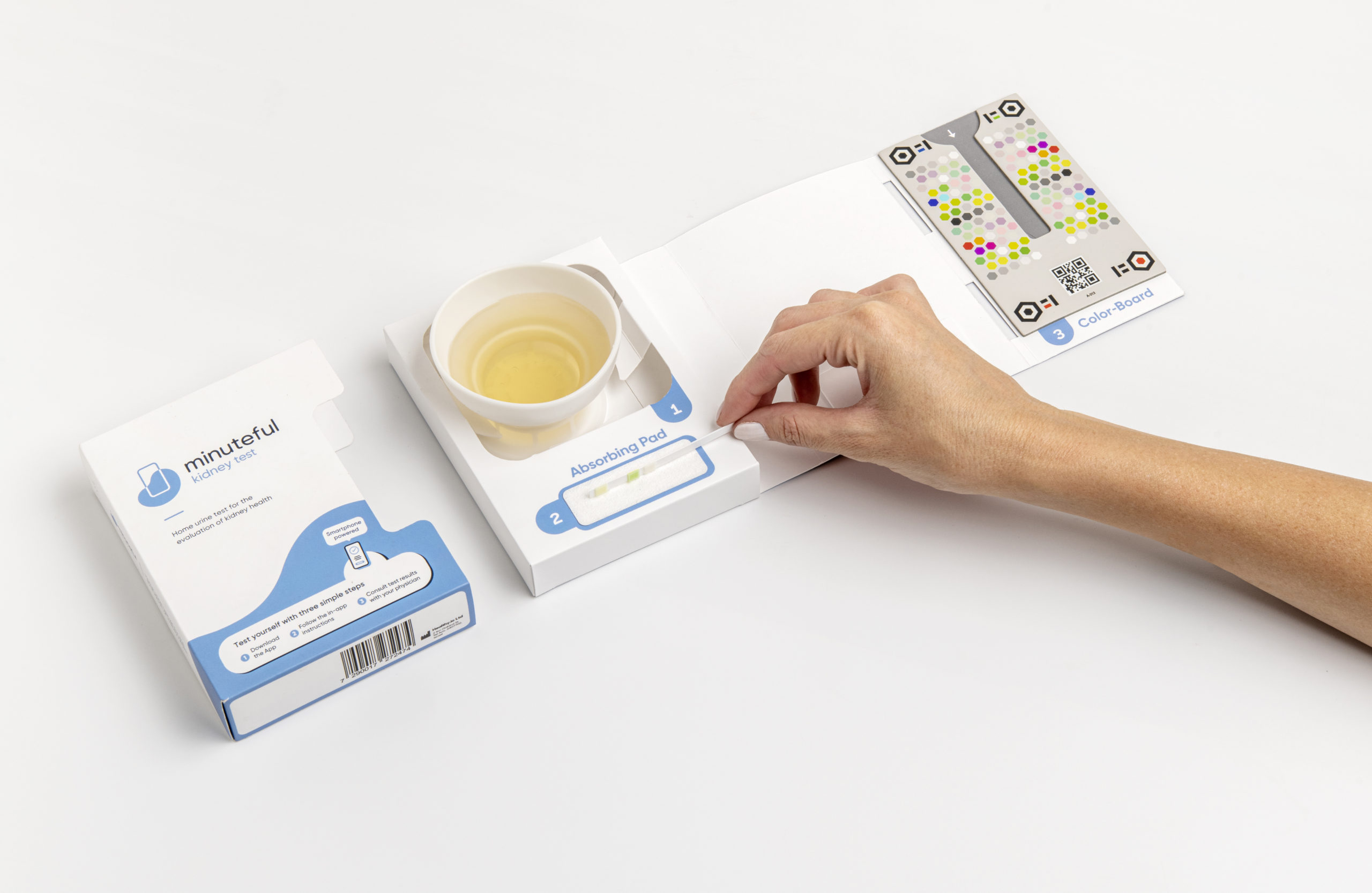
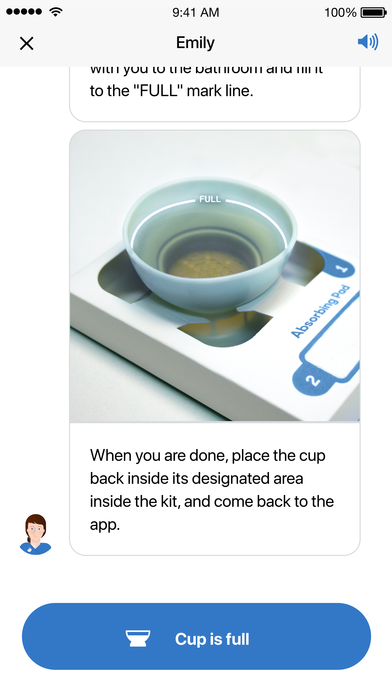
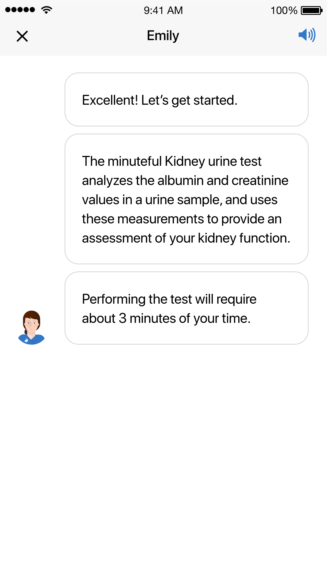
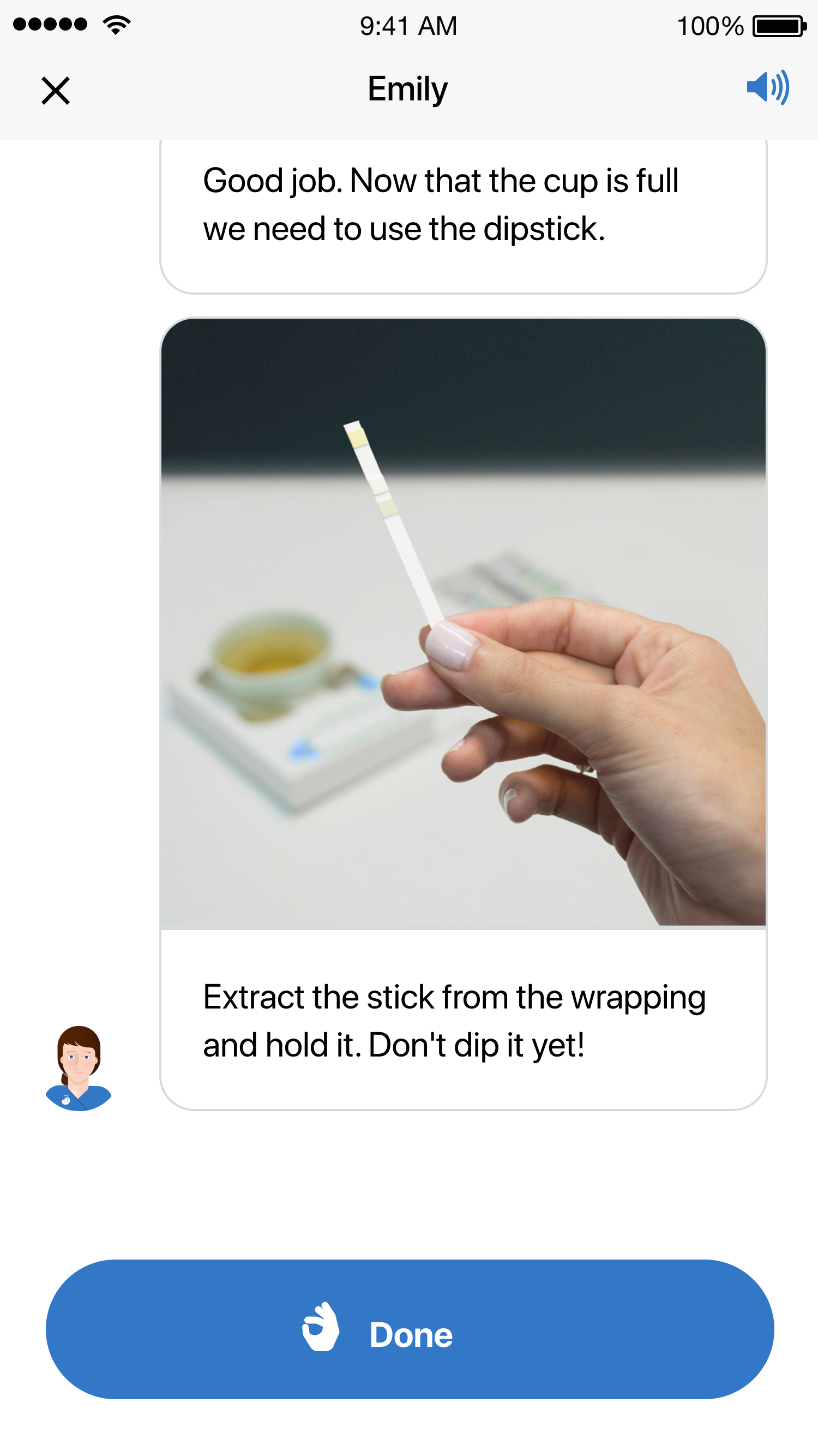
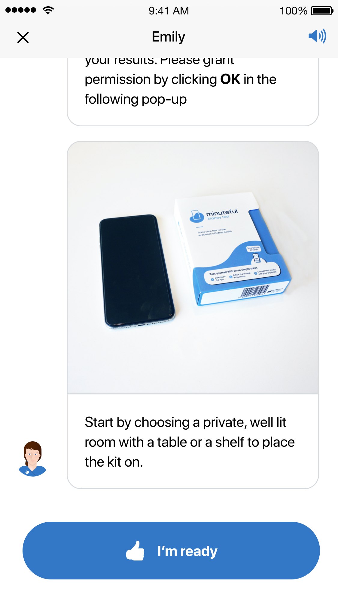
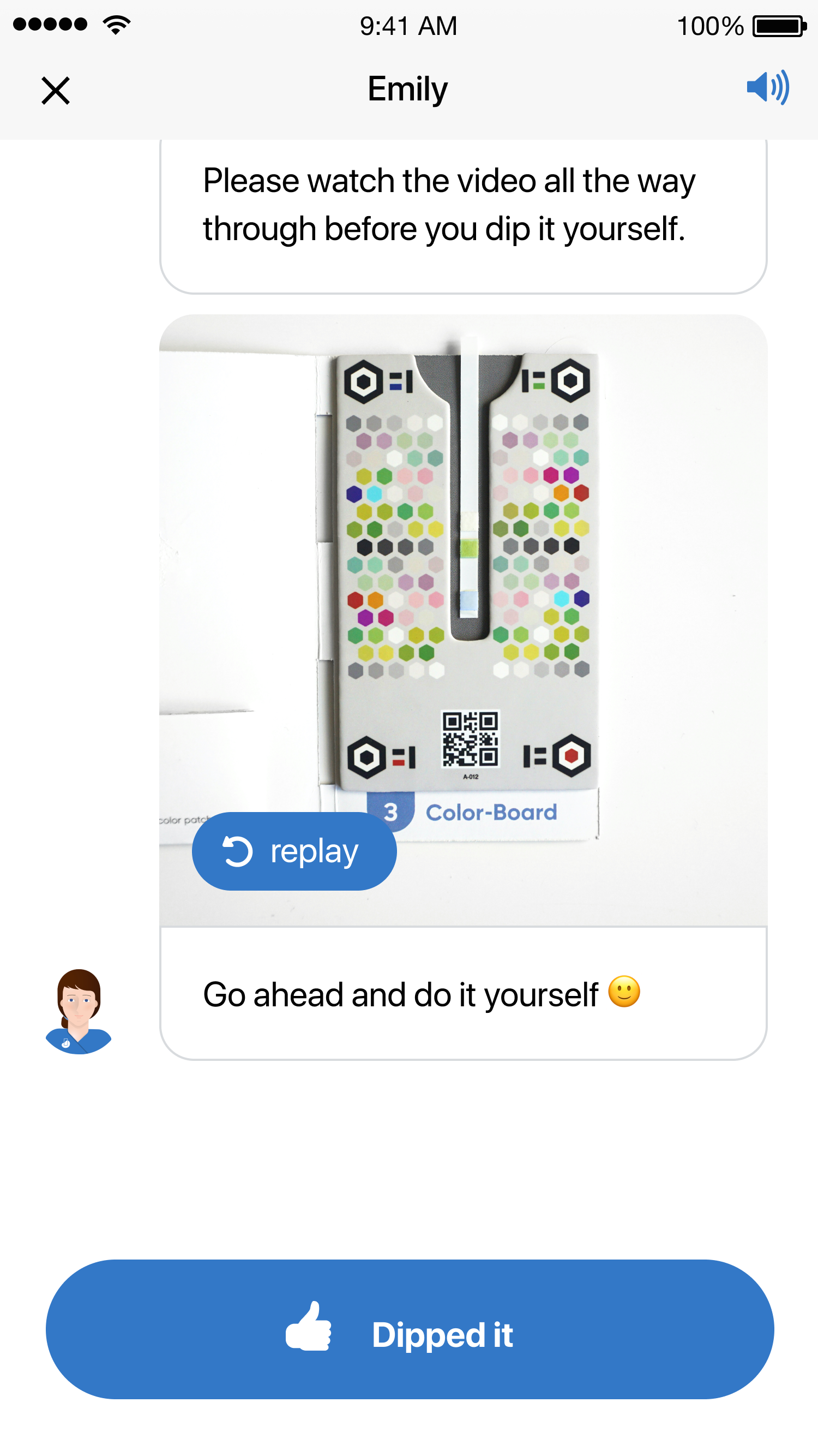
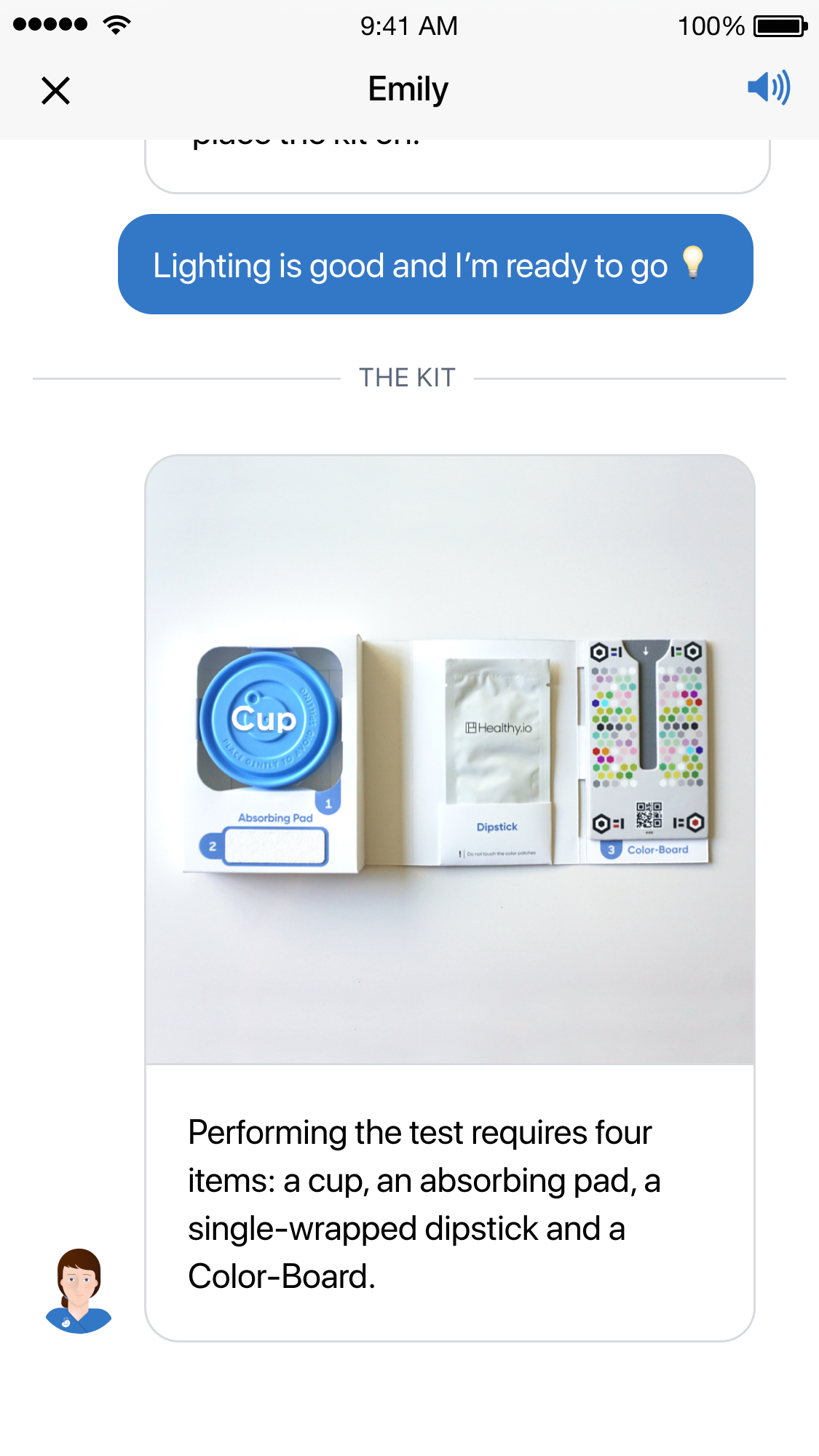
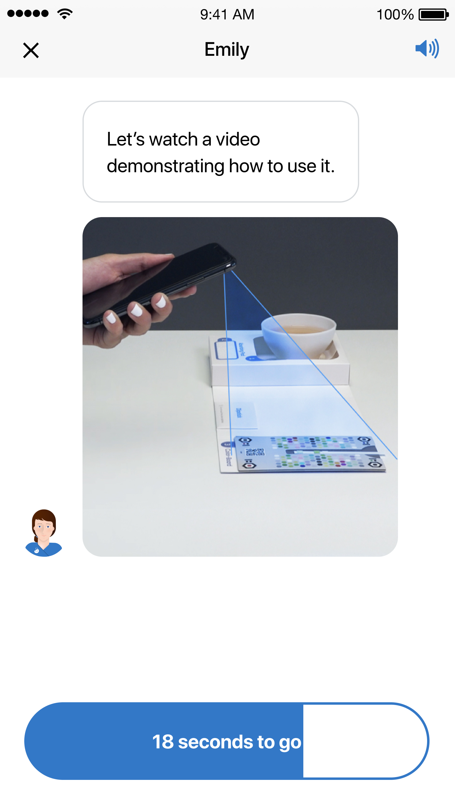
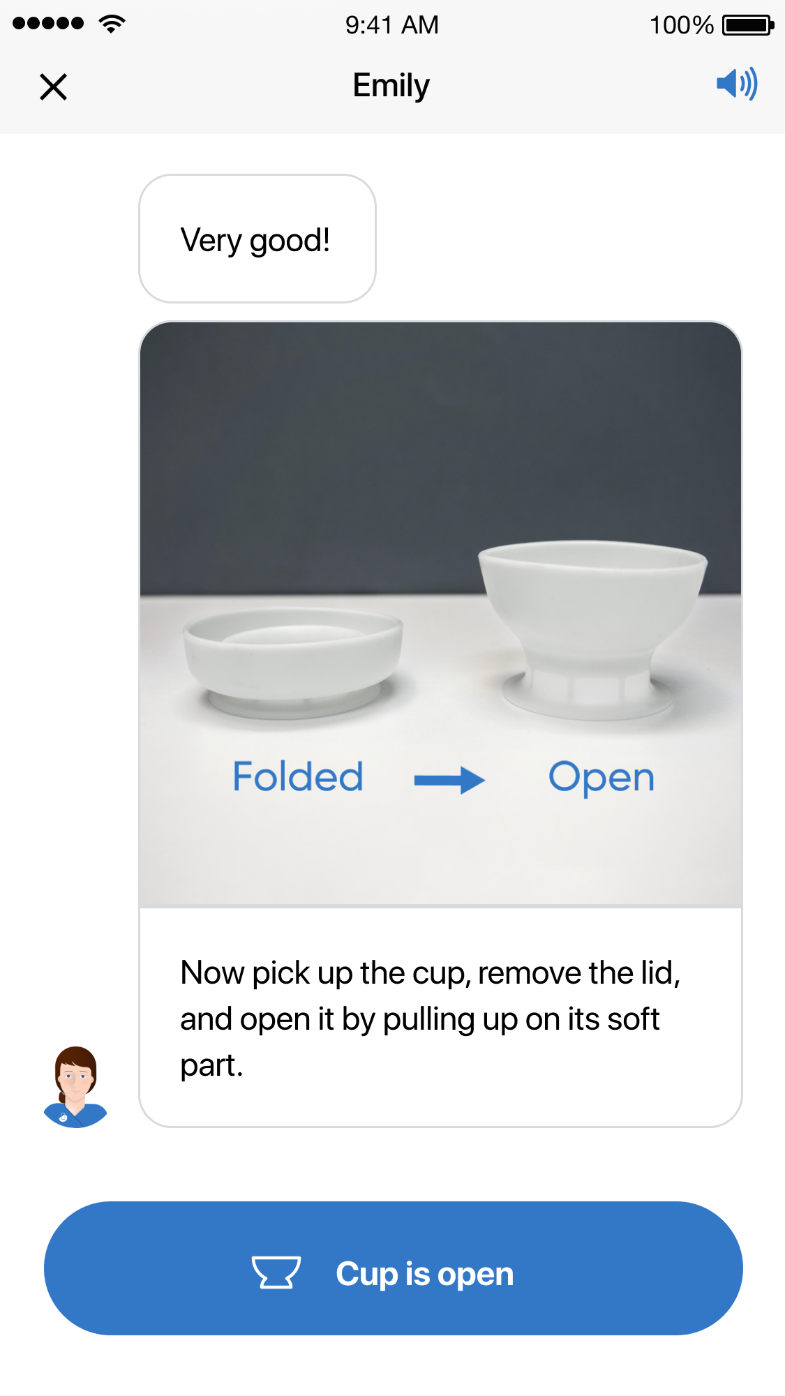
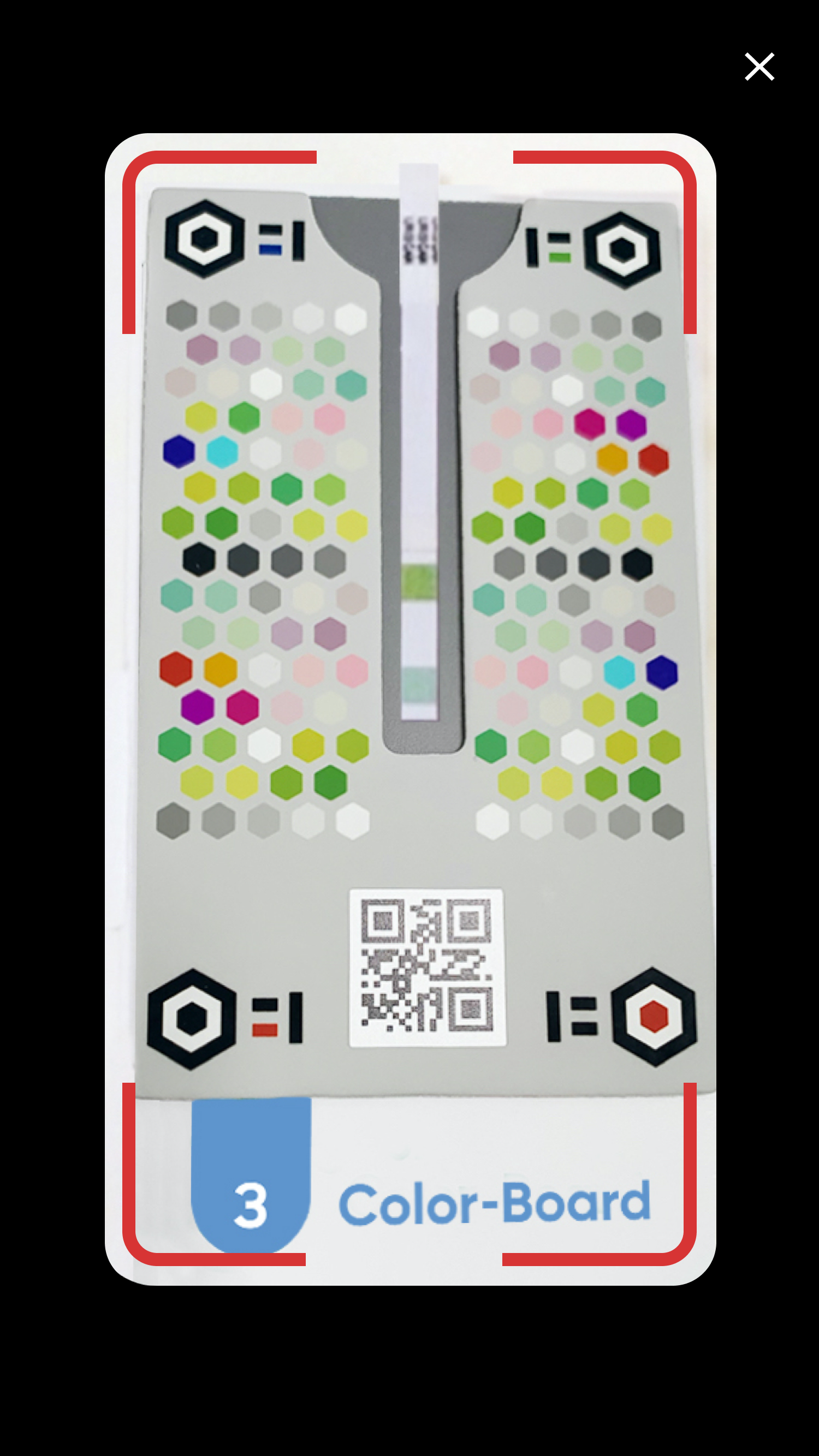
Test with the kit flow
From opening the kit to scanning the color-board and waiting for the results
Initial Experience & Results Delivery Flow
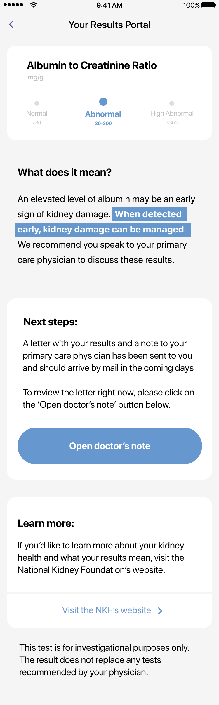
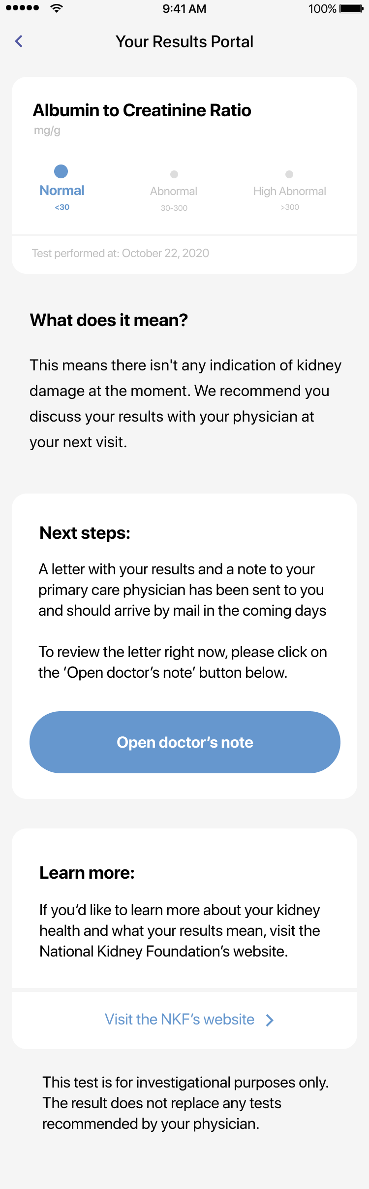
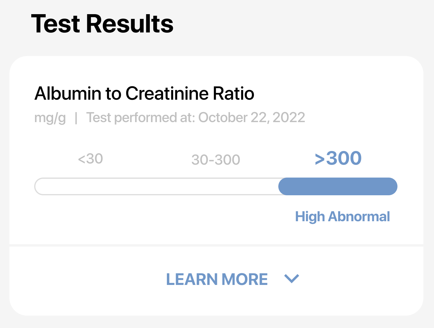
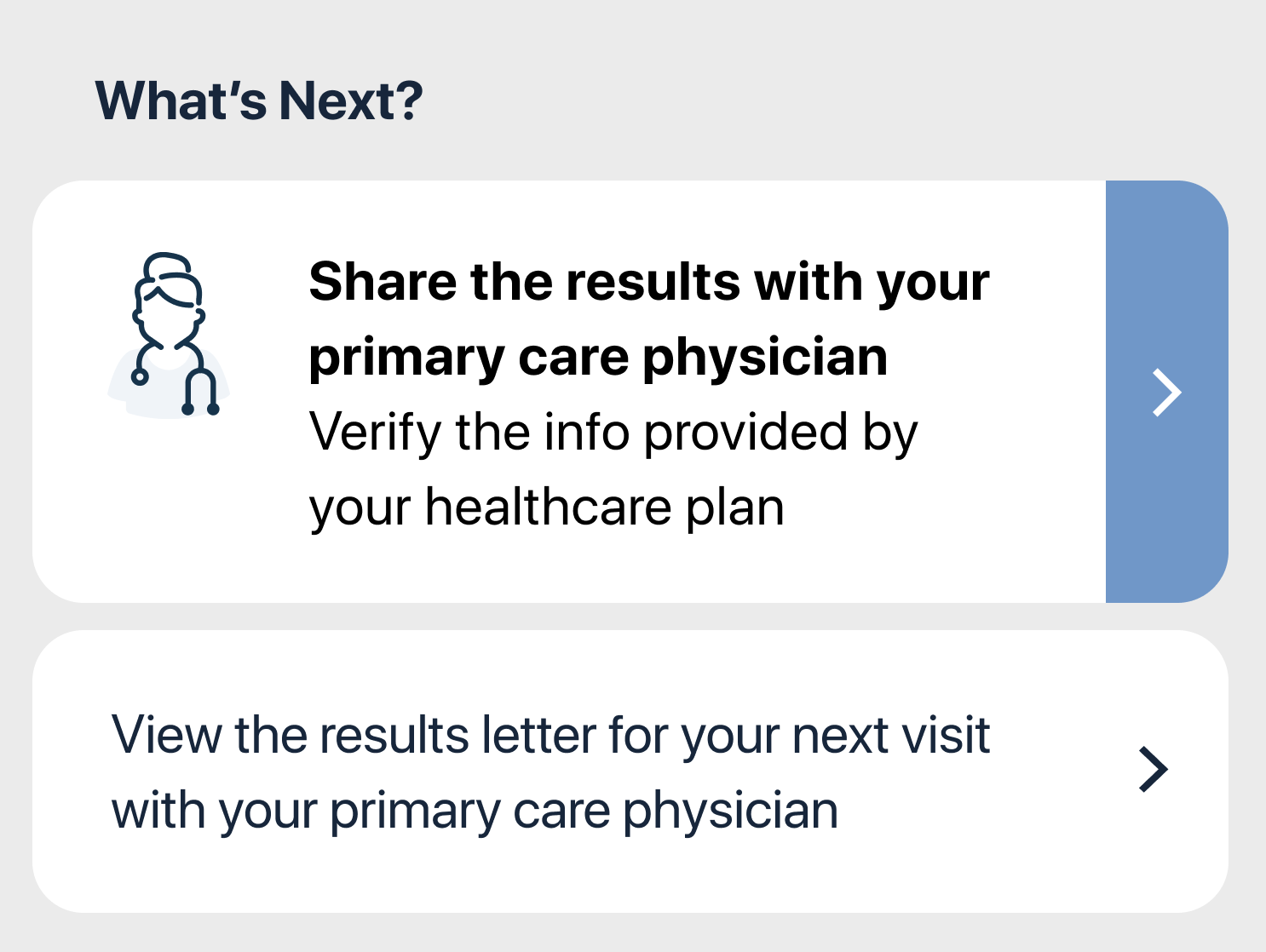
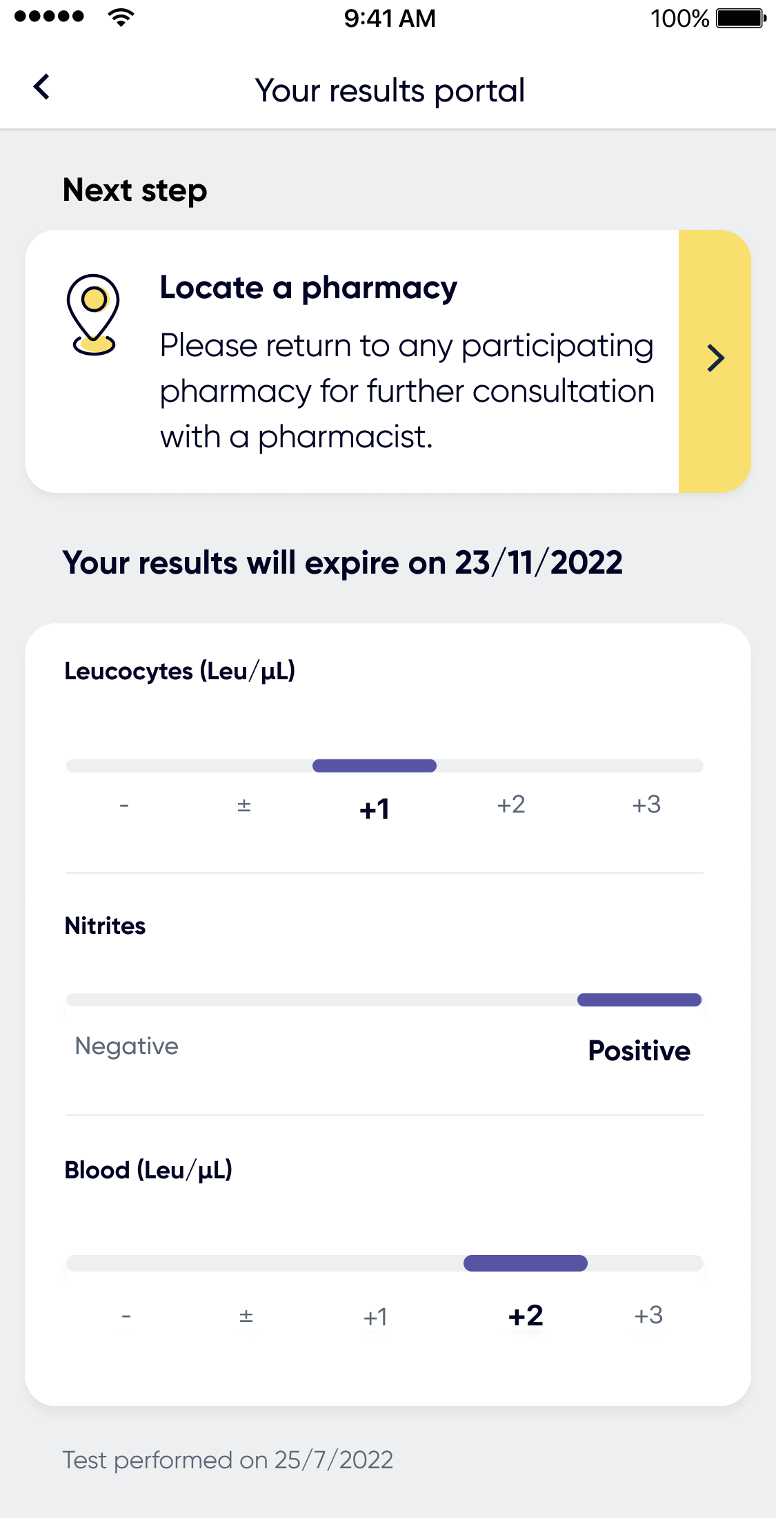
These are the designs and content we were using on the older version of our ACR app (Kidney Check) at the time when I took ownership of the product's design.
The first view of the results was during the chat, once the test completes. The second view was in the results portal and it included different types of additional information related to the results.
Results rethinking
Business goal - close the clinical loop
Guide the patients on what to do next after they get their results by simplifying the results section and its call-to-actions. By doing so, additional care may be provided to our patients in need and our partners (clinics, doctors, health plans) will get more validation of our product's value proposition.
Challenges
1. Content overload of various types of information
2. Different CTAs per partner and flows
3. Semiquantitve results reflected in a quantitve way
4. Support accessibility and address UI inconsistencies
5. One test result vs 2 test results view for certain partners
My role
I was the design owner of all of Healthy.io's urine test apps, and especially Minuteful Kidney which launched at 2021.

Prioritizing Information
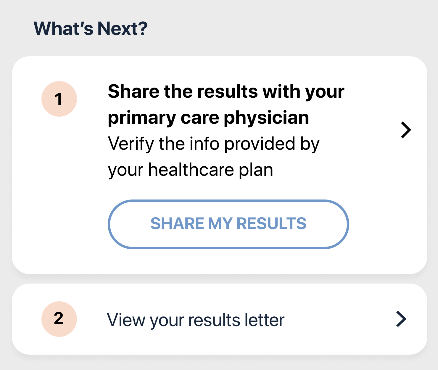
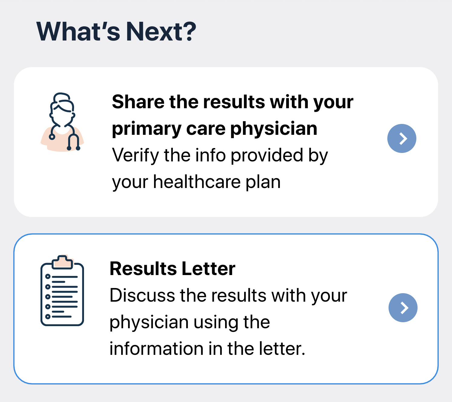
One of the big challenges here was prioritizing the information our patients will recieve at this point in the flow and guiding them towards the next step they should take.
Our main CTA was determined by the test result (1 of 3 options) and the way each healthcare provider was aiming to end the flow with (results letter / digital share with a doctor).

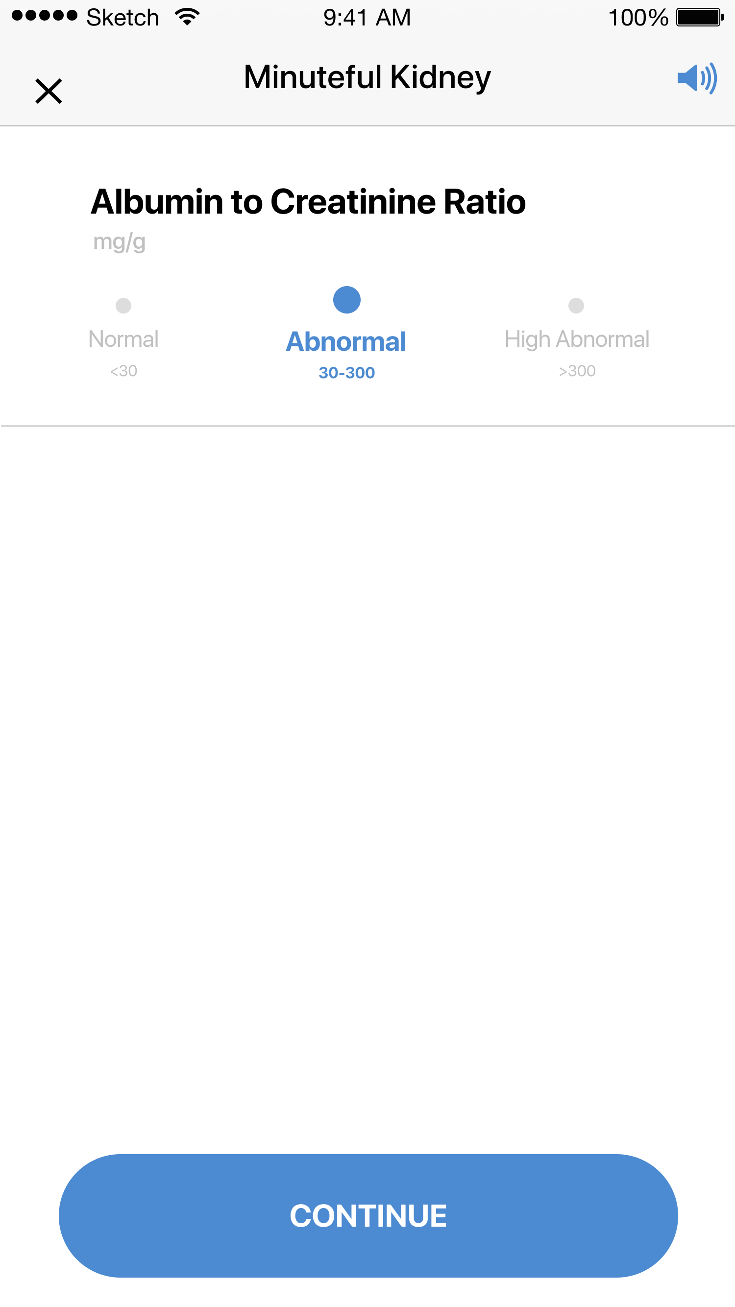
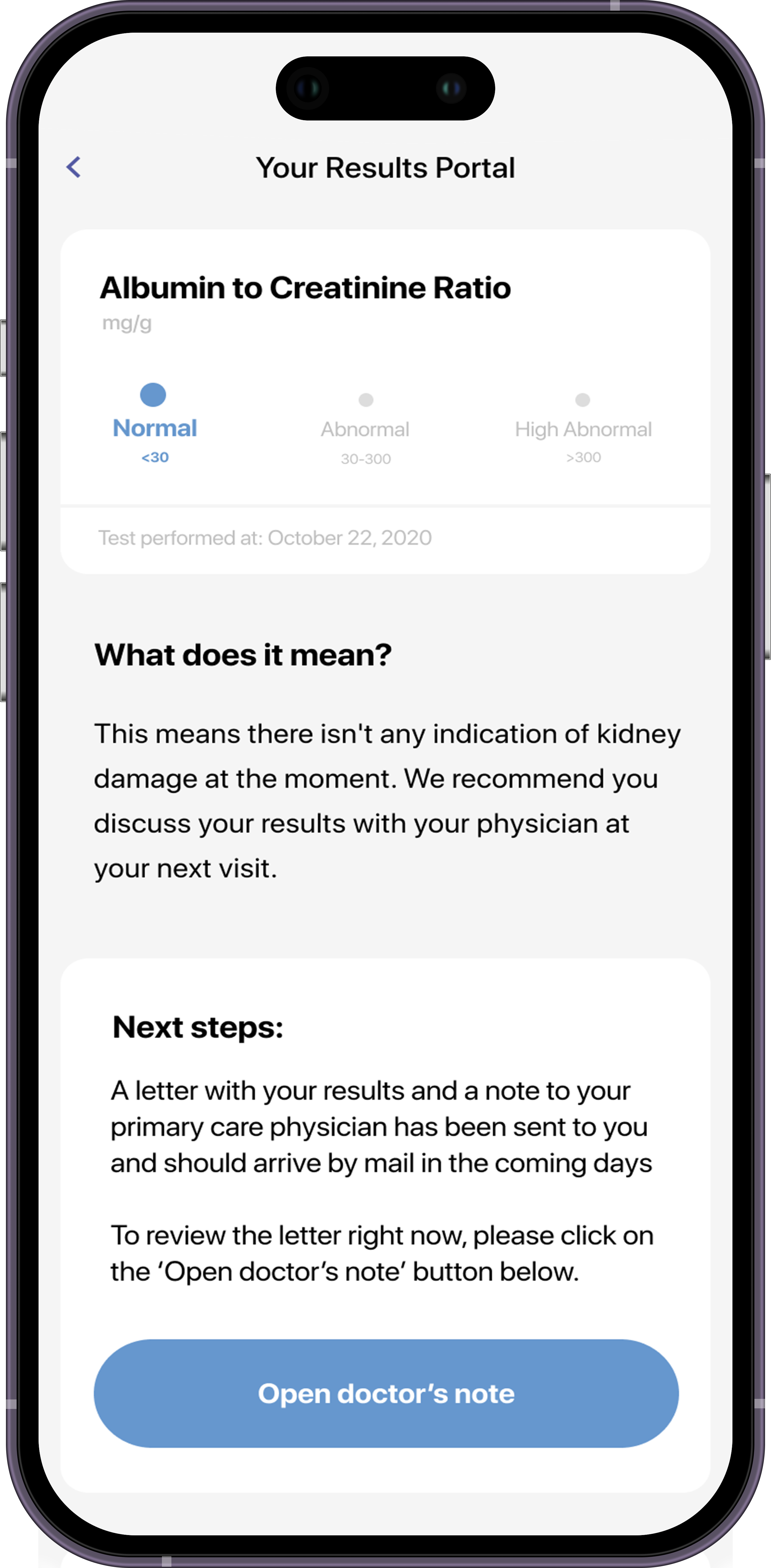
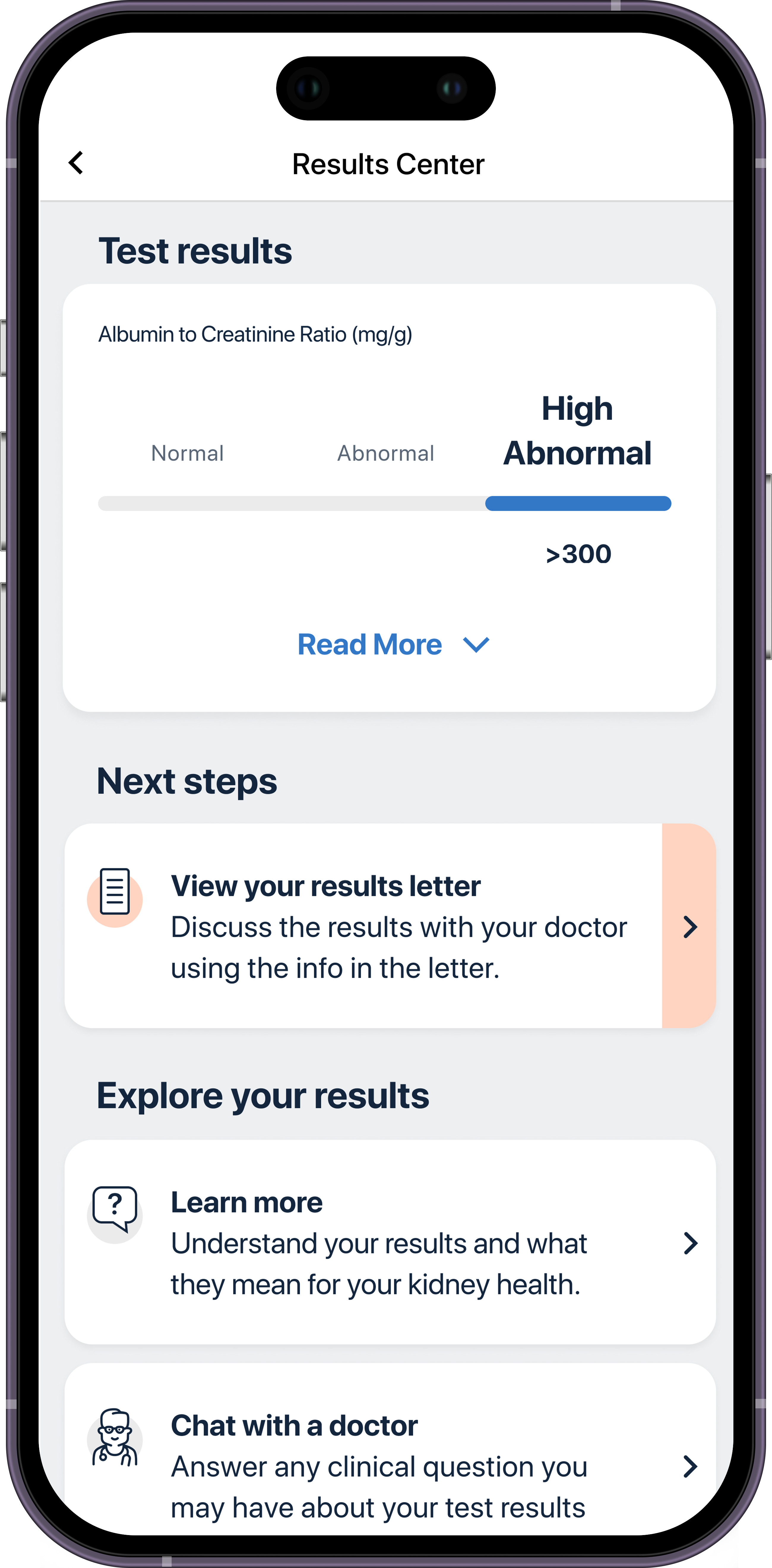
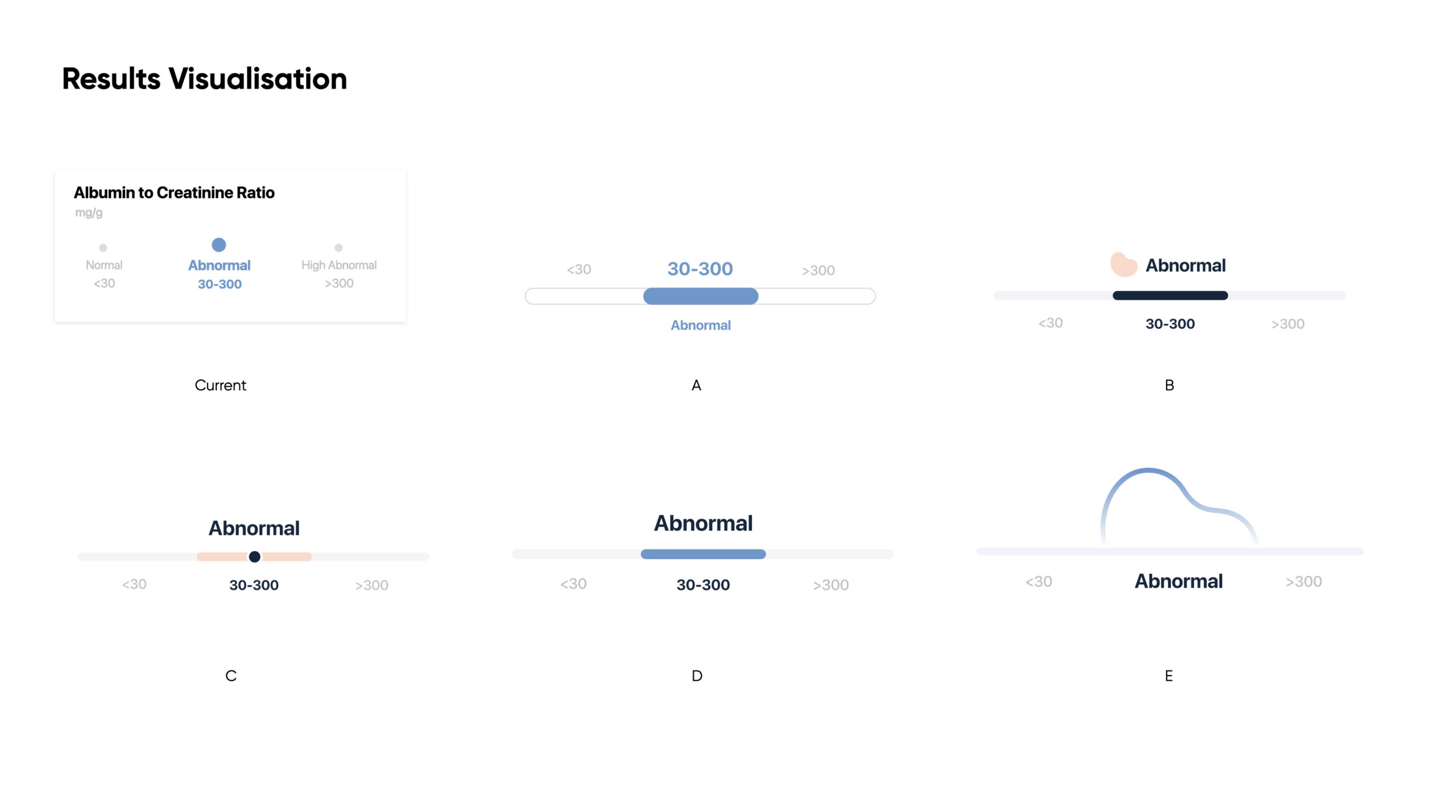
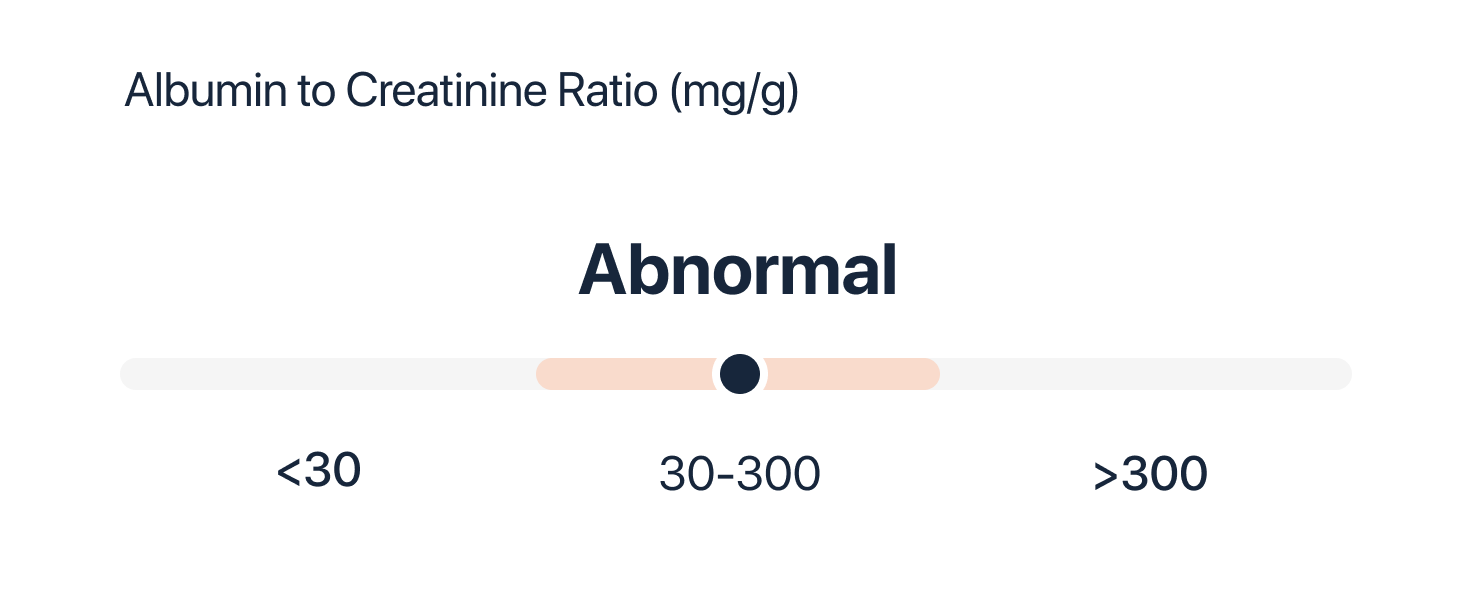
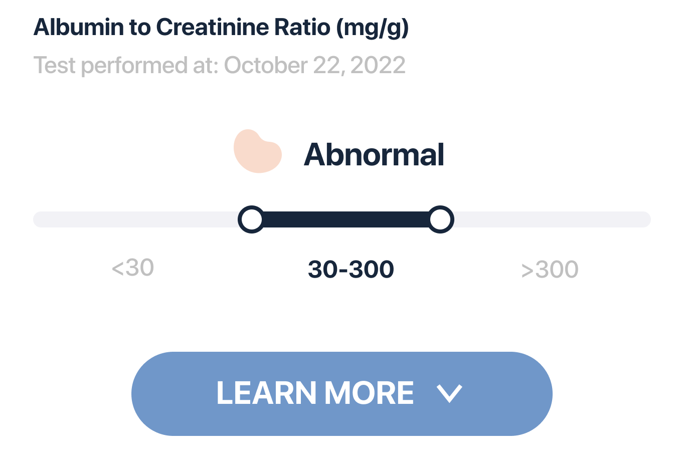
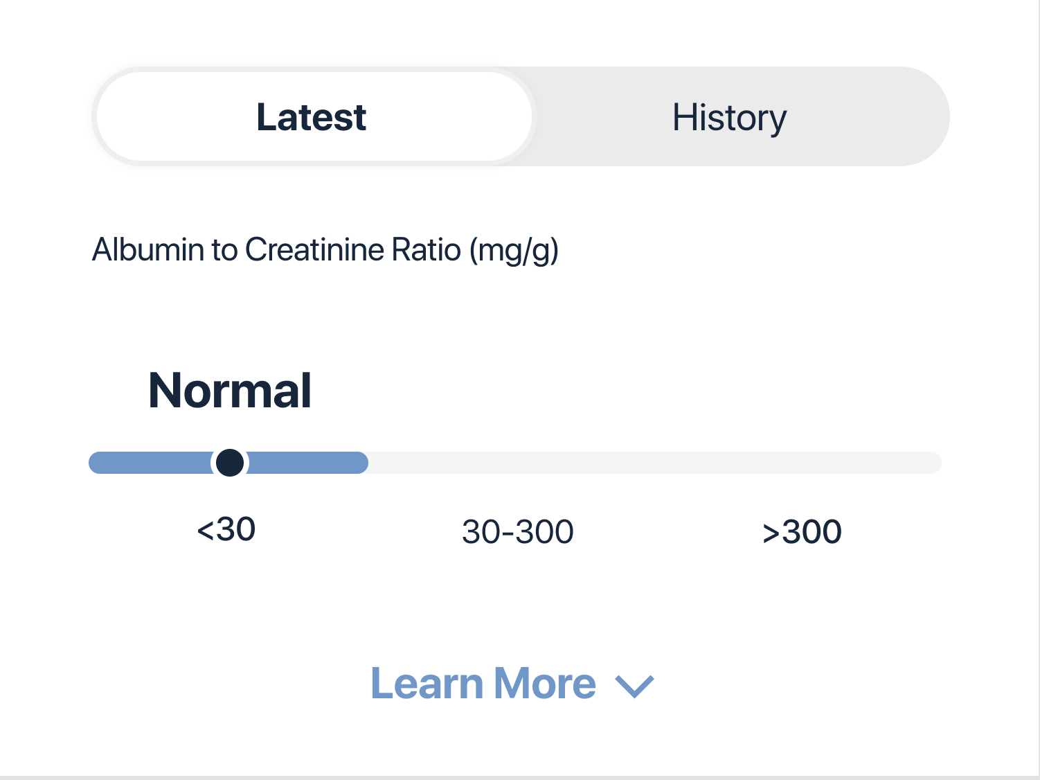
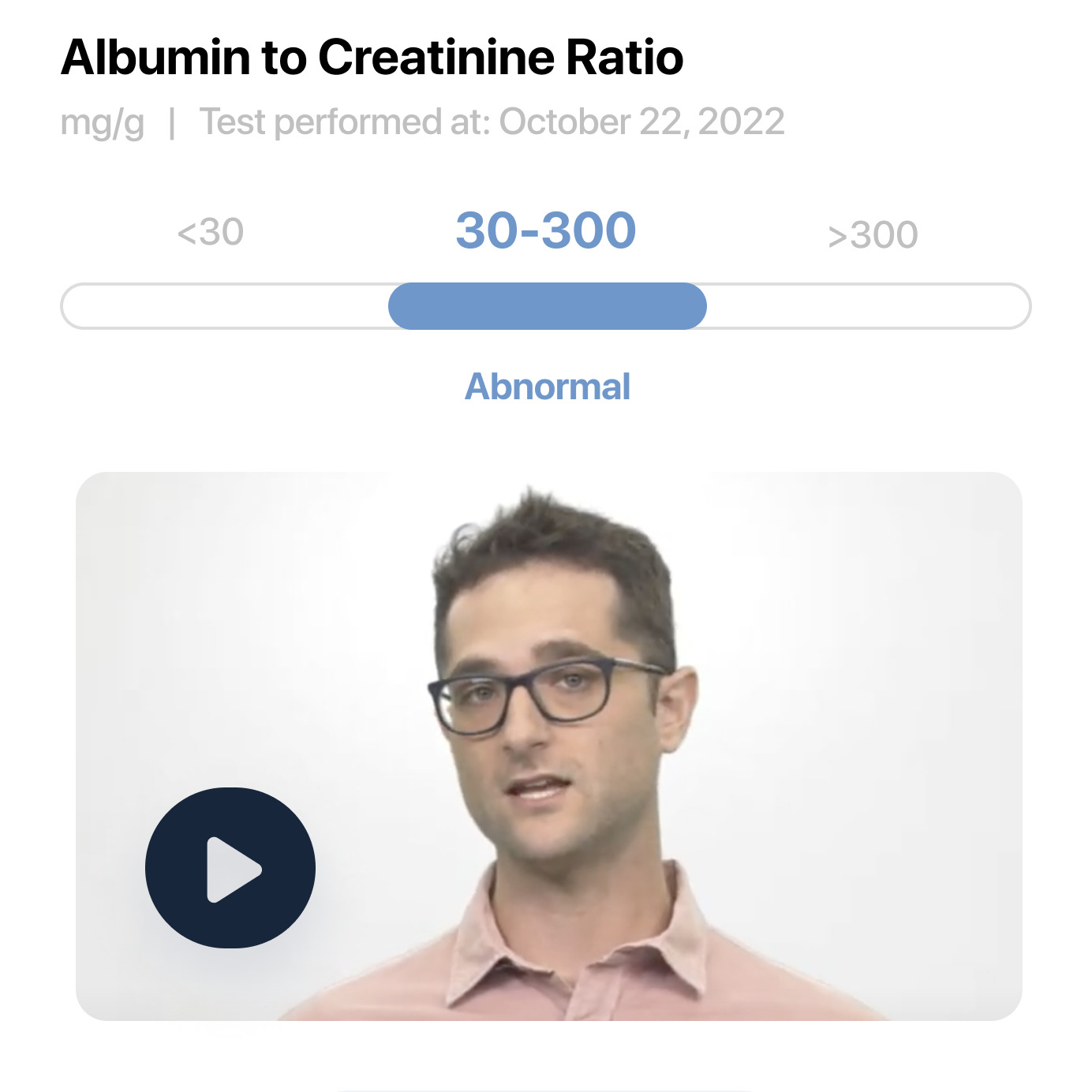
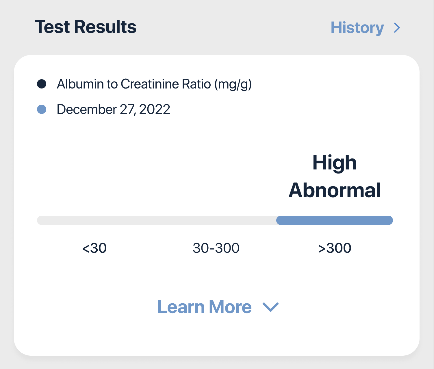
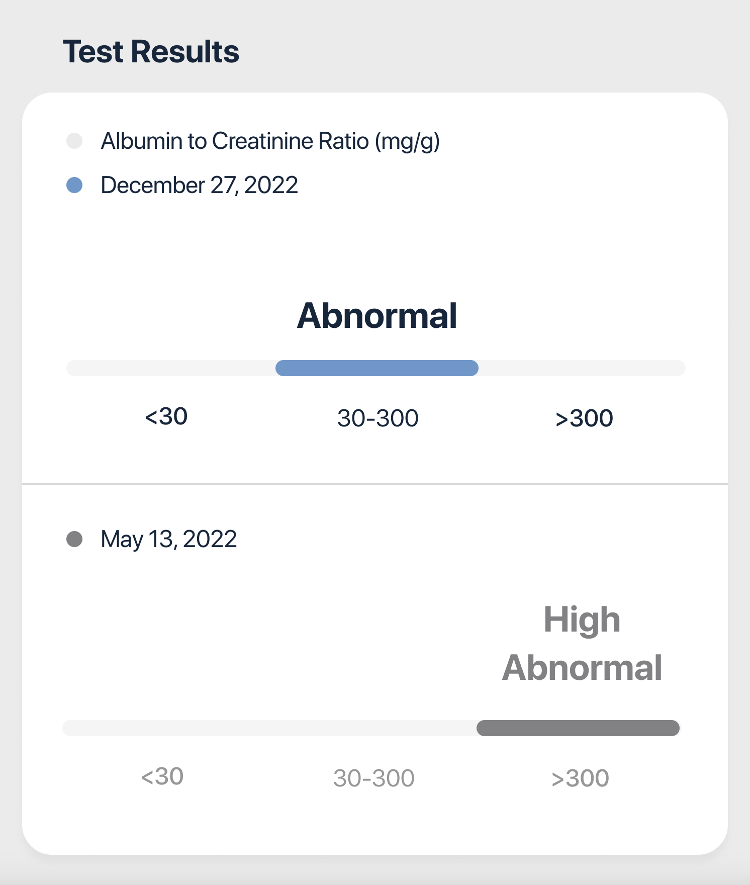
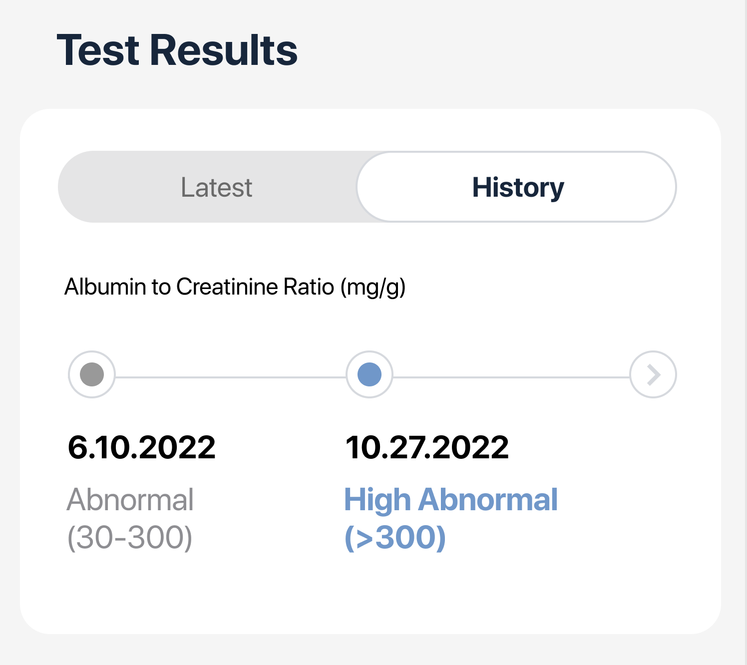
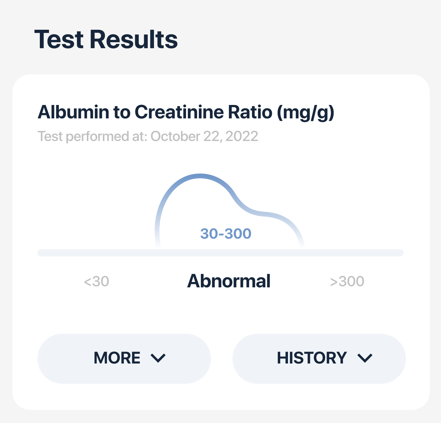
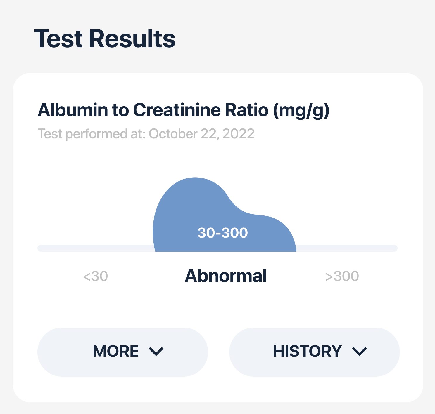
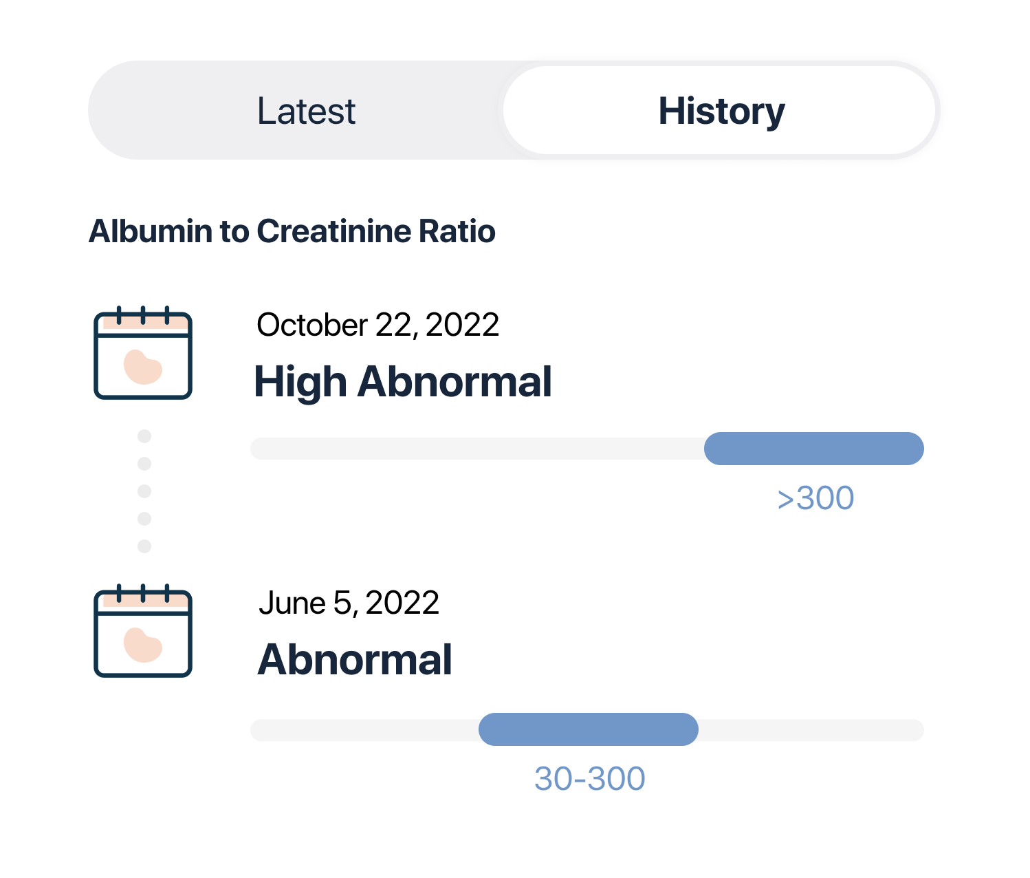
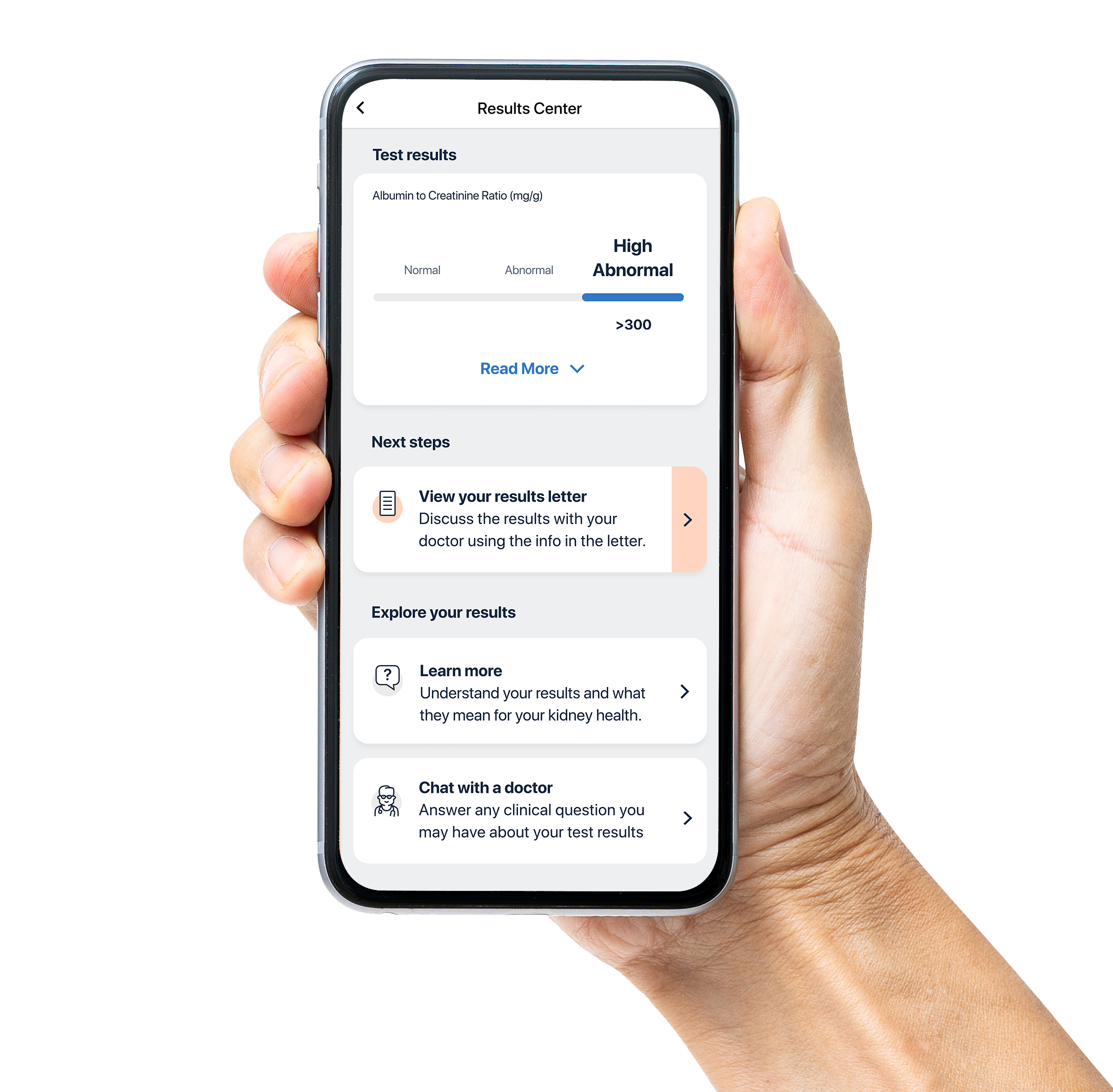
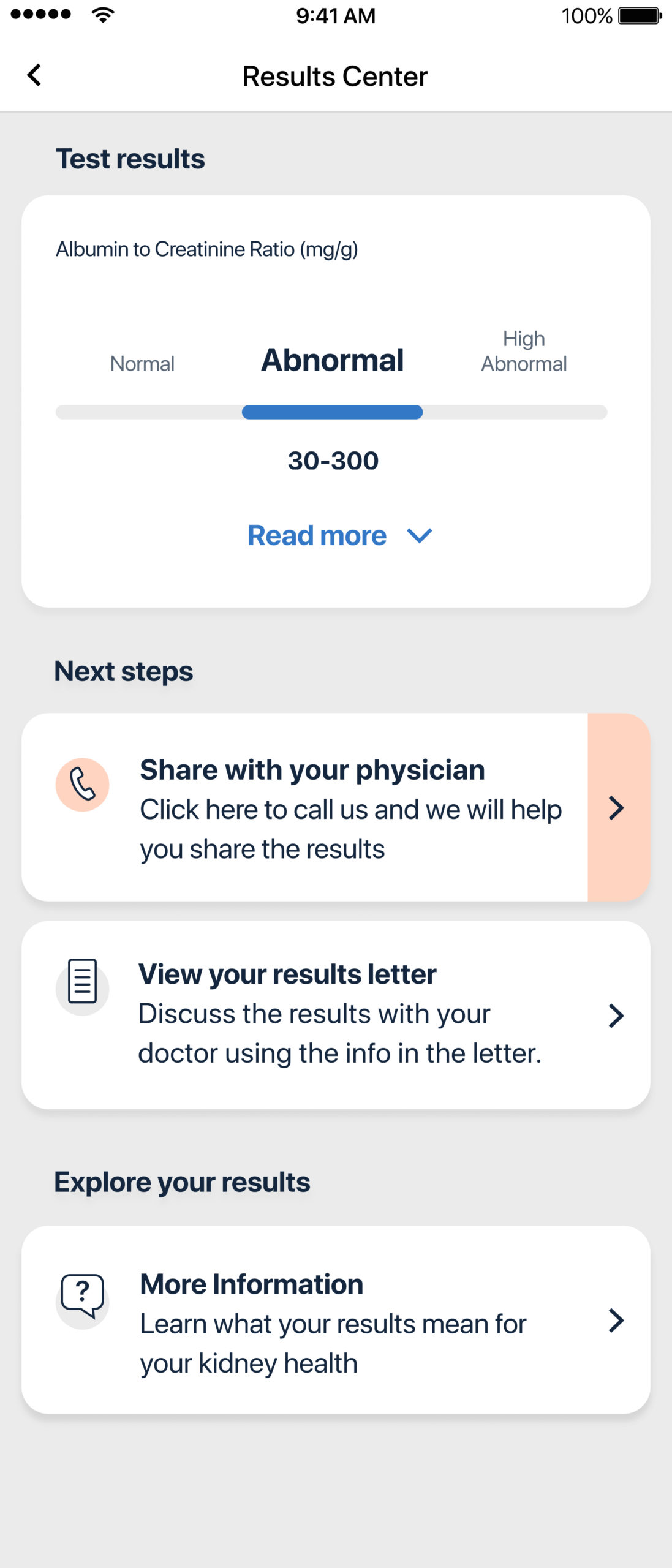
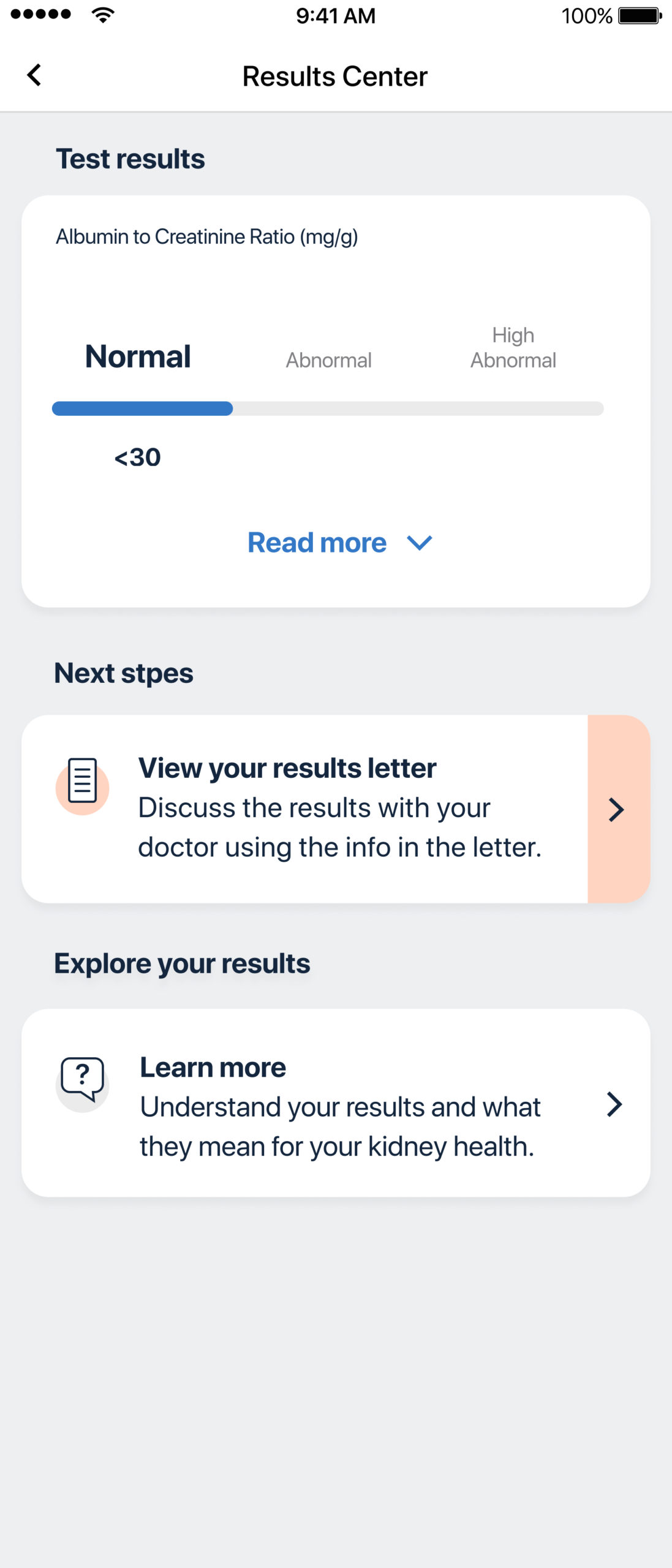
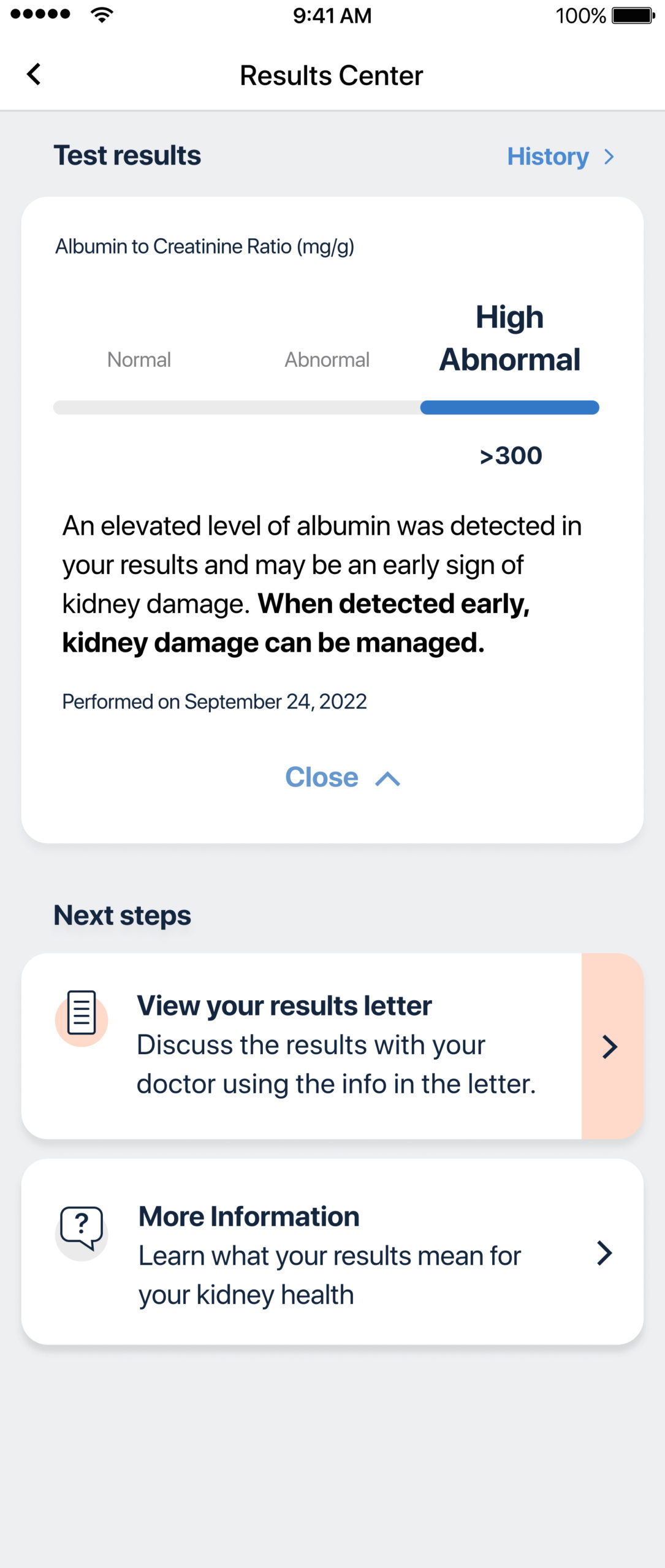
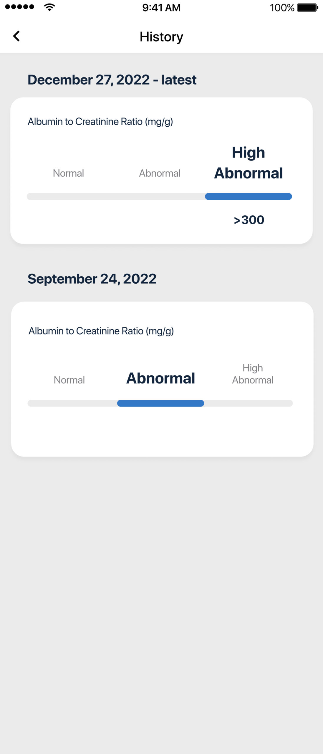
Visualizing the ACR range
Instead of showing raw values, I wanted to design a more intuitive range graphic indicating whether the result was normal, abnormal, or highly abnormal—helping patients understand their result at a glance.

Building for Scale
Our results section was a key part of our flow, and aside from supporting various flows and partners in Minuteful Kidney, we had to take into account other apps with different user journeys who used the same component.
We had to find a structure that is both easily maintained from a dev POV, but also customizable enough from a design/product POV.
Prioritizing information
As more information and CTAs were added to the results section I mapped out the structure and prioritized each item, to help us reach the right layout.
Design research
Design iterations
Here are some of the designs and sketches I've made trying to solve some of the challenges of the results section.
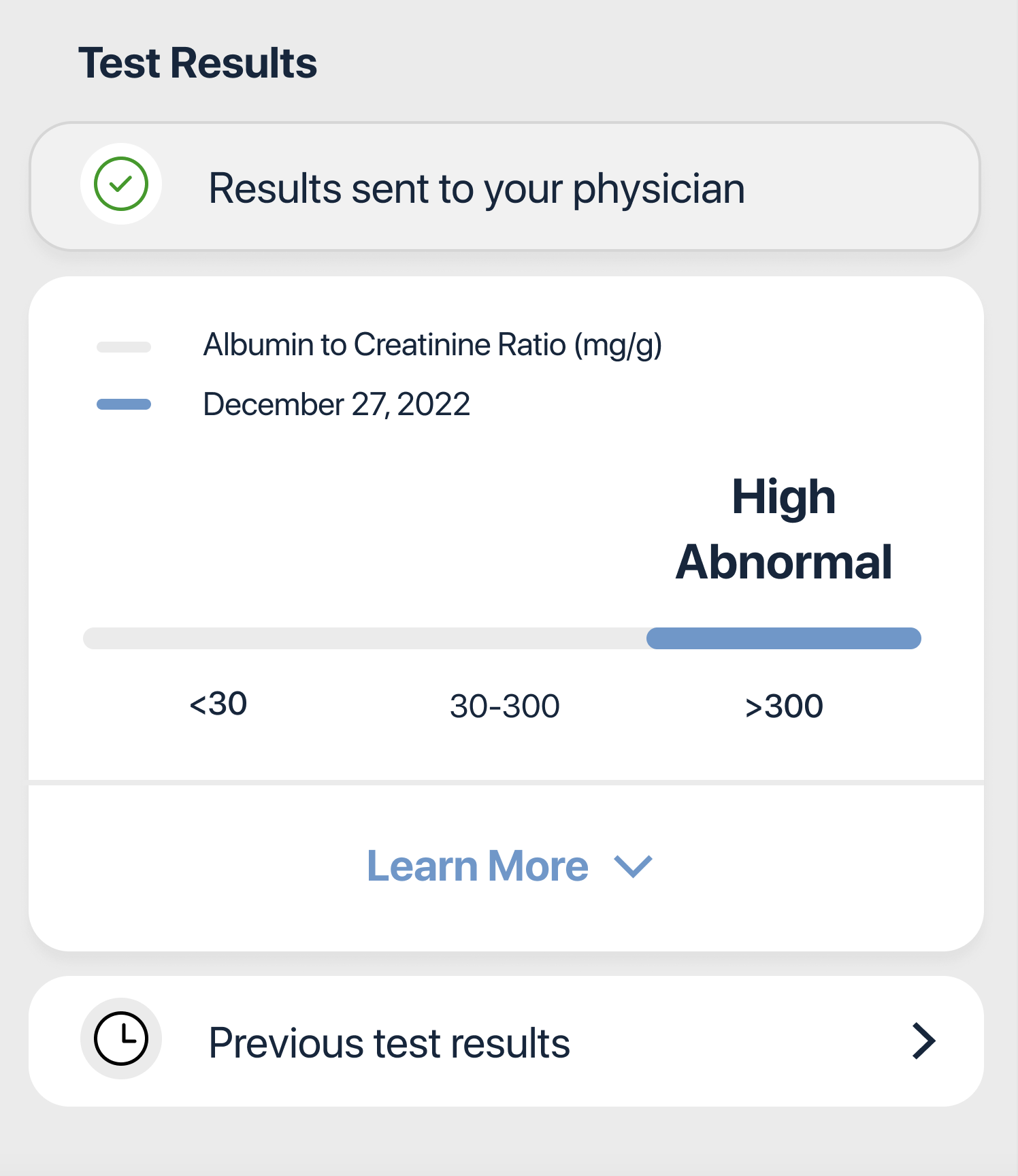
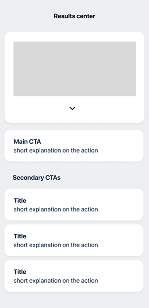
Results are in
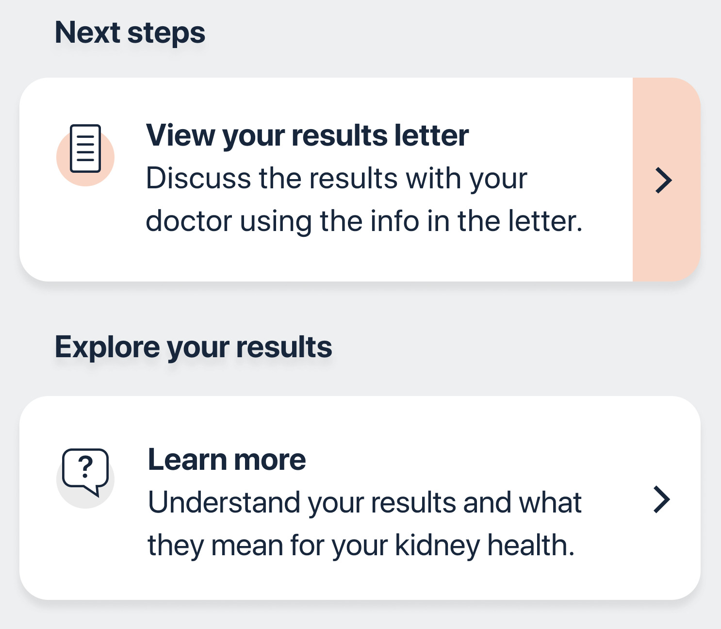
The design we eventually decided to go with was based on a clear structure of 3 sections (results, next steps & explore), while each section could feaure 1 or 2 items, and only one item was the primary CTA.
This new structure could support adding new items and customizing per partner's needs, and could feaure more than one test result for partners who offered this flow to their patients.
Adaptation to Minuteful UTI results section
This is one of the variations I had to take into account during the redesign of the results portal. It shows the results to women who complete their UTI test (which includes 3 parameters), and also had to support different CTAs.
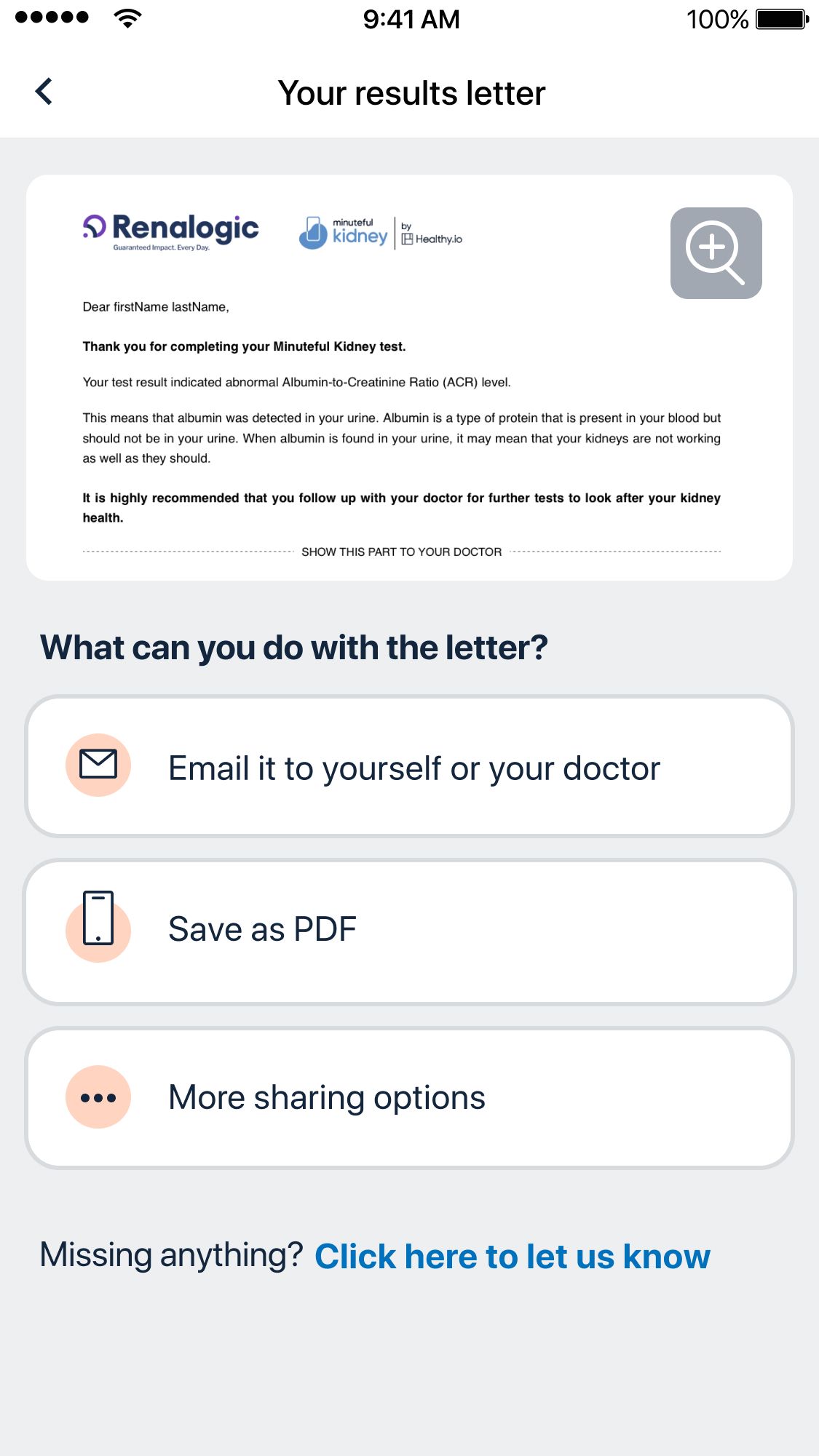
Results sharing
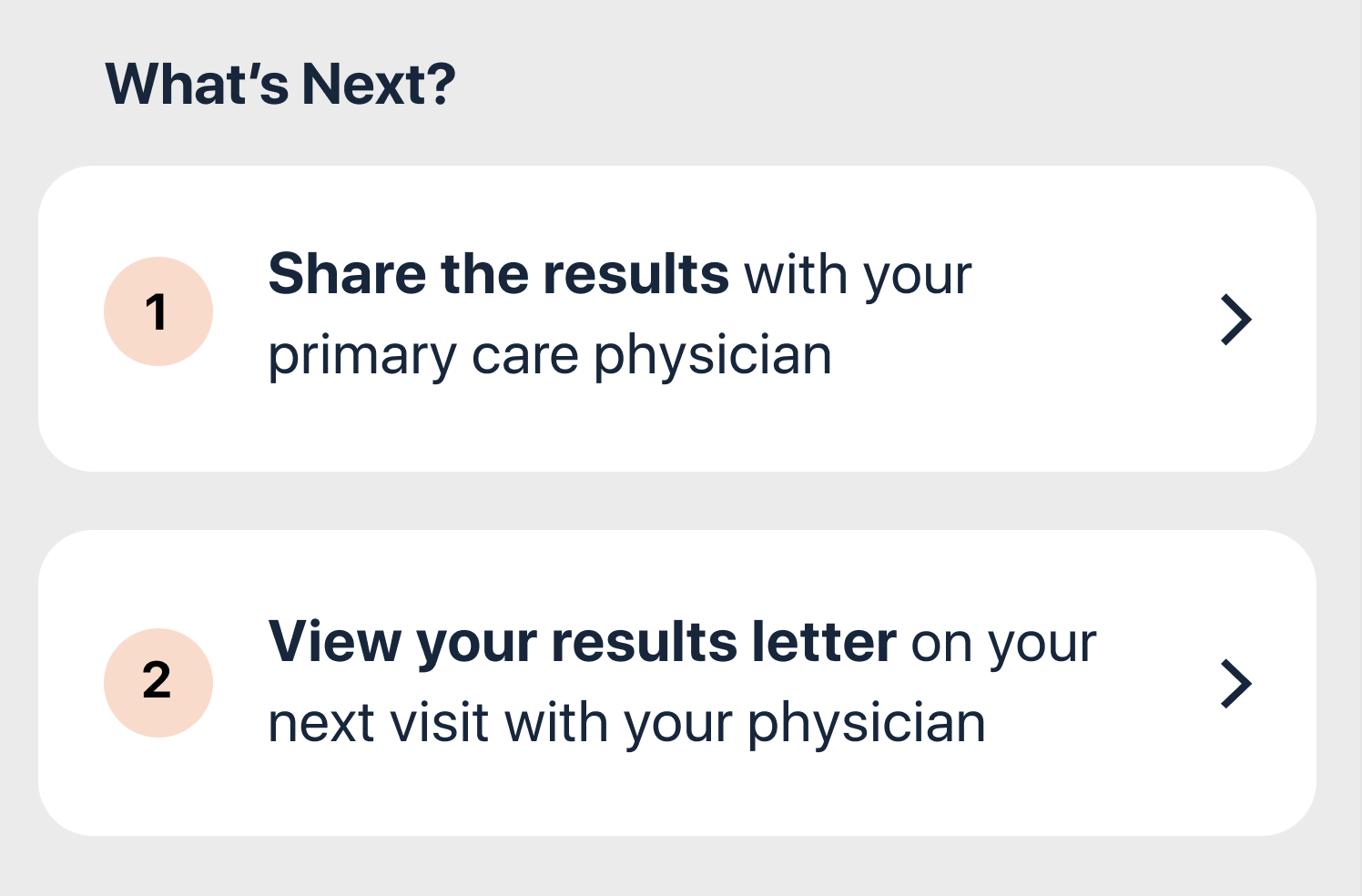
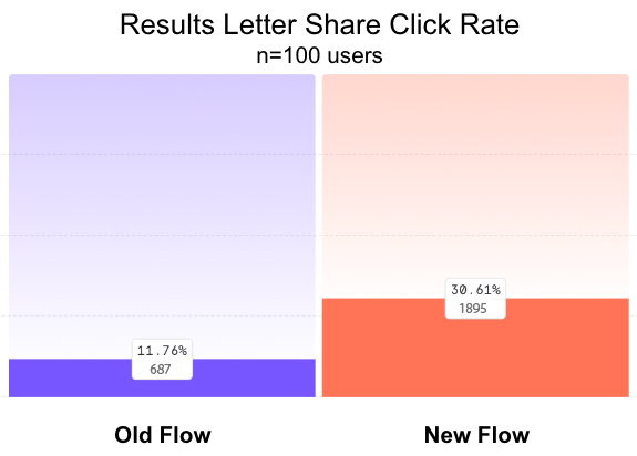
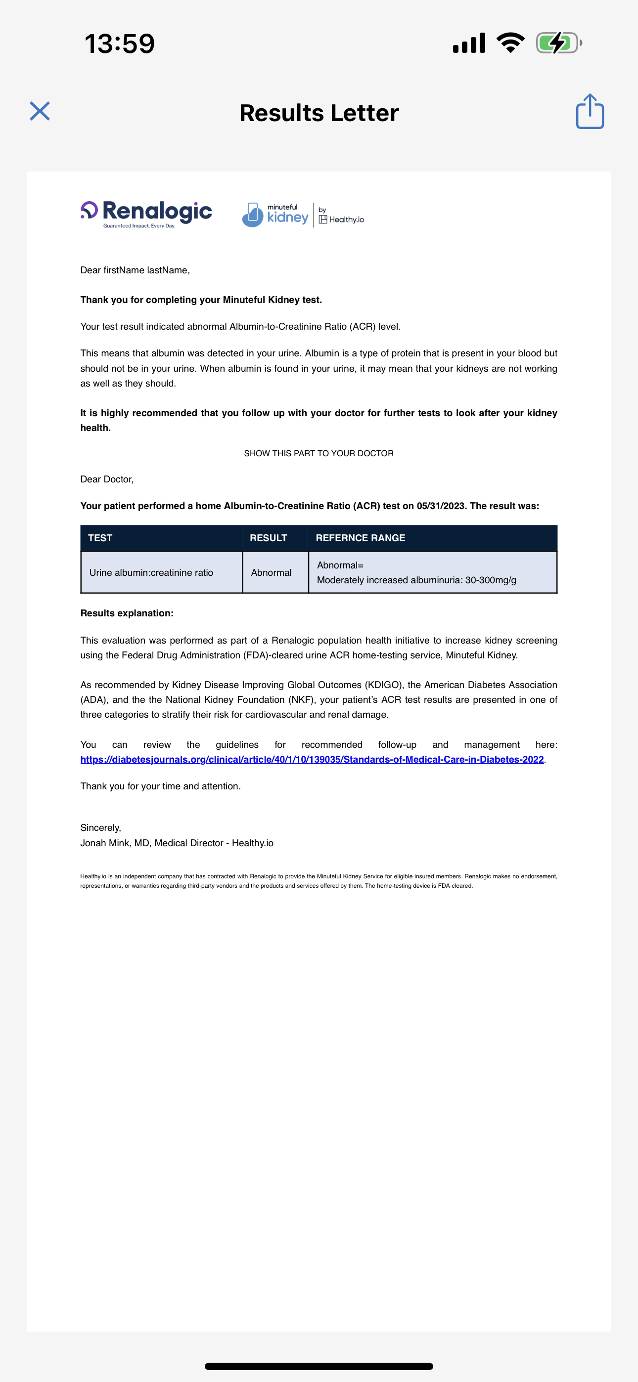
One of the primary CTAs on the results section encourages patients to share their results letter with their doctor for further treatment. This is a major business goal for the company as well, to make sure the clinical loop is closed between patients and their primary care physician.
This used to be done through a generated PDF letter viewed in the app, and users could share it using native file sharing options. After testing it with a new screen that simplifies the most common sharing options to our users we saw a big increase in letter sharing.
Old screen
New screen