SeekWell, 2025
Framing the vision journey of GoEyes
GoEyes (also known as myRx Refraction Exam) is a mobile health app that enables users to perform a vision refraction exam using only their smartphone’s front-facing camera.
Its launch on the app stores was still pending on FDA submission and regulatory approval.
Background & Context
For decades, the only way to take a vision exam was by visiting an optometrist in person. That changed with the groundbreaking technology developed by 6over6, an Israeli startup that pioneered smartphone-based vision testing using just the device’s front-facing camera. The company was later acquired by US-based SeekWell, expanding its reach and regulatory ambitions.
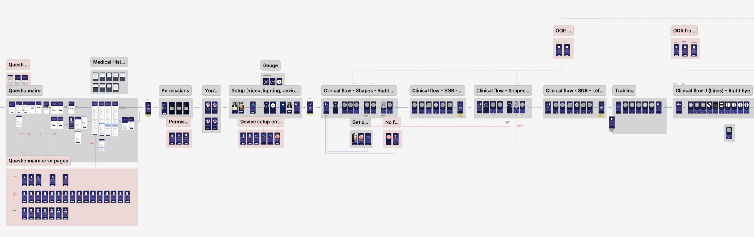
By the time I joined the team, GoEyes had already gone through multiple usability trials across Canada, the US and Europe, with thousands of users completing the scan flow. While we had gathered valuable insights and were continually working to improve the user experience, we faced significant constraints—any major changes to the interface or interaction design were limited due to the version already submitted for FDA approval.

Key challenges

- Skepticism & trust barriers - Asking users to complete an eye exam entirely on their smartphone, from home, naturally raised trust concerns. Many users were skeptical about the accuracy of a mobile-based scan and questioned whether it could match the precision of a traditional in-clinic exam.
- A 15-Minute Exam… Followed by a 24-Hour Wait - While our value proposition emphasized convenience and speed, the end of the flow introduced a friction point: results had to be reviewed by a licensed eye care professional before a prescription could be issued, leading to a potential 24-hour delay. This undermined the perception of immediacy.
- An Incomplete Experience Flow - The clinical flow concluded without clear closure or next steps. This gap existed because handoff messaging was delegated to the host apps integrating our SDK. However, to build enough user confidence to justify both the waiting period and the cost, we needed to deliver a more guided and reassuring end to the experience.
- Designing Within Regulatory Boundaries - Although we had tested numerous UI and UX improvements, we were bound by strict constraints: the interface submitted for FDA approval couldn’t be meaningfully altered.
UX approach

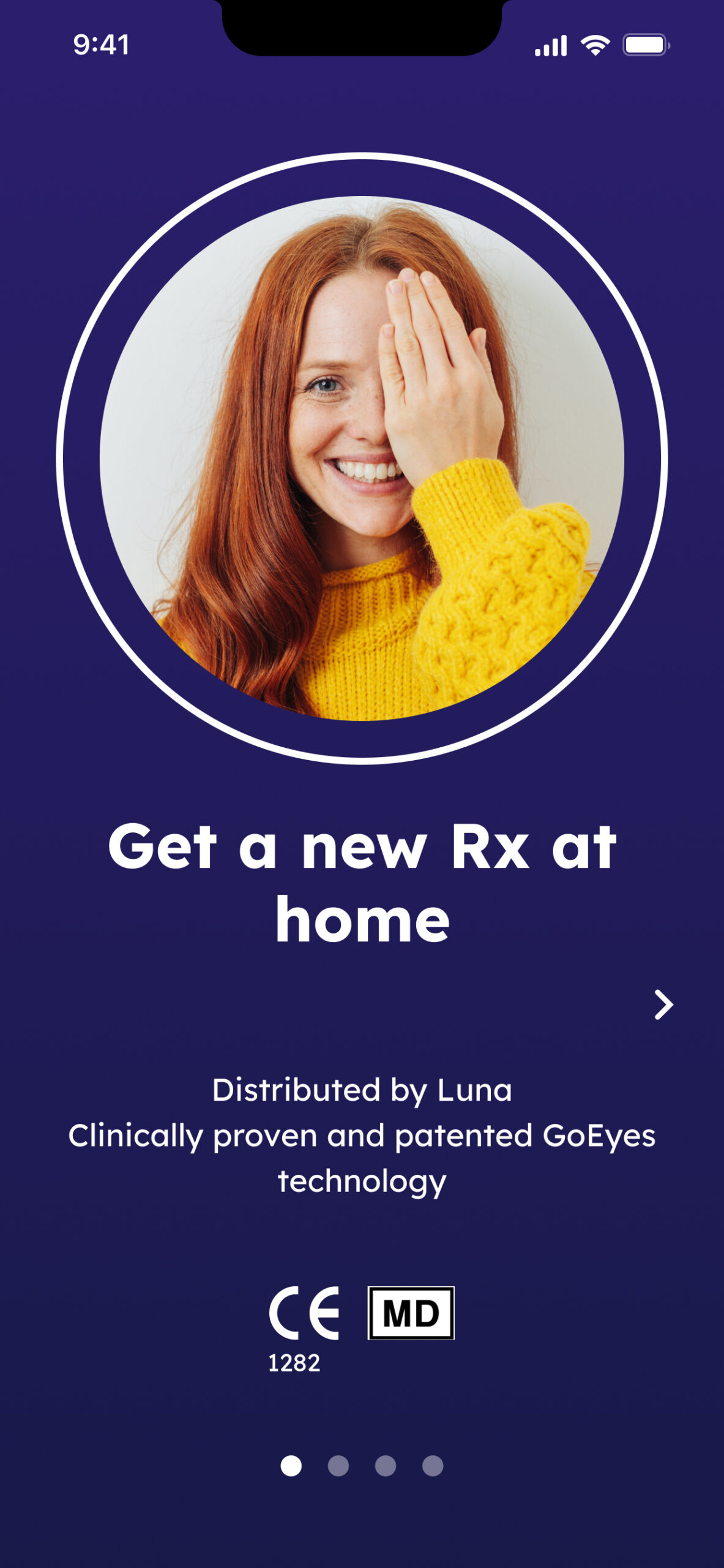
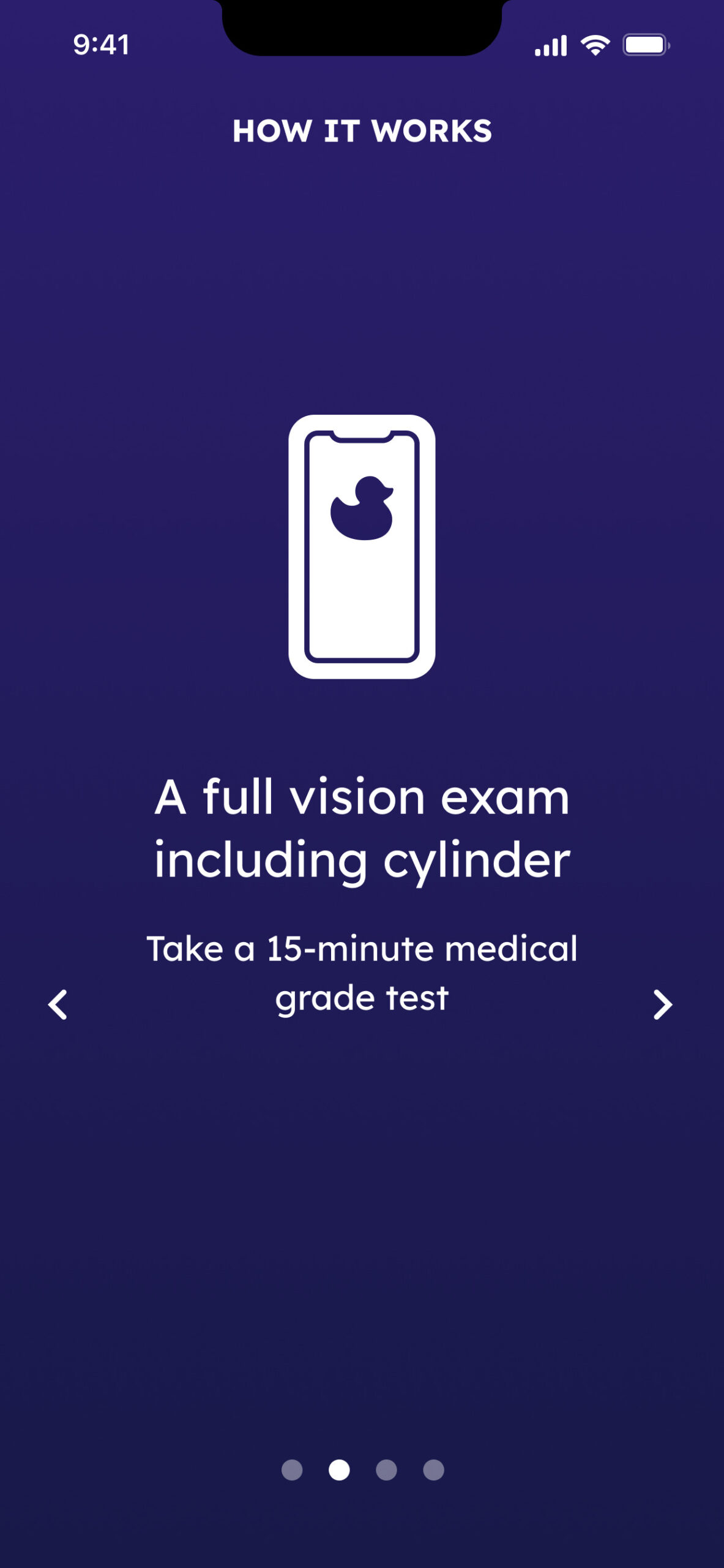
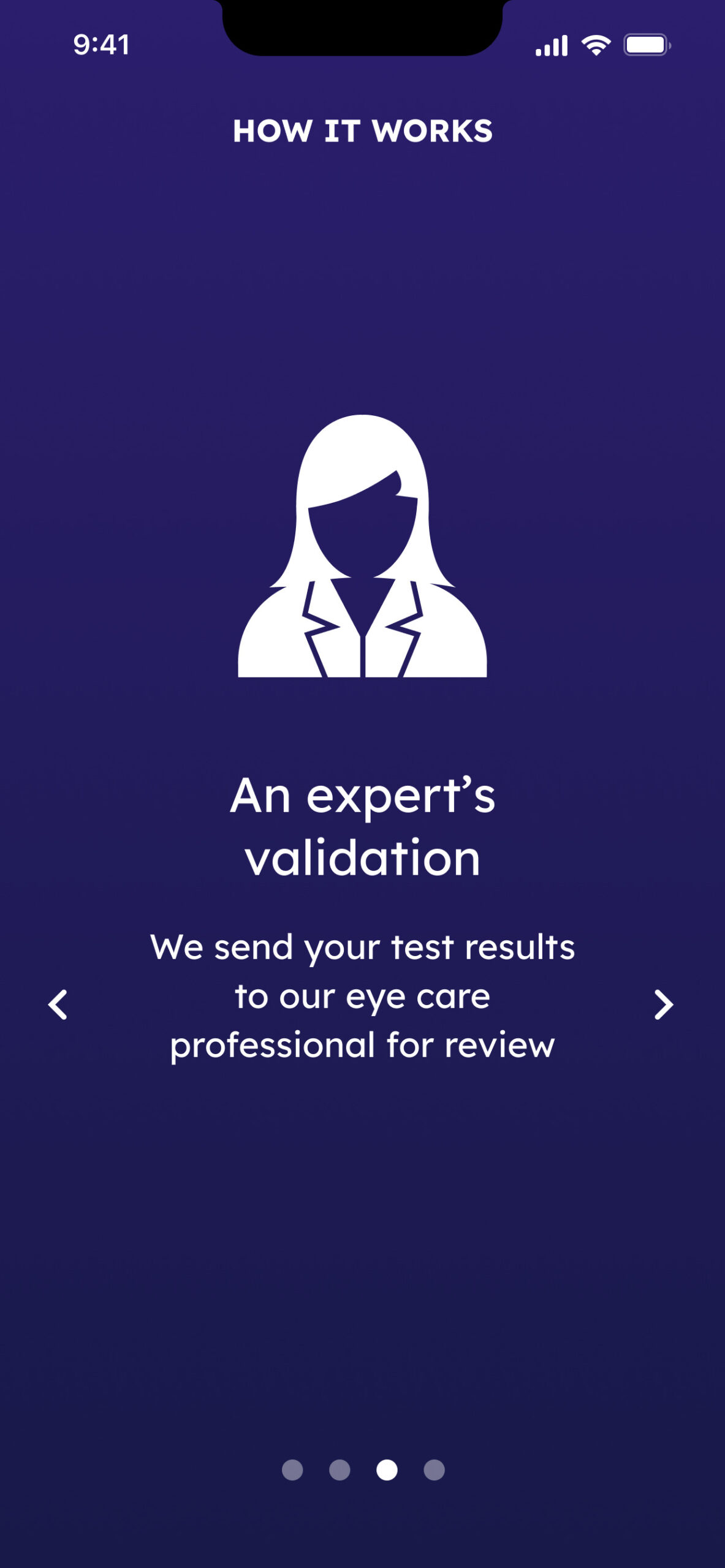
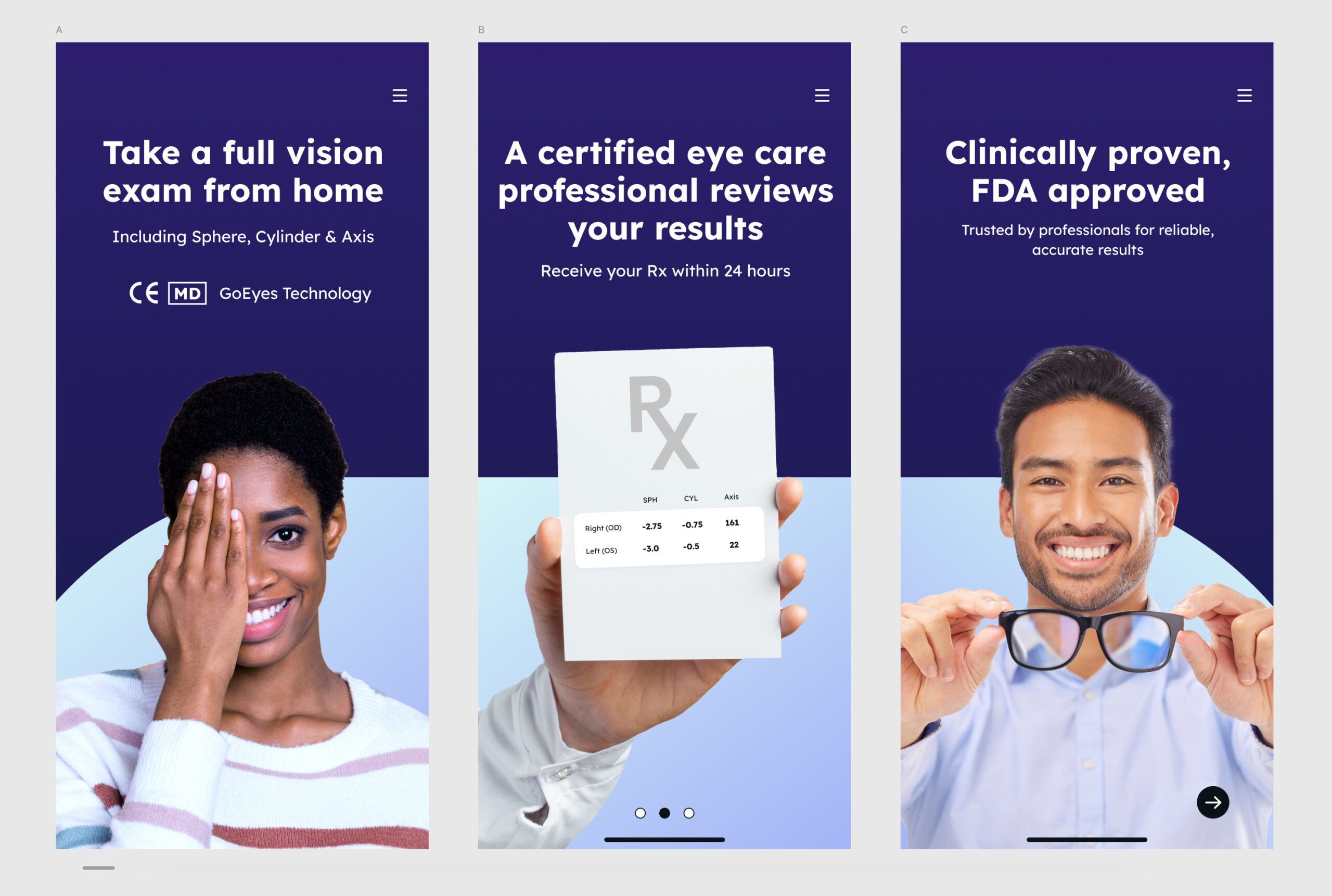
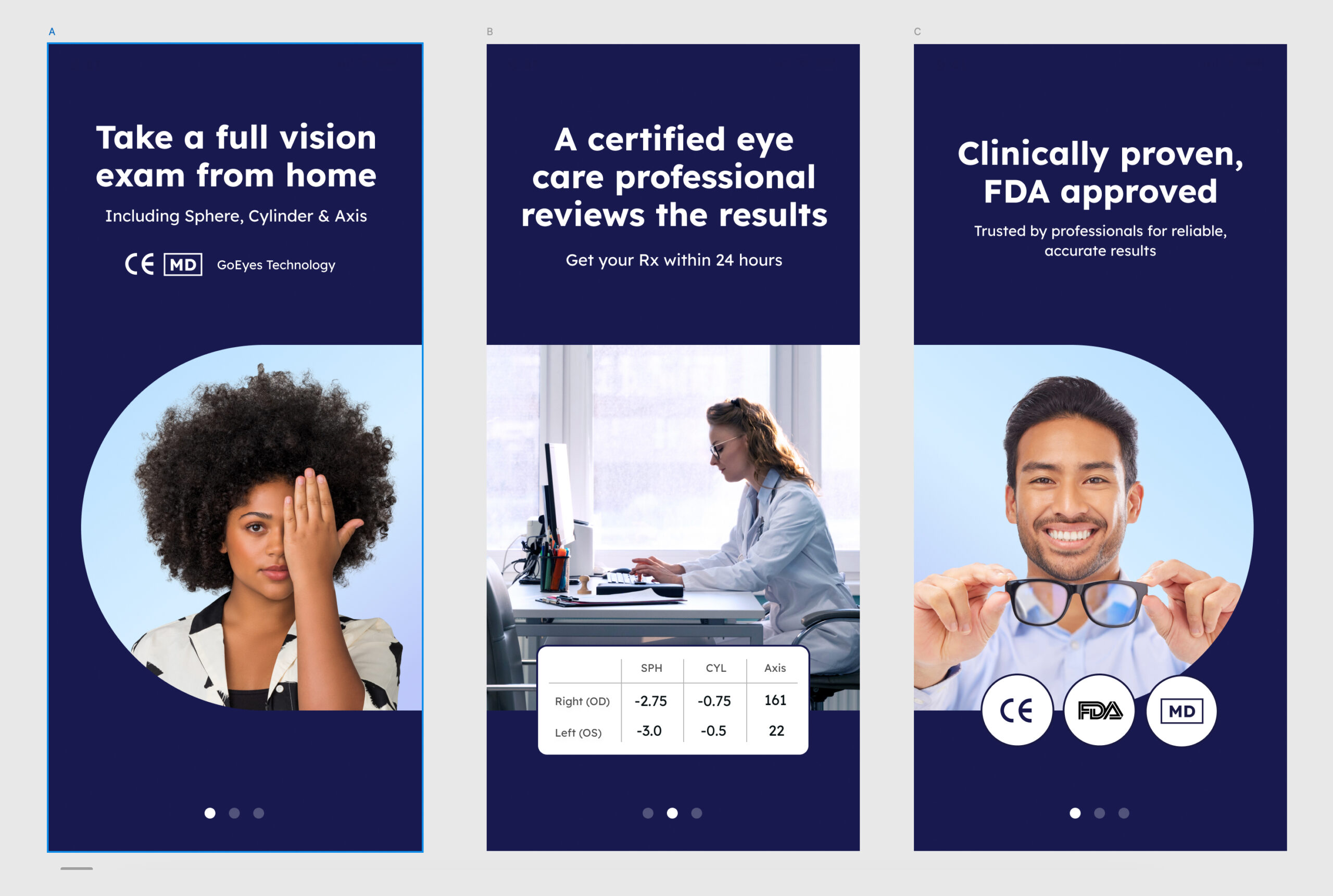
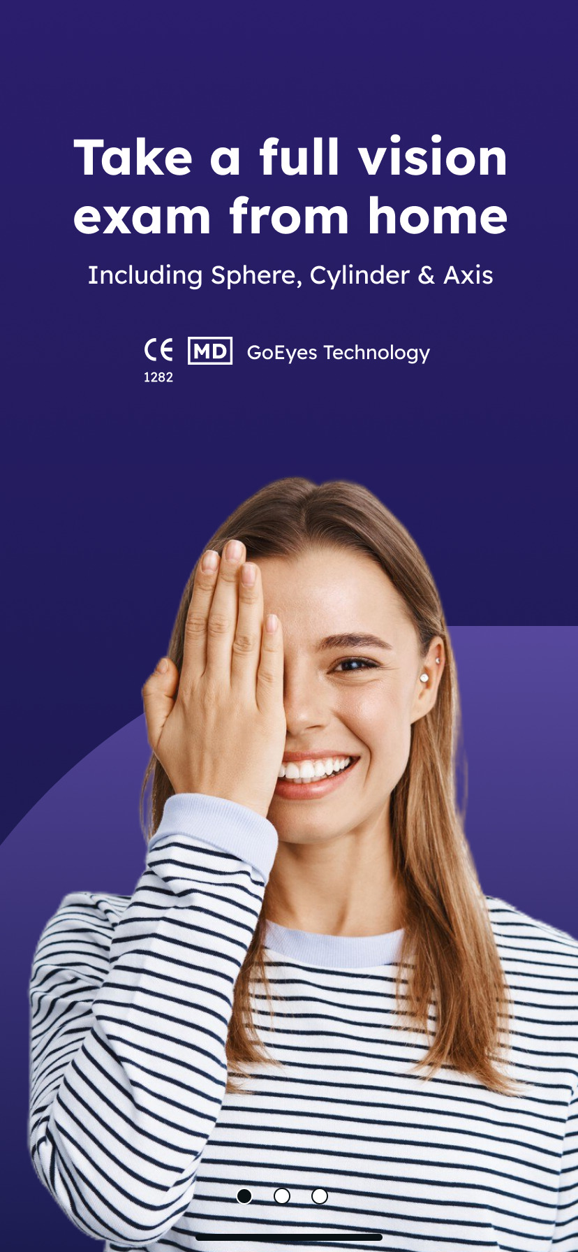
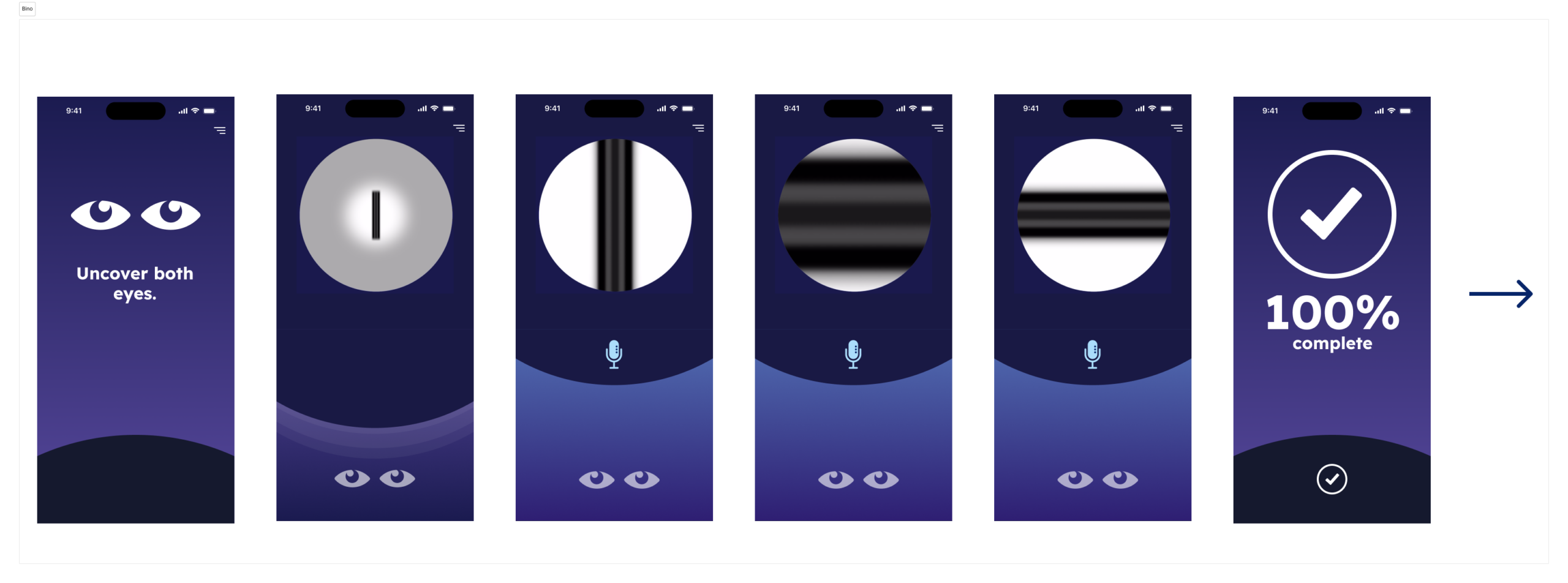
Human-centered visuals, and a real doctor
We transitioned from an icon-heavy, illustrated style to an image-based visual language grounded in real people. This shift was designed to build credibility, familiarity, and trust. To reinforce this even further, we introduced a real-life eye specialist at key points in the flow, offering reassurance and clinical authority exactly when users needed it most.

Using the barrier as a strategic advantage
We turned the 24-hour specialist review into a trust-building feature, positioning the app as a tool for collecting high-quality data reviewed by a licensed eye doctor. Updated messaging throughout the flow reinforced this clinical oversight, increasing user confidence.

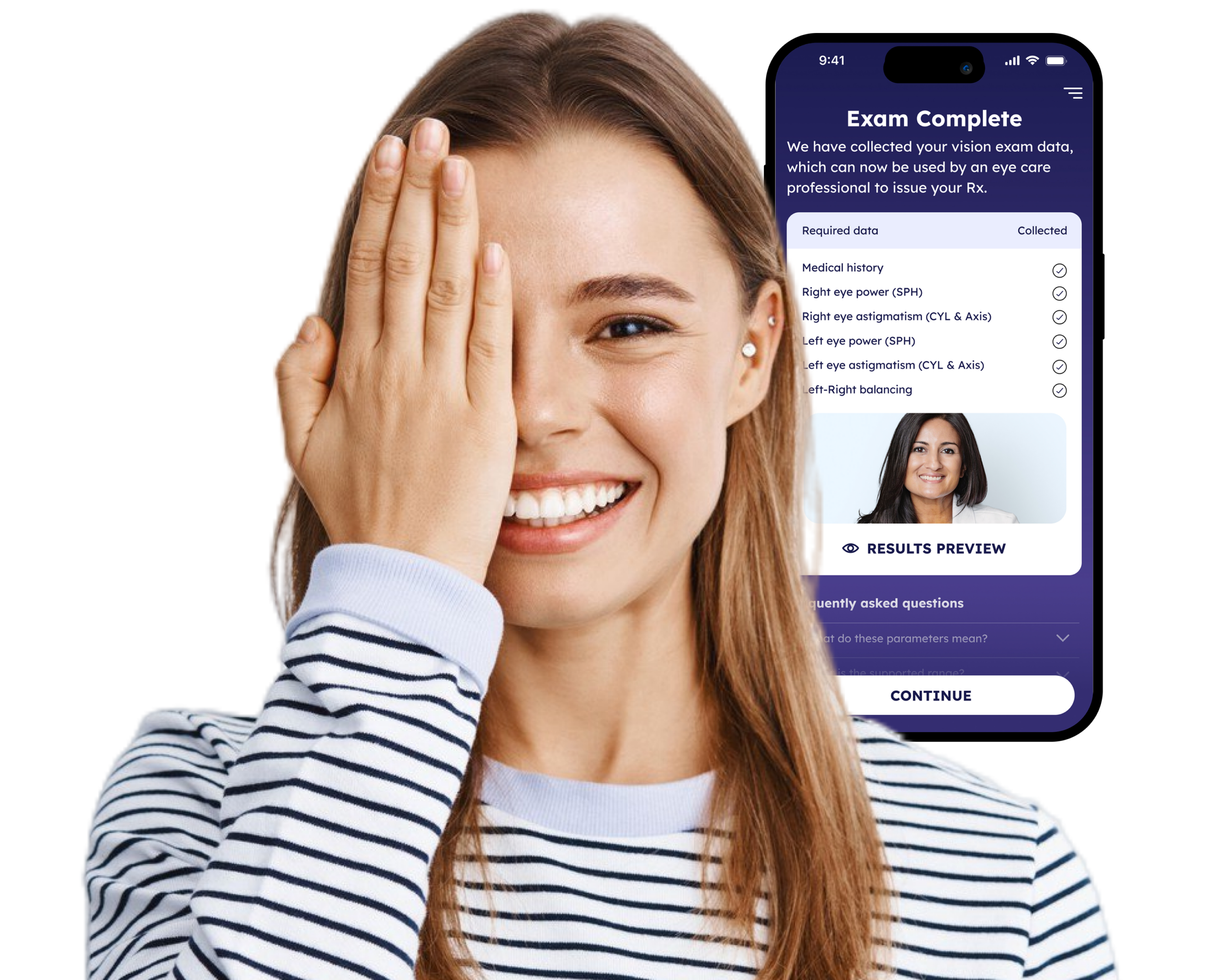
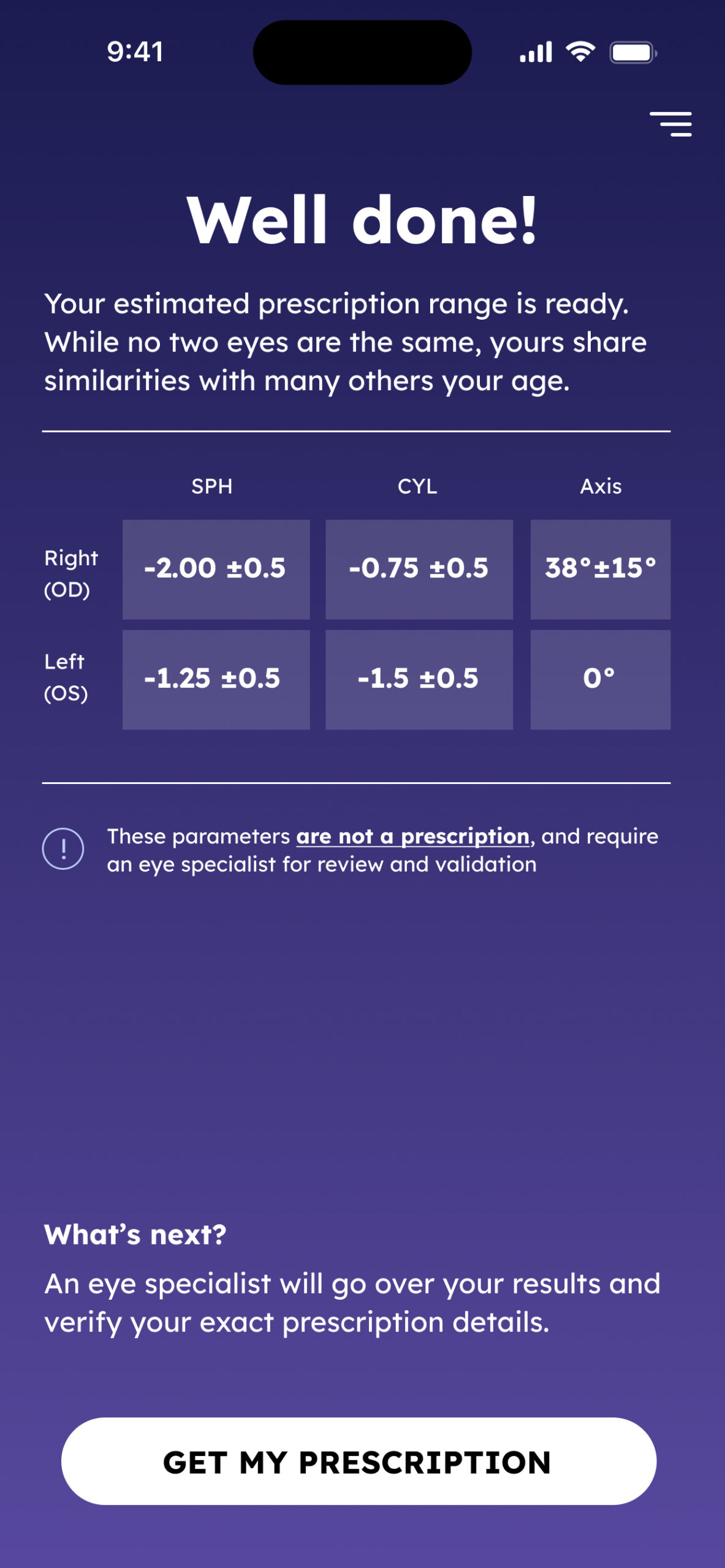
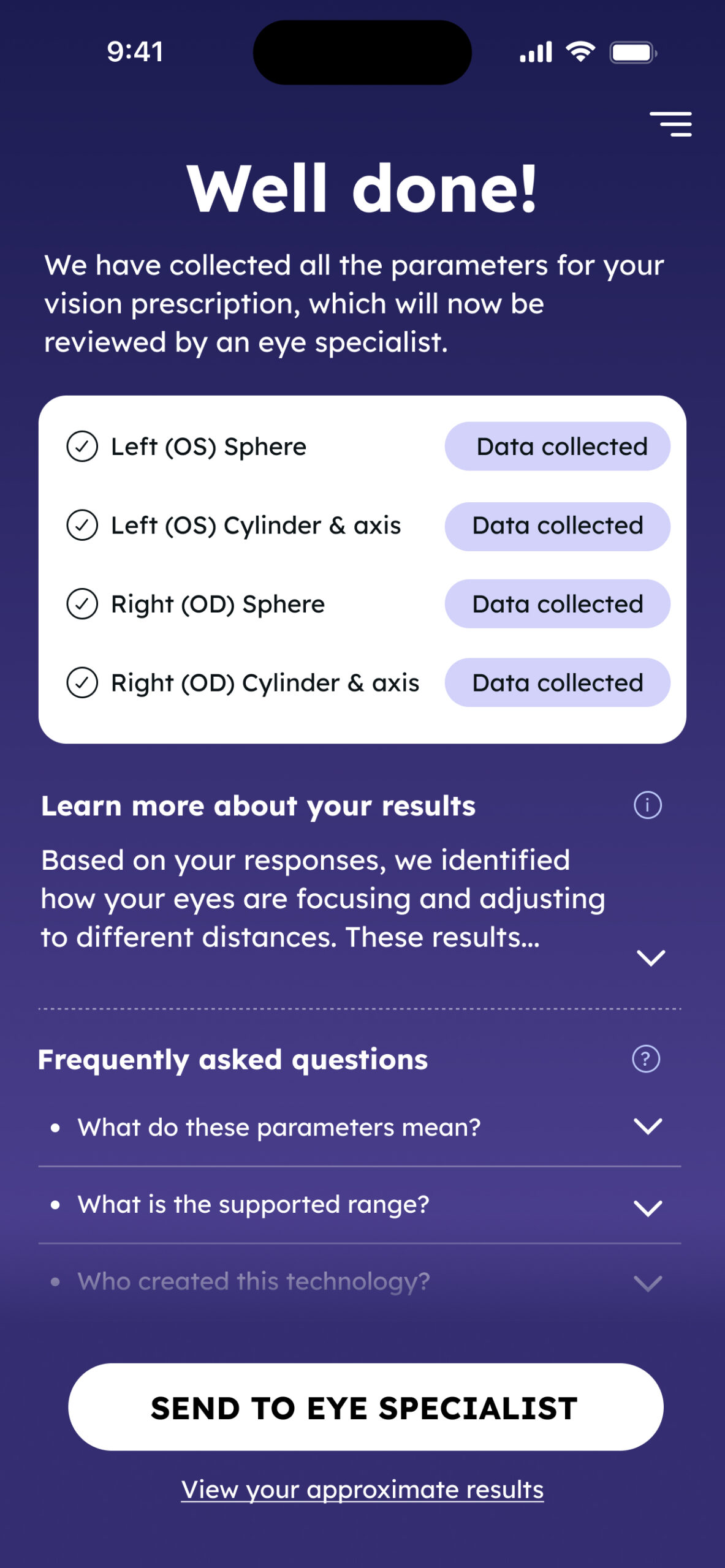
Exam complete screen
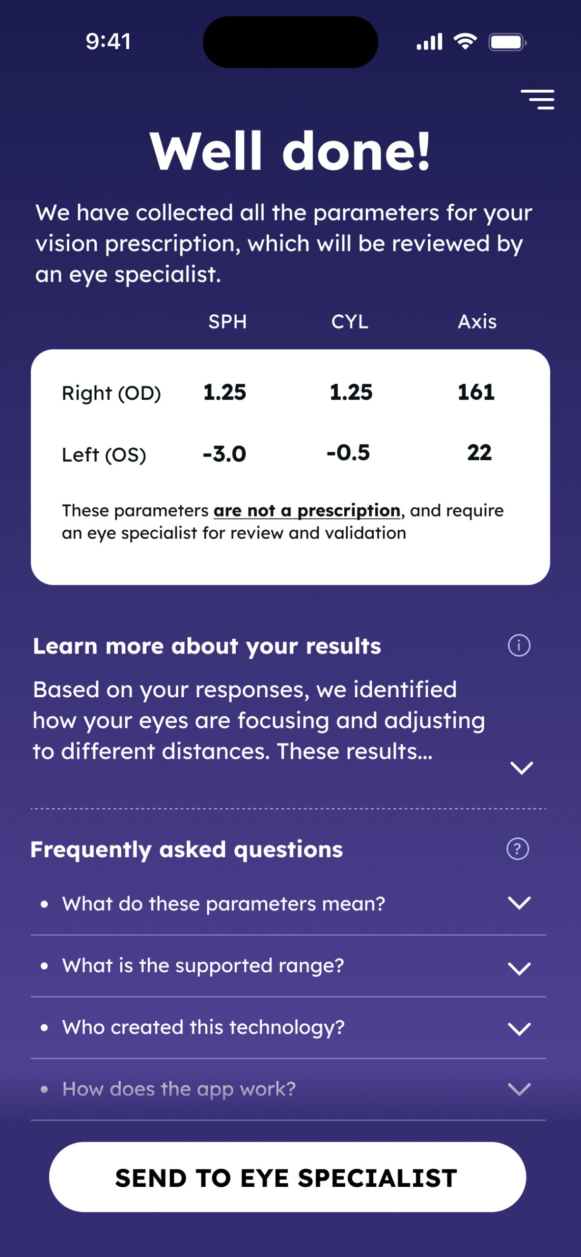
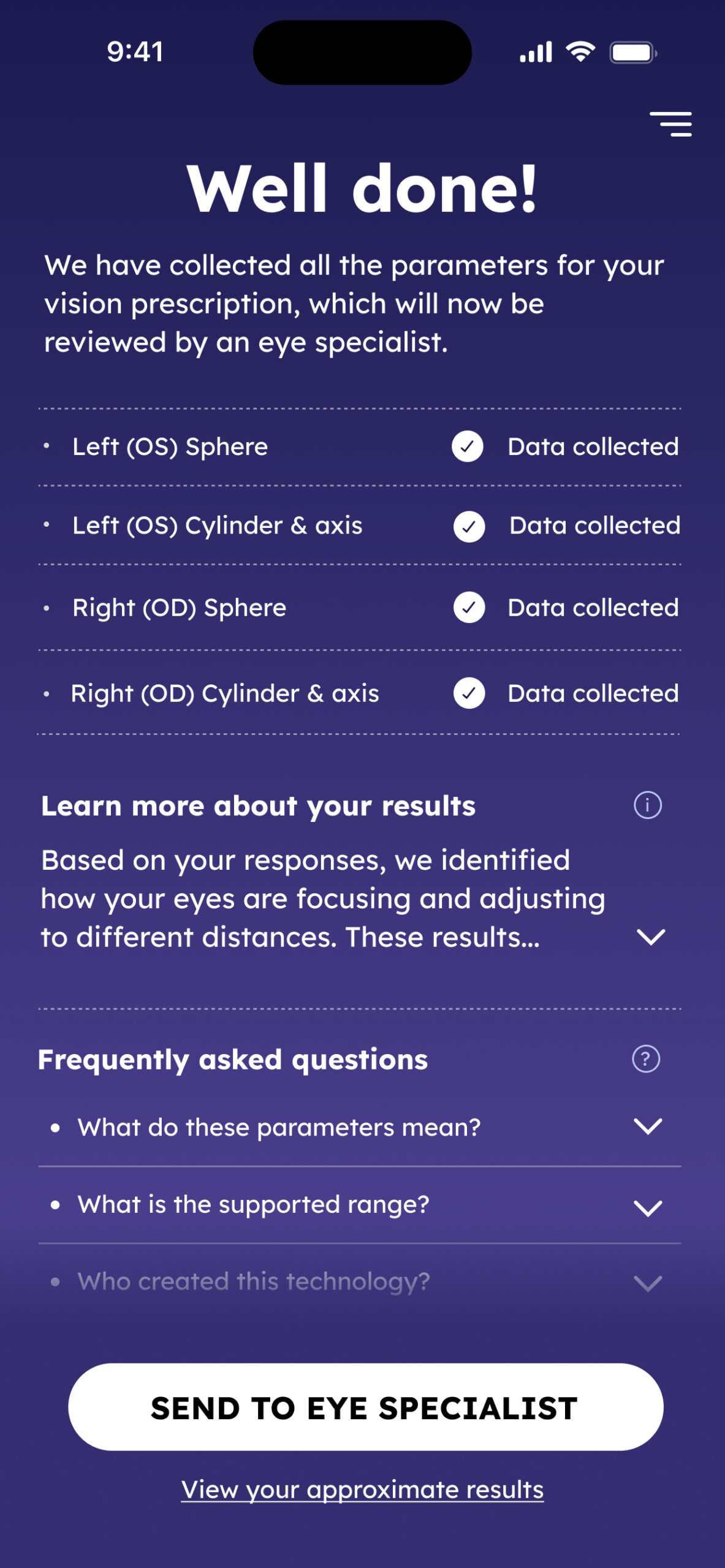
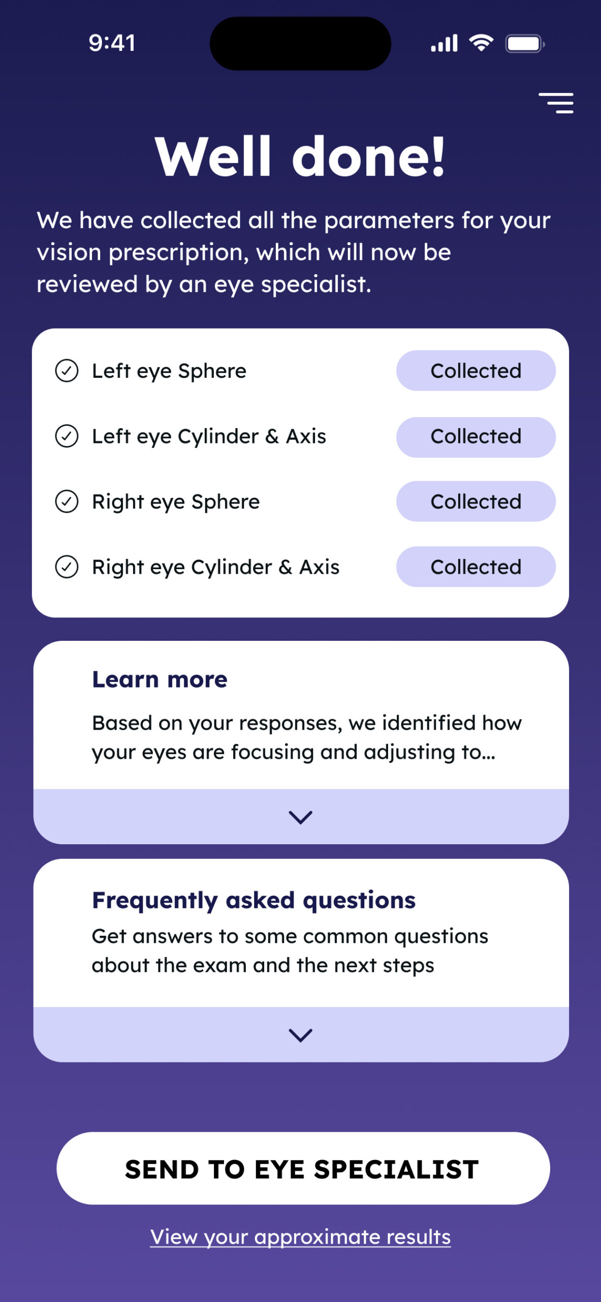
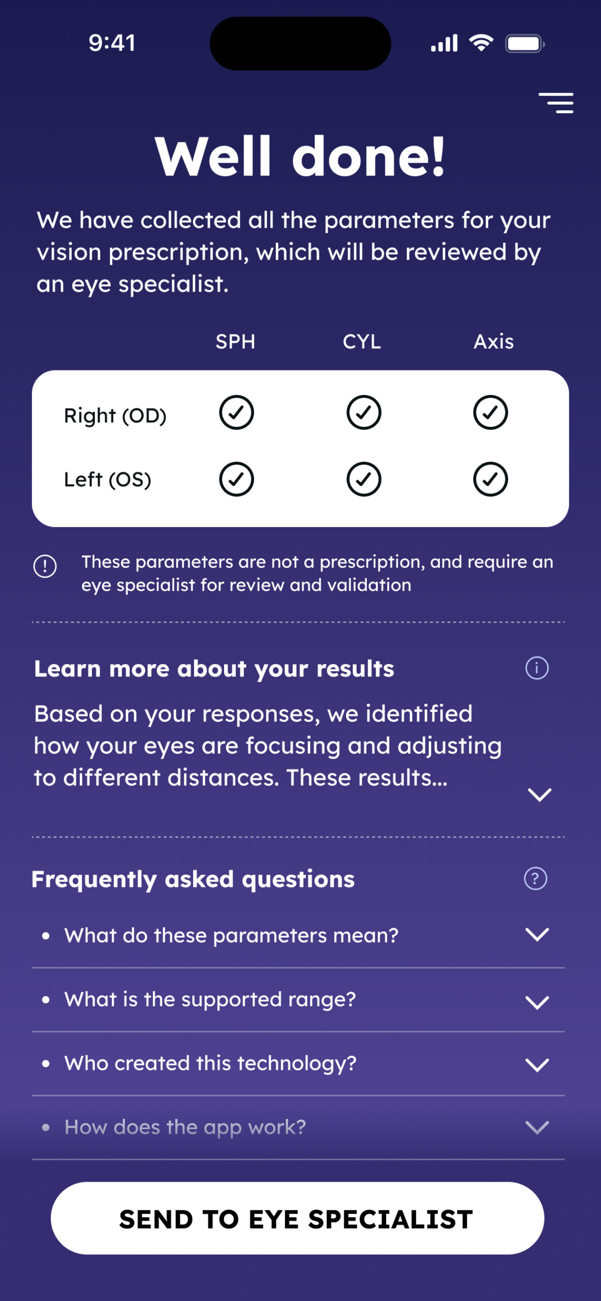
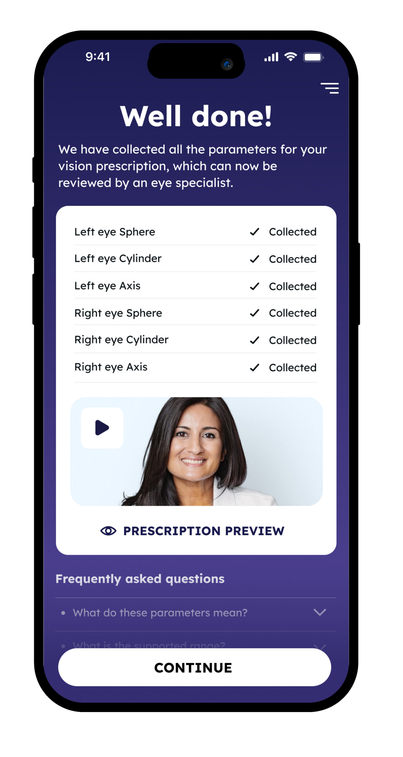
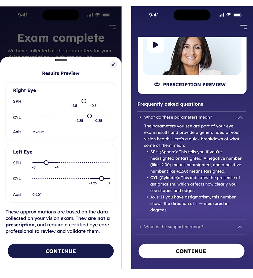
We introduced a new end-of-flow screen that summarized the data collected during the exam, included a “Next Steps” video featuring a real optometrist, and provided an FAQ section to address common concerns.
We also explored adding a “Prescription Preview” feature to give users a partial look at their results.
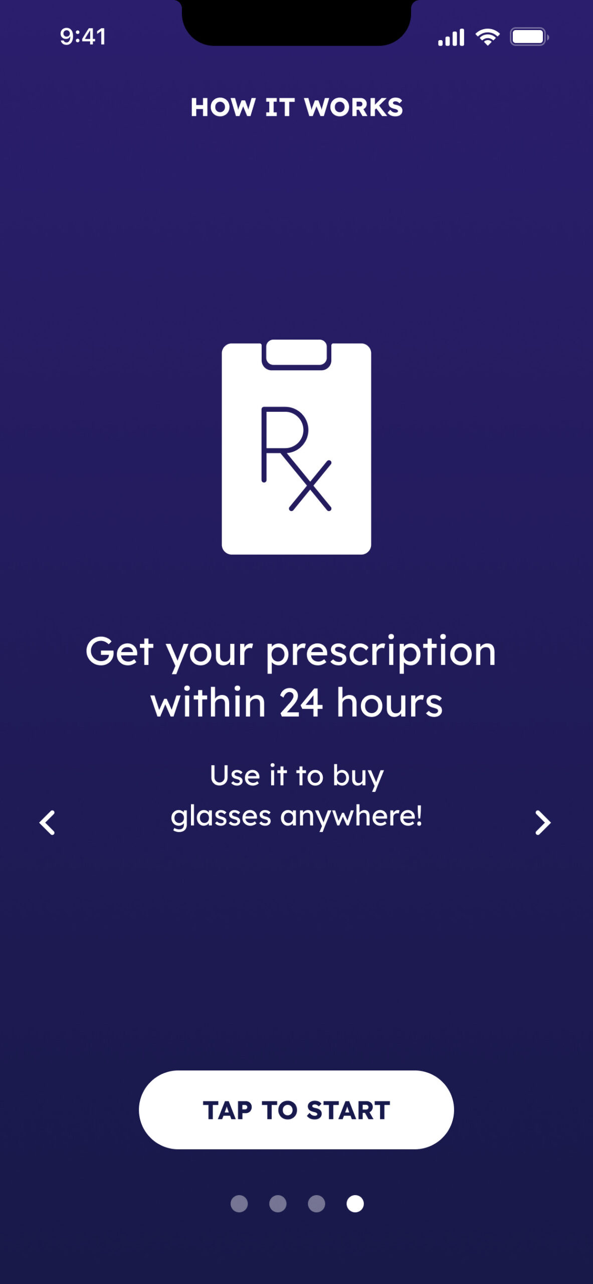
Existing onboarding screens (before my time)
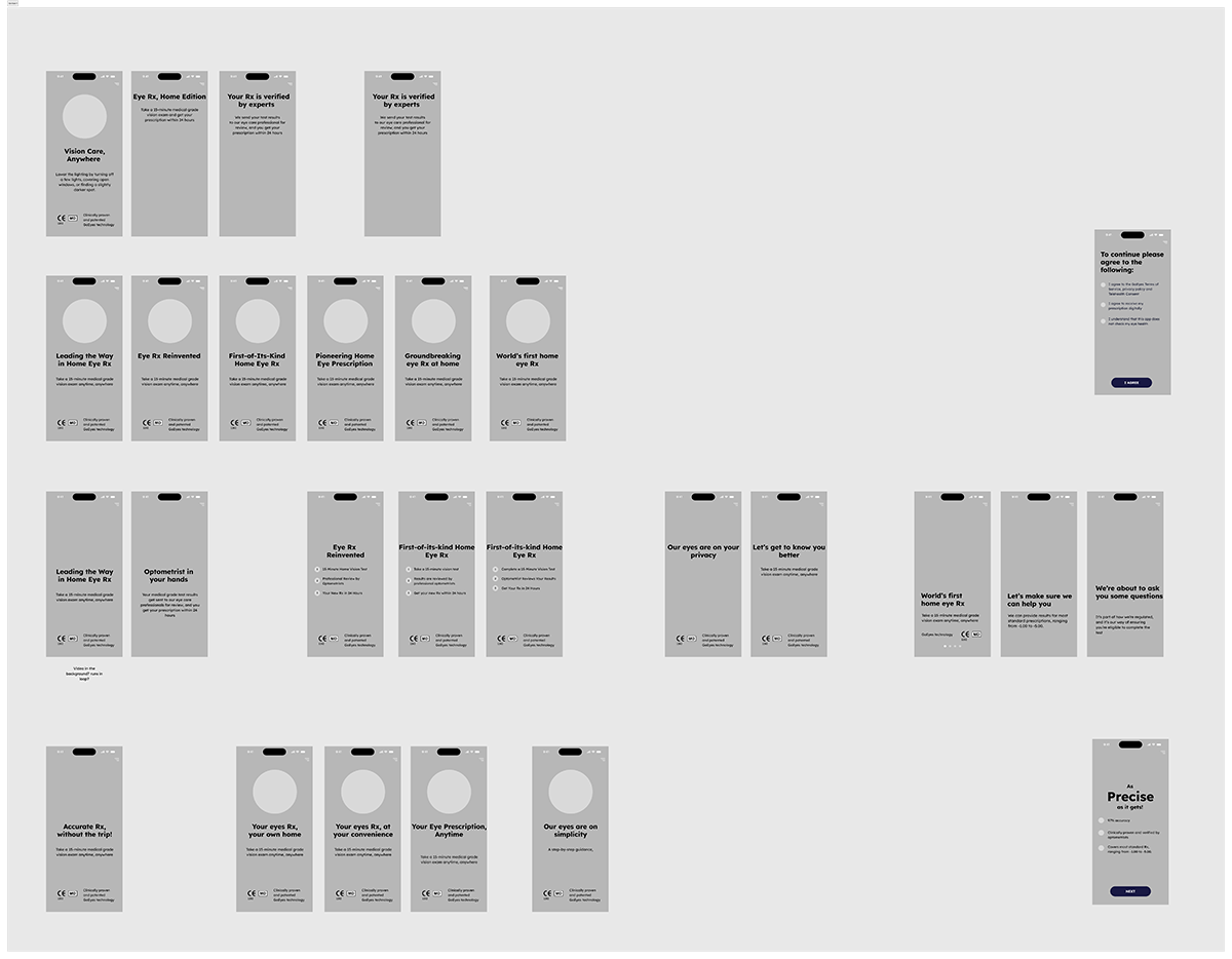
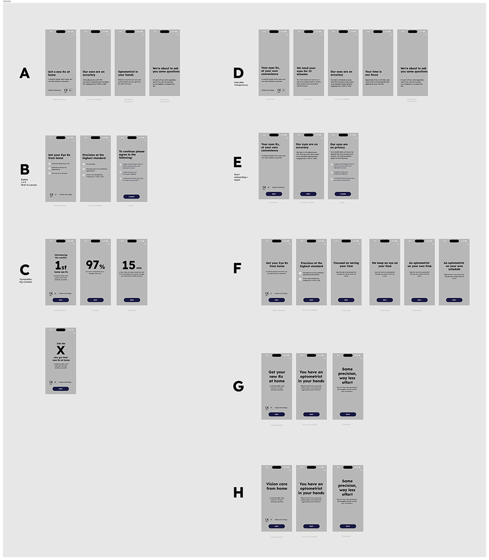
Ideation and rethinking
The first step of this project involved a thorough review of our existing onboarding messaging to identify key points worth retaining and refine them around a new central narrative—highlighting the eye specialist’s review as the core value of the experience.
While the visual direction was pretty clear from the start, crafting the right narrative to communicate our value proposition and USPs took multiple iterations to get just right.
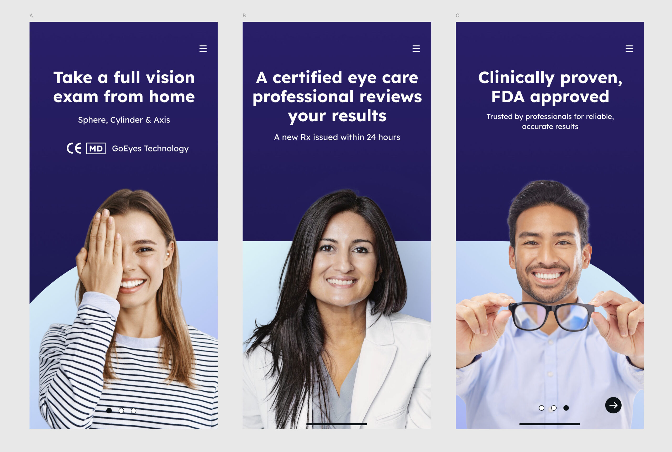
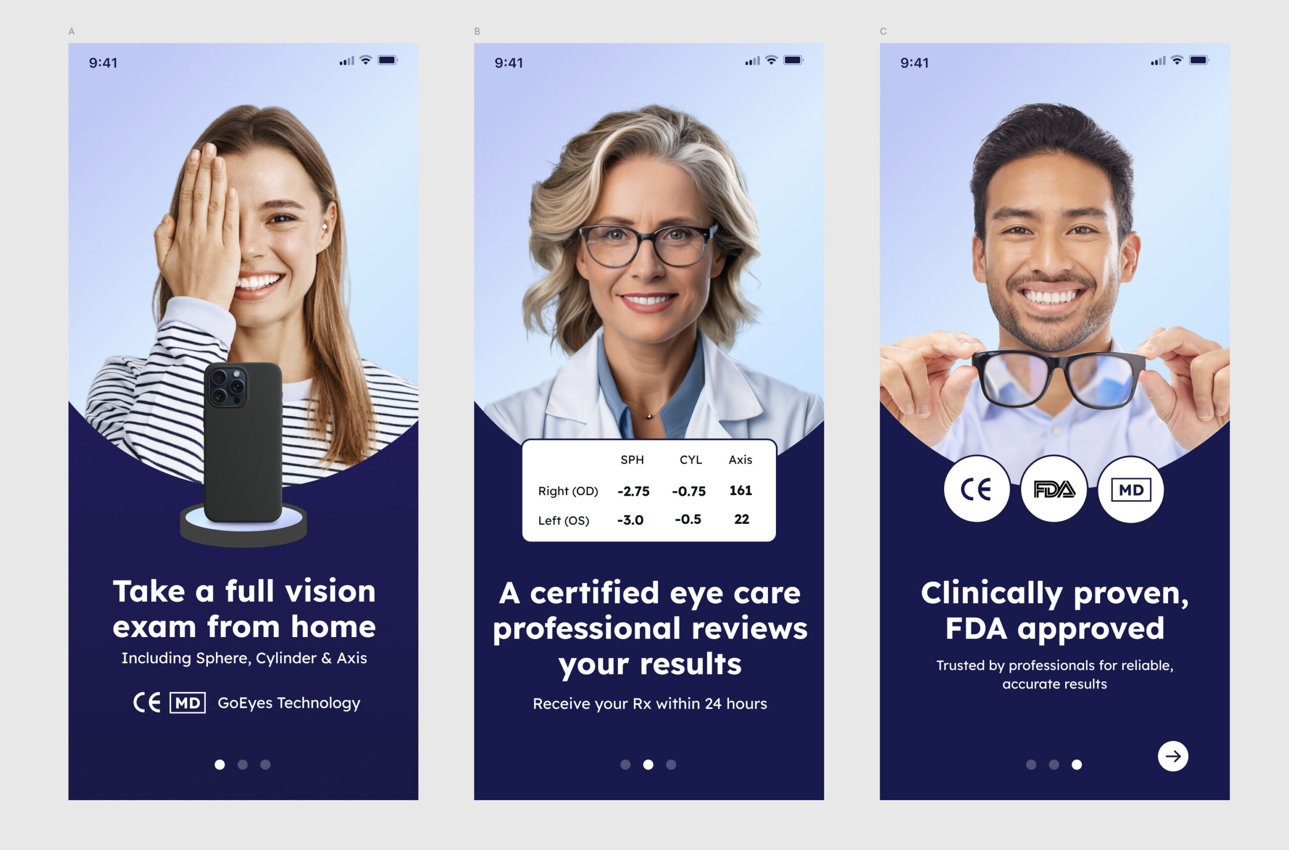
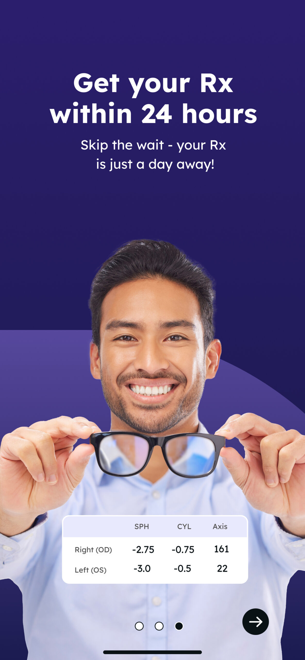
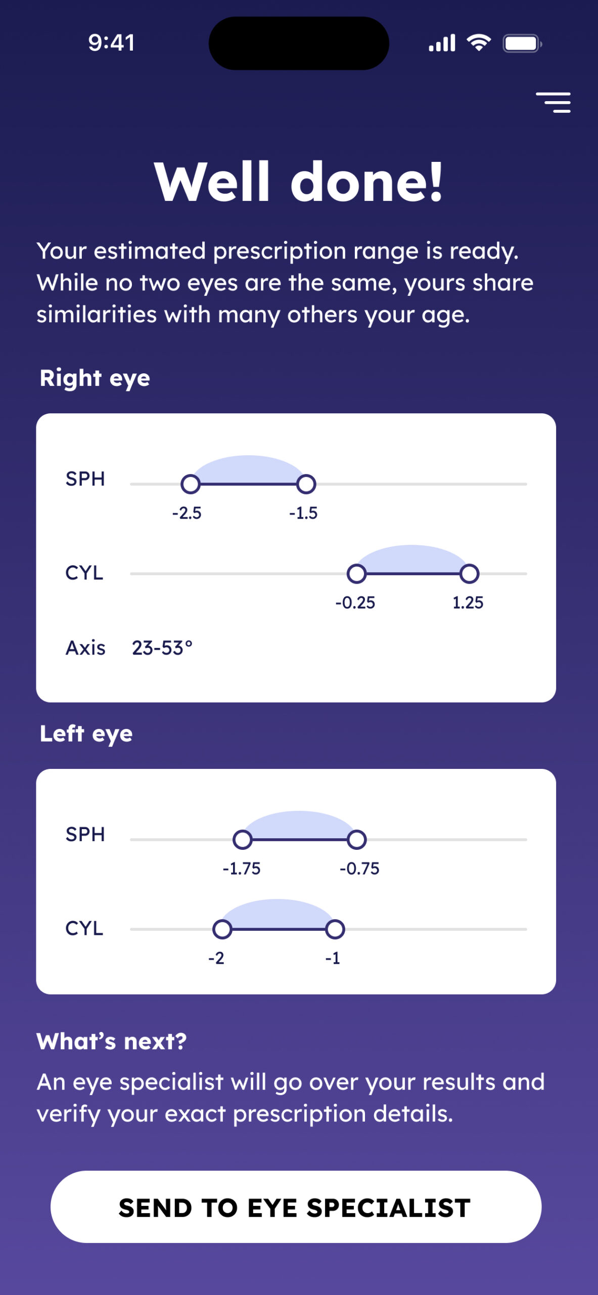
Onboarding that inspires confidence
We have shifted from a generic, icon-heavy style to a human-centered visual language that builds trust and relatability from the first interaction. We feature real people—both users and certified doctors—to emphasize credibility and create emotional connection, helping users feel at ease with an at-home medical exam.
The clean, minimal layout with bold, legible typography ensures clarity, while the gradient purple background signals professionalism and consistency with our brand identity. Key benefits (like speed, doctor review, and full exam scope) are presented upfront to strengthen user confidence.

A never-ending journey
The clinical flow concluded without clear closure or next steps. This gap existed because handoff messaging was delegated to the host apps integrating our SDK. However, to build enough user confidence to justify both the waiting period and the cost, we needed to deliver a more guided and reassuring end to the experience.
End of flow - A key moment in the user’s journey -emotionally, cognitively, and functionally
Our users spent 15-20min on the exam and are anxious to get their results. Some of them remember the promise of an “Rx from home”, others may know the results are sent for validation before they get their new Rx. It’s safe to assume not everyone will remember any of that.
Main UX objectives
- Acknowledgement - address this moment in the journey, celebrate and encourage the user on a job well done
- Actionable next steps - provide clear CTAs and information helping users send their results to the ECP
- Confidence & trust - Users may doubt the accuracy of the results they get, need to find ways to increase their trust in the process
- A personal touch - in a classic vision exam, the optometrist will let you know what your parameters mean, and be there to answer any question you may have. We need to address all of that here.
- Cognitive load & clarity - show the essentials first, then let users expand for more details.
2 concepts we explored:
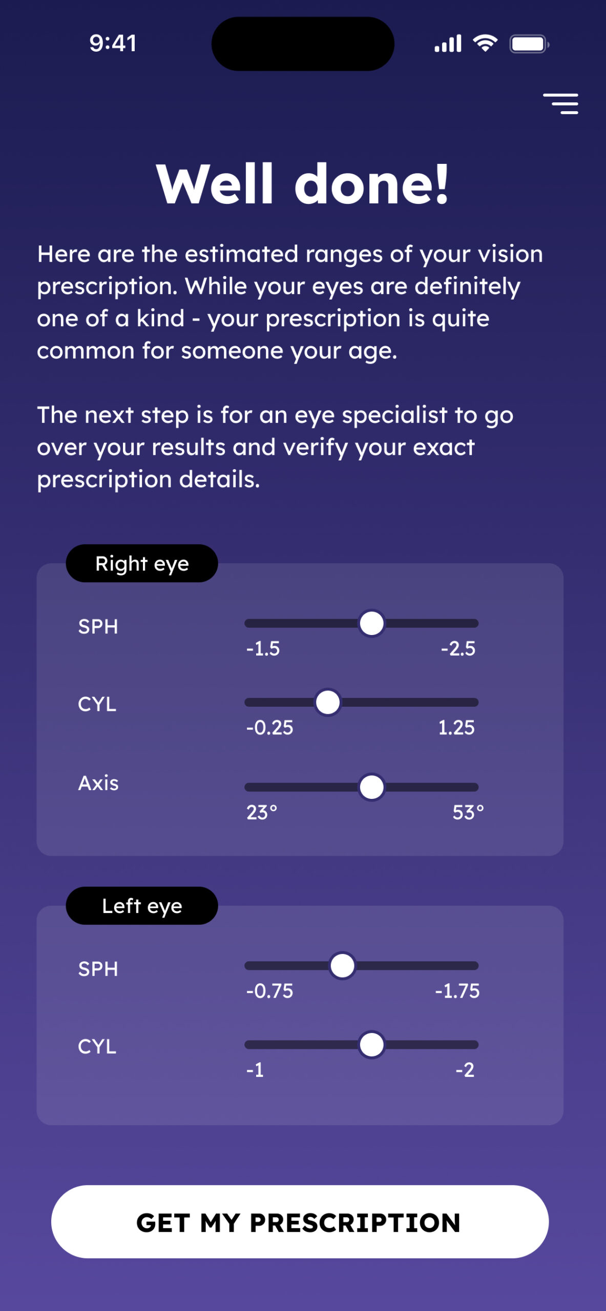
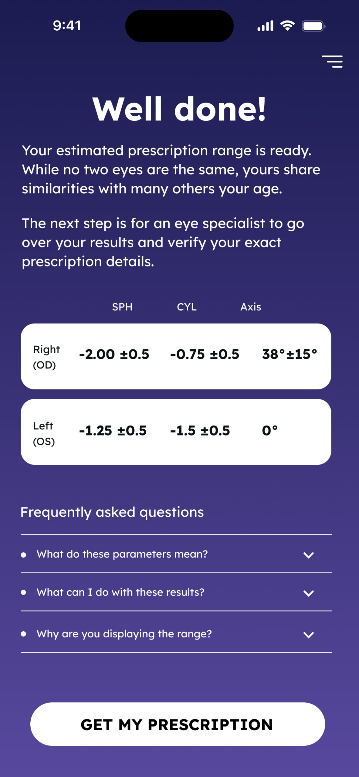
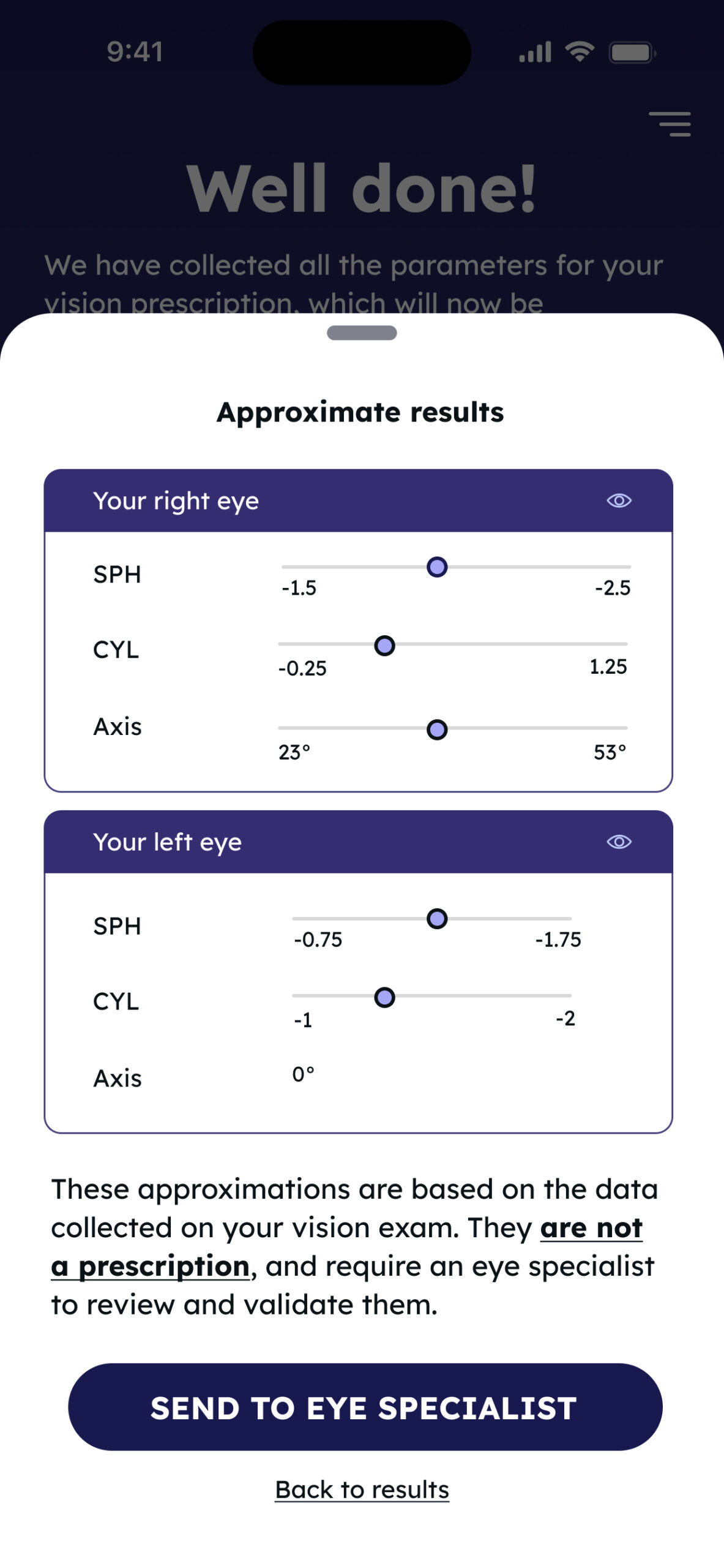
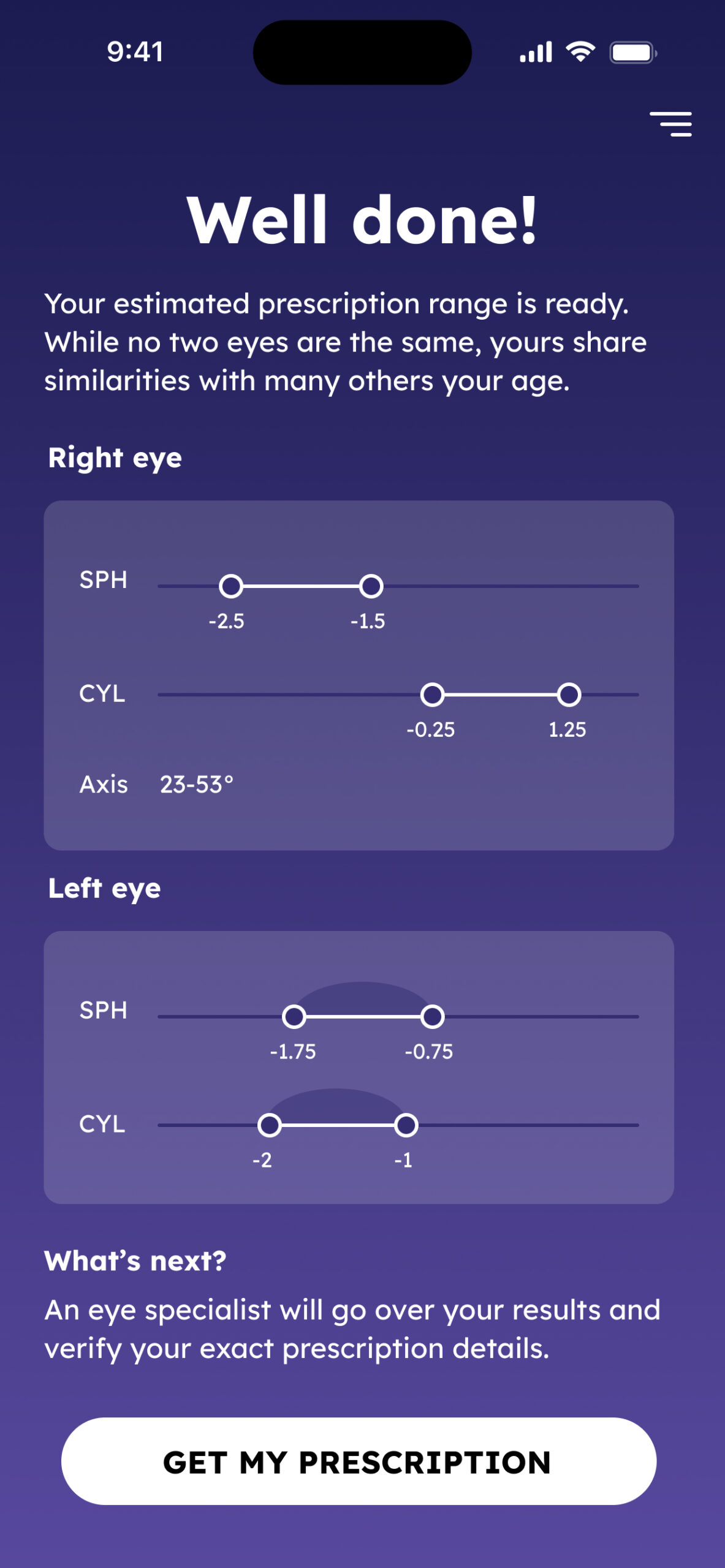
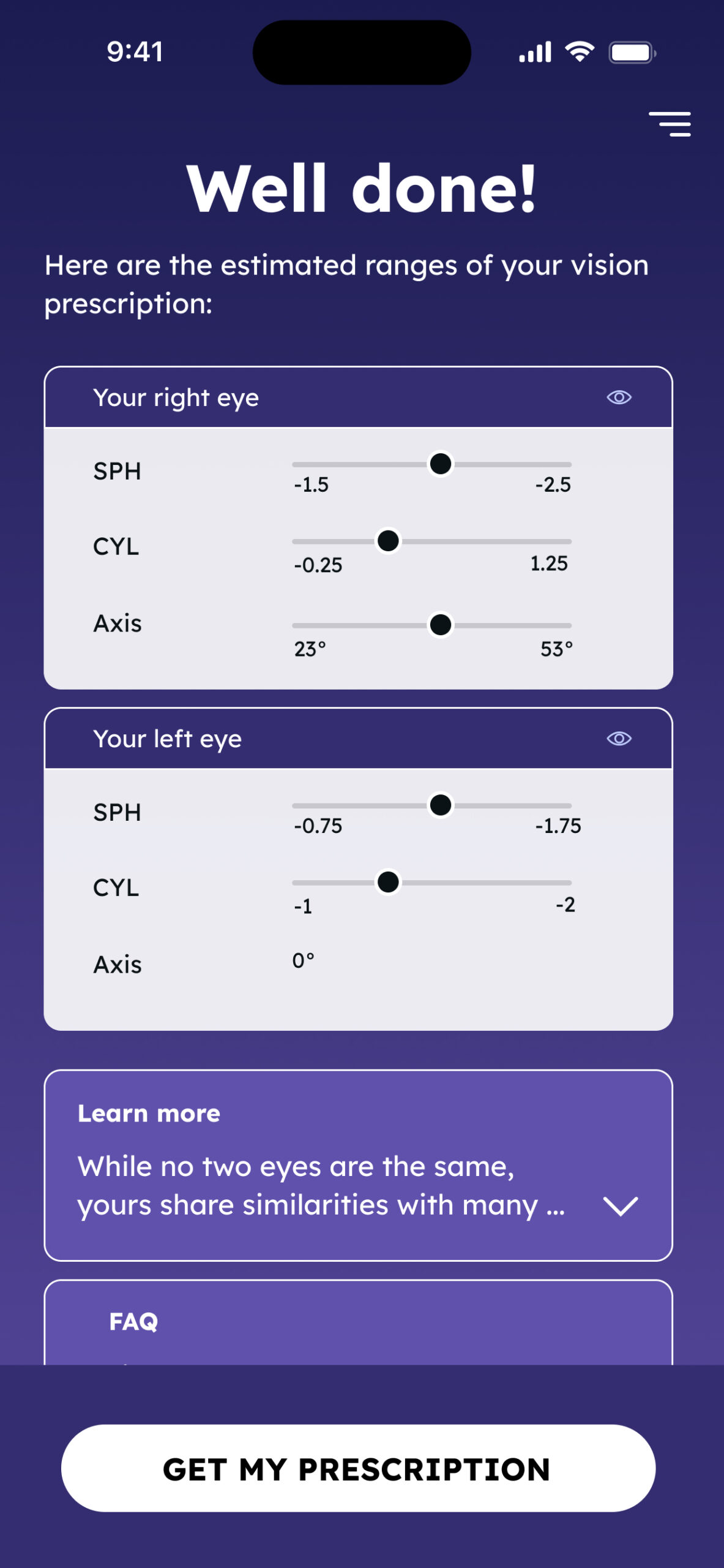
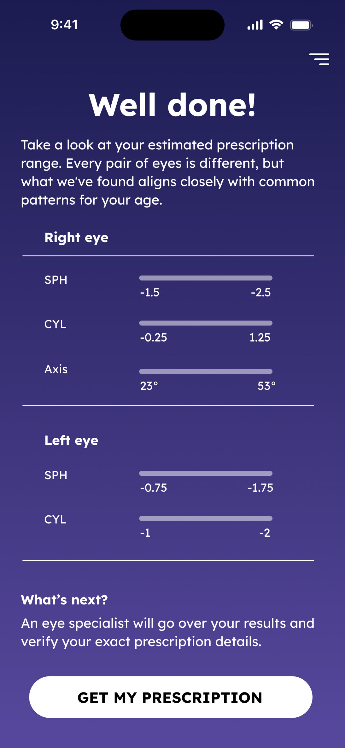
- Estimated results
Show the user a “glimpse” in the form of an approximated range of results, followed by a disclaimer that these results are not an Rx and should now be sent to the ECP for validation. The rest of the flow remains as it was without any content changes. - Data collection
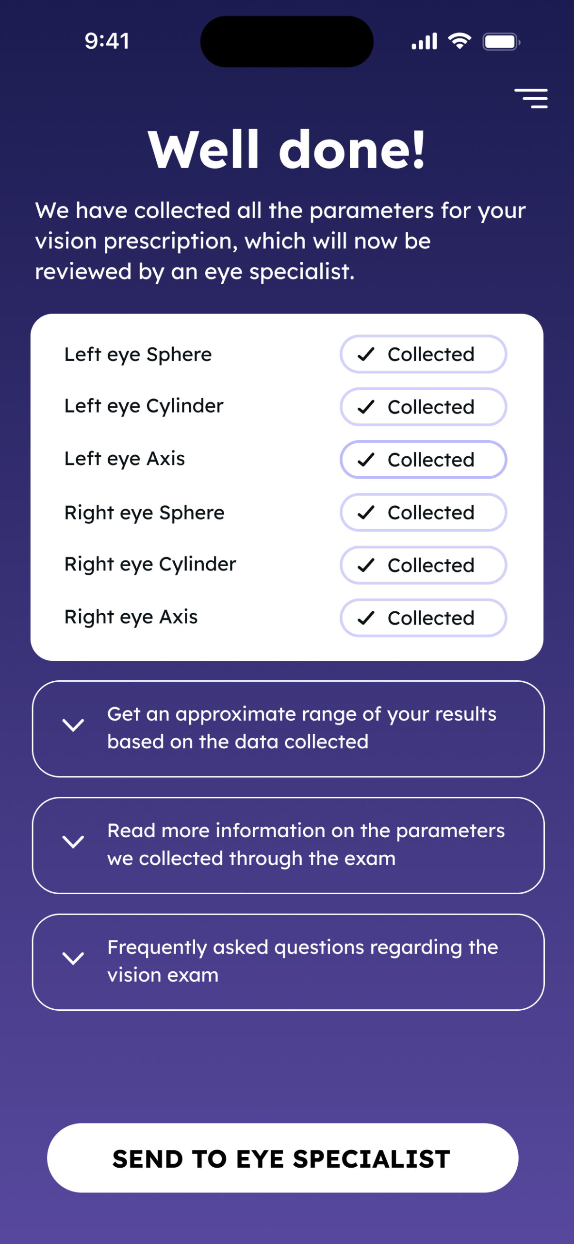
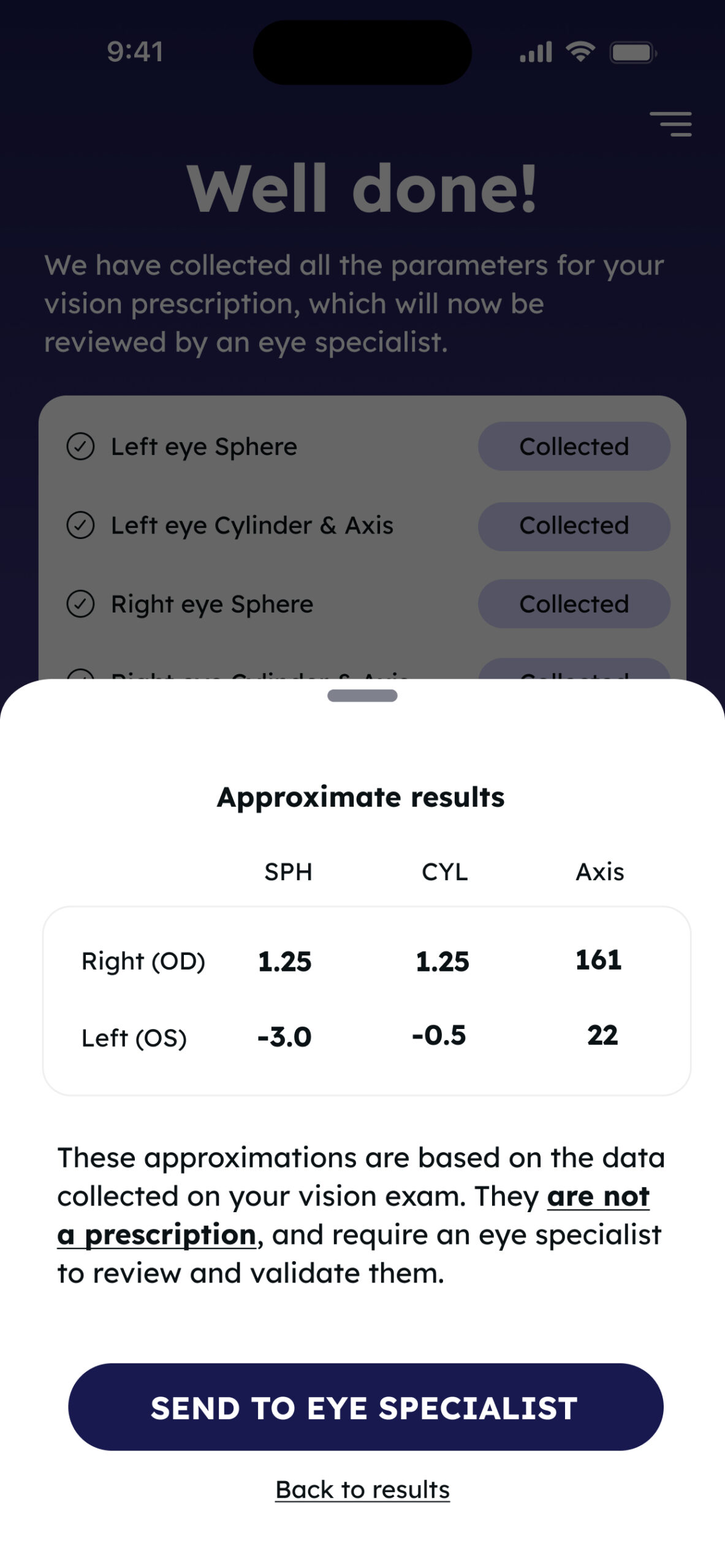
We look at the app as a tool, designed to gather all the necessary information and measurements for the optometrist to issue a new Rx. With each step in the process, our terminology will shift to “data collected” so that in the end we can show all the parameters we gathered for the ECP to base the new Rx on.
Some mockups exploring the two concepts:
Exam complete
We ultimately chose a design that blended both concepts. At the forefront was a video featuring a real eye specialist, explaining what data was collected and what users could expect next—a calming, authoritative presence that helped close the clinical loop in a digital context.
Supporting elements like an FAQ section and a preview of the results were positioned lower in the hierarchy. These provided optional depth, giving users the opportunity to learn more about the exam and build confidence in the service before reaching the purchase step.
Metrics
Following the introduction of the redesigned final screen and the new onboarding screens we observed a measurable boost in user trust and purchase intent (based on surveys and usability trials).
Survey responses showed a 17% increase in users reporting confidence in the accuracy of their scan results. When asked about their willingness to complete the purchase and pay for the service (getting an issued prescription by a licensed optometrist) we've noticed a 15% increase, indicating that a clearer, more reassuring wrap-up helped users feel more secure in completing the purchase.
Qualitative feedback highlighted the value of the eye specialist presence on both parts of the flow making the digital exam feel more “real” and clinically credible.