SeekWell, 2024-2025
Through the lens of trust - redesigning GlassesOn
GlassesOn is a scaning app extracting the current prescription details from a pair of glasses, making it easy to shop for new eyewear online. The app offers a guided experience with voice and video prompts.
Background & Context
Traditionally, users must visit an optometrist to get their vision parameters. Some people remember parts of it, most do not pay enough attention to it as they rely on the optometrist/store to provide them with an appropriate pair of glasses. Most people either don't get their parameters after their visit or don't keep a copy of it for future purchases.
When I joined the company, GlassesOn was in a transitional period between 2 versions, differing in their algorithmic approach to the scanning process.
Our legacy version (V1) had already been out in the app stores for a couple of years, with a lot of data to collect insights from, and also served as a white-label SDK for partners like GlassesUSA, Smart by Glasses, and The Framery.


Key Challenges
- A first-of-its-kind experience - asking users to scan their glasses using a smartphone and a computer screen is inherently tricky.
- Skepticism & trust barriers - users have concerns on the accuracy of this scan and whether it actually matches the precision of an in-person visit to an eye clinic.
- Tilting the glasses is a pain point - even users who completed the process point to this section as the hardest part, others have to go through it more than once to complete.
- User's surroundings - lighting conditions, space & phone quality can affect the scan's accuracy and consistency.
- Shorter than a visit to a vision specialist, but not short enough - V1 had an average 7.3 min to complete the scan and we were aiming to reduce it to less than 5 min, without hurting our completion rates.
- Partner UI customization issues - legacy UI supported color themes per partner which affected buttons, texts and icons, and caused several accessibility and usability issues.
- Dev resources and priorities - most screens were shared with our legacy version and could not be altered dramatically within this project's scope. This was meant to be the first phase of a UI liftup, focused on increasing trust in the app.
UX approach

Human-centered visuals
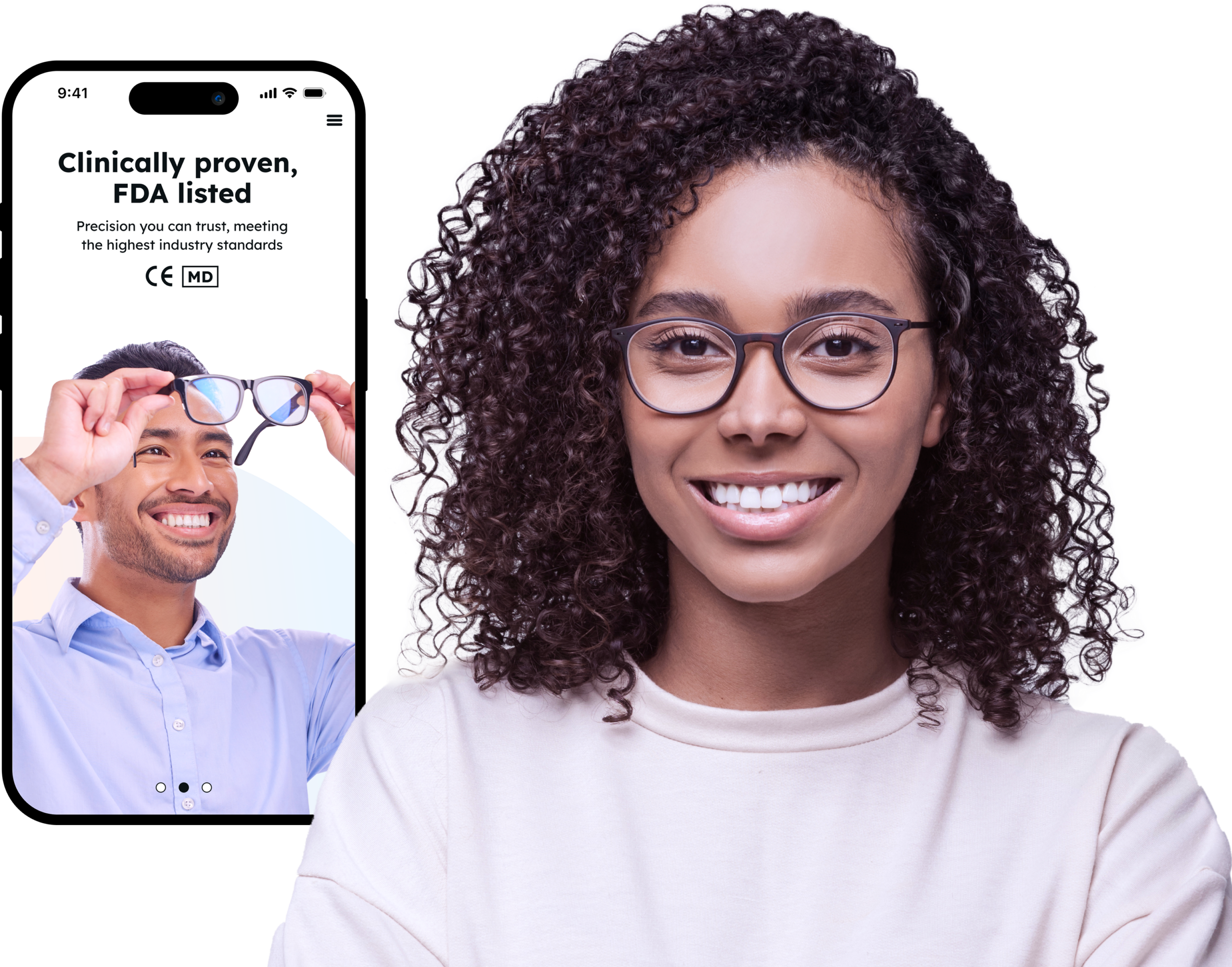
We shifted from an icon-heavy, illustrated style to a visual language centered around real people —boosting credibility, familiarity, and trust.
Using real-life footage was also considered for some of our key assets to bridge gaps of understanding.

Data-driven guidance
We enhanced our in-app guidance by reshooting our core tutorial video based on insights gathered from usability sessions.
In addition, we refined our feedbacks throughout the scan (voice & animations) and introduced clearer error states—all based on pain points we identified.

Transparency
We've refined our microcopy on key steps in the flow, setting the user's expectations, and also added progress indicators to provide more clarity for each step completed.
We've enriched the results screen with FAQs —creating a more transparent and reassuring user journey.
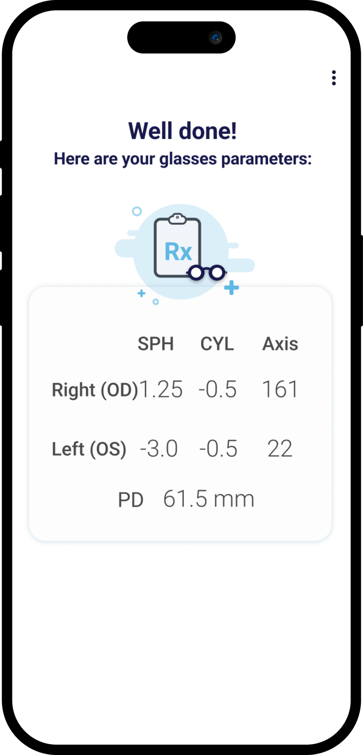
Legacy app (V1) key screens
Here's what the GlassesOn flow looked like when I came on board—before the redesign process began.


GlassesOn V2
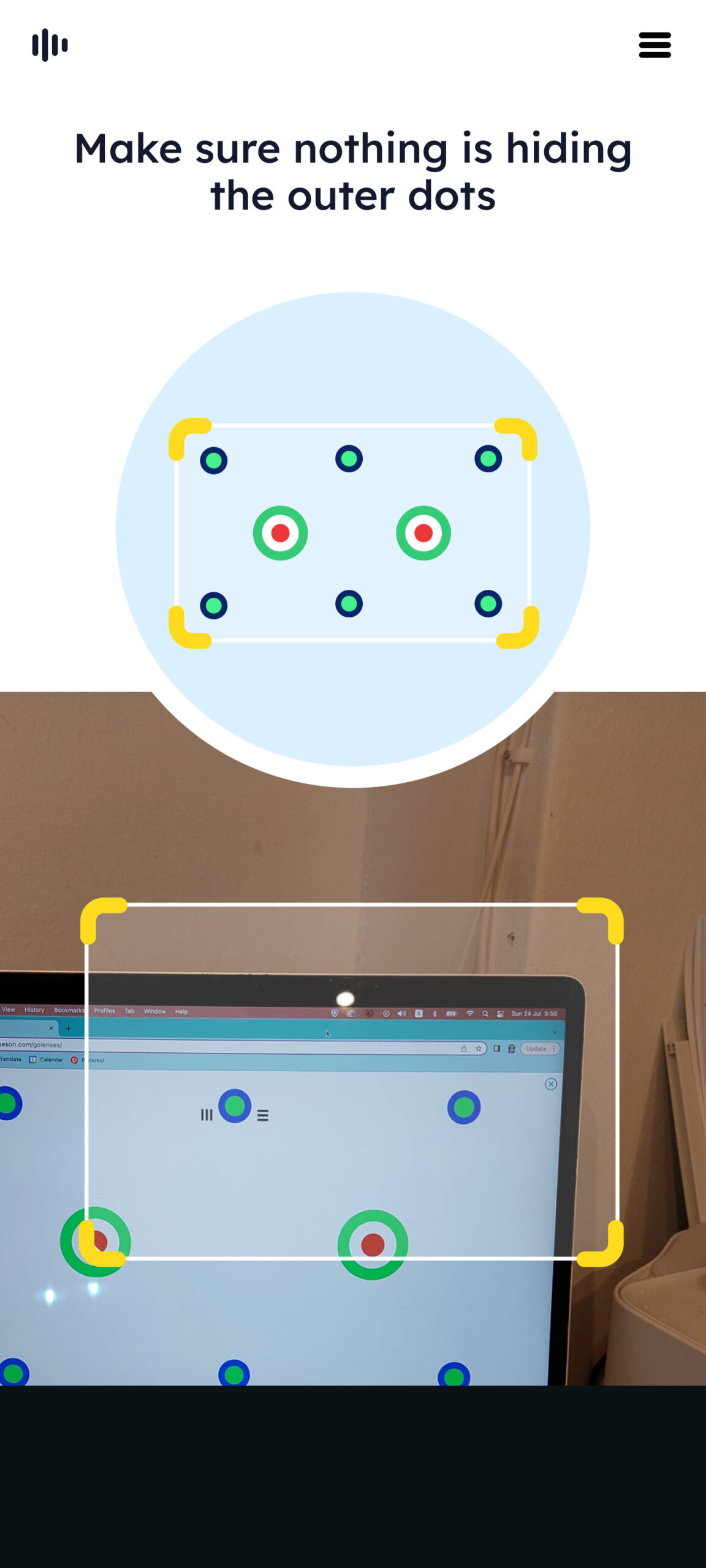
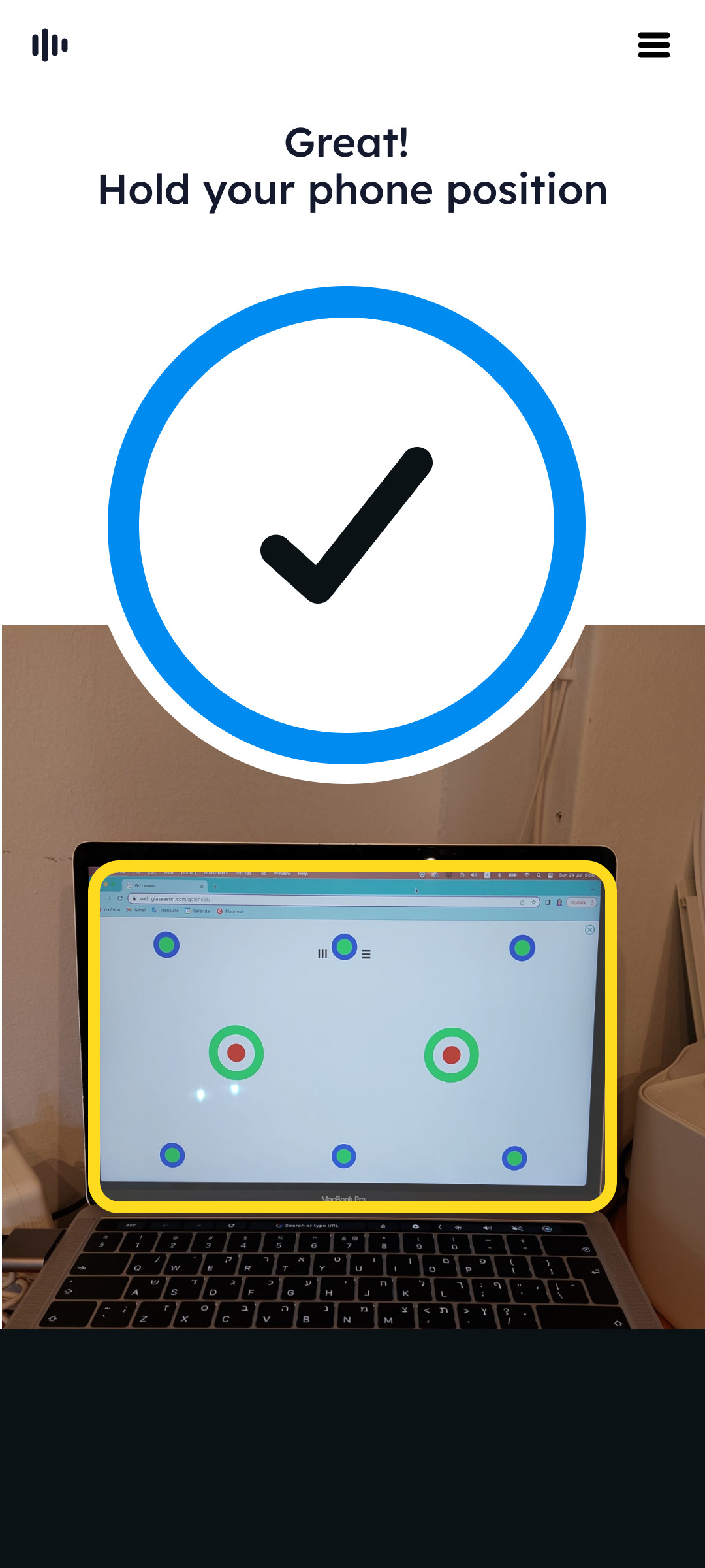
The following shows the first sections of the flow - onboarding screens, flow selection (full scan vs pupillary distance scan), setup and screen calibration.
The back gradient became the primary customisation tool to differentiate between partners, keeping the rest of the UI constant.


Adding a real doctor to the flow
One of the main ideas to increase trust in our apps (not just GlassesOn) was to include a “white coat persona” - a real-life eye specialist who will endorse our app and possibly serve as a recurring figure throughout the experience.
Due to legal issues and the time it would take to enlist the right person it was decided to push this to a second phase of the redesign, but I believe it would have had a strong positive impact on the way our users percieve this product.
These are some mockups I've created for this purpose.


Tutorial video background
Before starting the scan, users are shown a short tutorial video. In the legacy version, most guidance was delivered via audio prompts during the scan itself, with only a brief, loosely structured visual overview beforehand.
The tutorial presented a sequence of actions but lacked a clear, memorable structure, making it difficult for users to retain the steps. Crucially, it also underemphasized the most challenging part of the process—tilting the glasses—which often led to user confusion and errors.
Complete tutorial overhaul
I led this project end-to-end—from revising the storyboard and script to reshooting the video in-office, and handling all post-production editing. The updated tutorial featured the following improvements:
- Simplified 1-2-3 process: Reframed the scan as a clear, three-step process—phone alignment, glasses position, and glasses tilt—each introduced with a memorable keyword to aid recall and comprehension.
- Focus on the tilting: Highlighted the crucial step with on-screen pointers and usability-tested tips. Multiple camera angles were added to improve user understanding. Added the arm rest position for stability and ease.
- Reduced visual clutter: Streamlined visuals to keep the viewer’s attention on essential hand movements and the positioning of the glasses, improving instructional clarity.

Original
Updated
Scanning screens
The main UX difference between V1 and V2 was at the scanning process, whereas on the legacy version there was only one screen (seen here on the right) with changing audio instructions guiding the user throught the steps.
On V2 we used a layout combining multiple guidelines (text, sound & animations) to address known pain points from our usability trials and provide clearer feedbacks at the right time for our users.


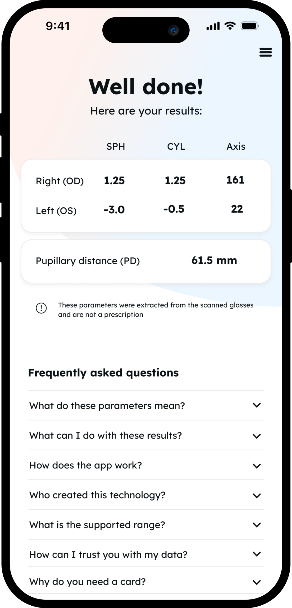
Results screen V2
On the left - before and after the UI change for this screen. An FAQ section was added, based on our users' recurring questions on our support channels. This screen also included a customized version for partners who do not show the prescription details at the end of the mobile flow.

Metrics
- Trust - Following the redesign, user trust in the app significantly improved. While trust is inherently subjective, post-onboarding surveys showed a 15% increase in users reporting confidence in the scan process. Qualitative feedback also highlighted that users felt the experience was more professional and reliable.
- Scan completion rates - The table on the right shows the dramatic increase (from 50% to 91%) of users passing "verify" through our usability trials. This is the point in the flow where users complete the scan and get their results. Changes between trials included both UI/UX updates, bug fixes and algorithm revisions.
- The tilt step - In the January 2025 trial, 70.58% of users successfully passed the tilt step, a major leap from 38% in July 2024 and 51% in June 2024.
- Glasses scanning time improved from ~3 minutes in the legacy version to just 66 seconds in the V2 trial (January 2025), a 63% decrease.
- Overall scan time - reduced dramatically from our legacy version from an average 7.3min to only 4.1min.


