Healthy.io, 2020-2021
Rebranding Healthy.io's products
One of the first projects I got to work on at Healthy.io was the rebranding process of our line of products, under the new name "minuteful" and the tagline "Healthcare at the speed of life".
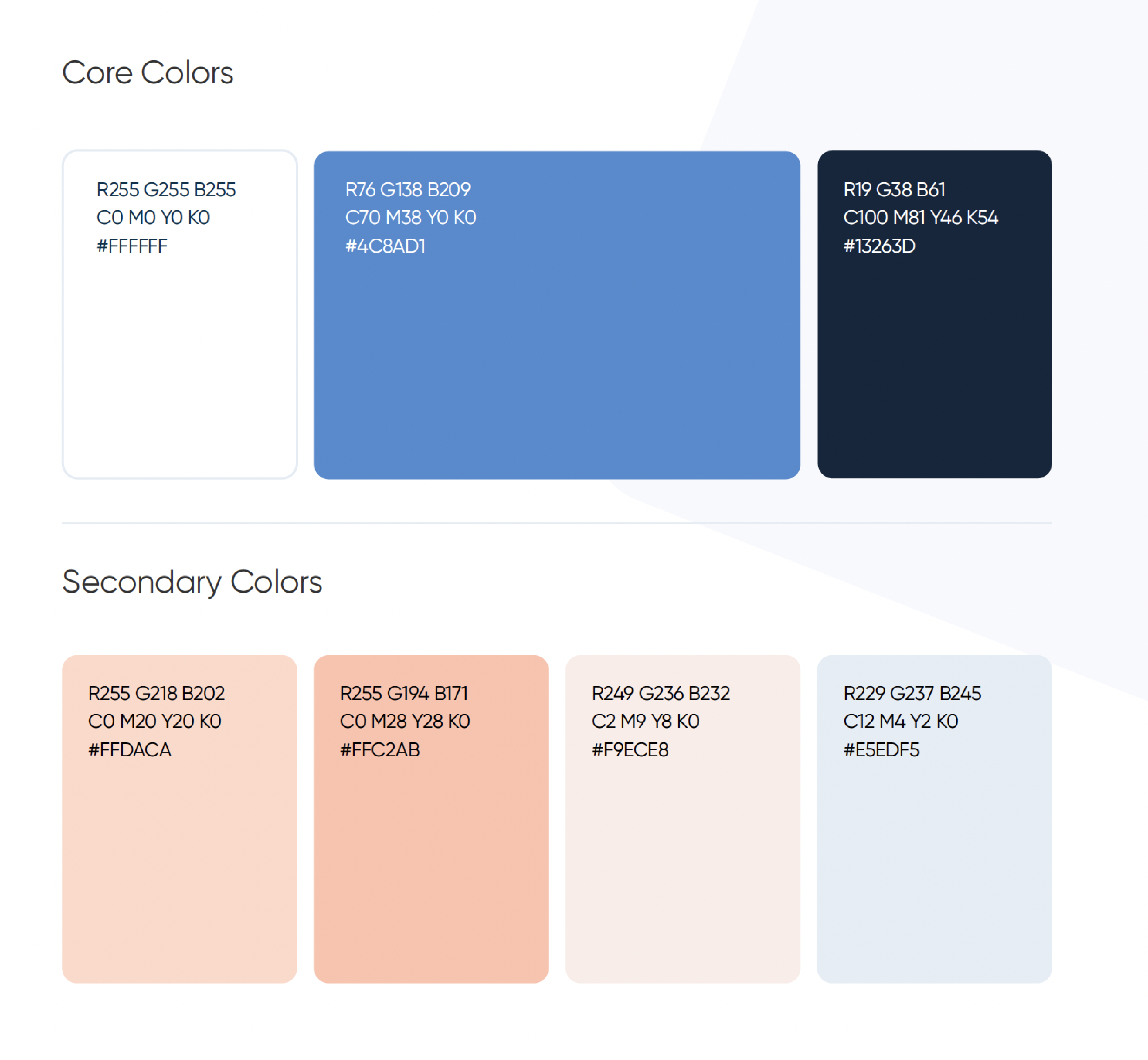
The process included logo designs, re-designing our test kits and laying the foundations (core values, color palette, typography, etc.) of our brand book and design system.
The starting point
When I joined the company in 2020, Healthy.io had already developed multiple home urine tests: Dip.io (a 10 parameter test for various types of health conditions, including pregnant women), Velieve/Dip UTI (detecting UTI) and Kidney Check/ACR (for early detection of CKD).
Each service was targeting a different audience, and was relying on different business models (B2C, B2B, B2B2C, white label). From a marketing and business perspective, as well as a brand/design POV it was time to unify our products and come up with one coherent story of us as a company.
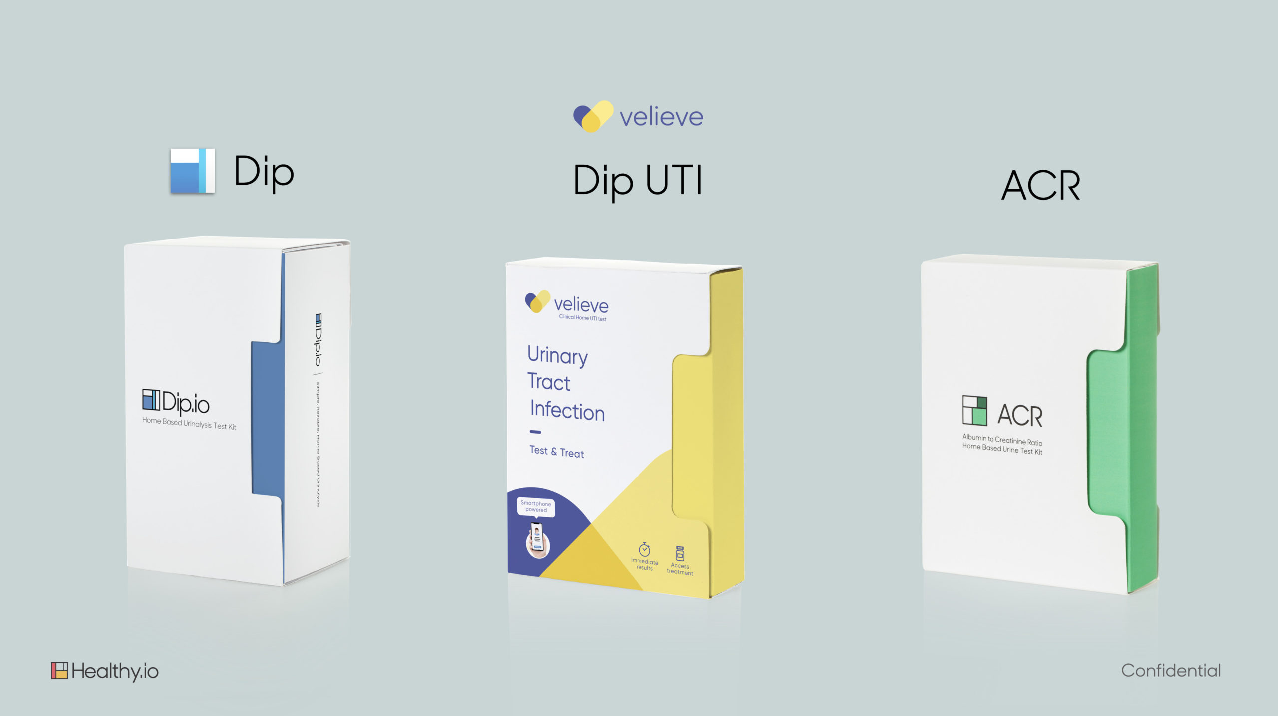
The original kit designs and branding of our 10-parameter test, UTI test and ACR test (before my time)
A new brand is born
Taking into account the core values of the company, our brand and marketing team came up with the new tagline "Healthcare at the speed of life" and the word "Minuteful" (a combination of minute and meaningful, which we can take ownership on).
Our new tagline aimed to capture the essence of our services - providing healthcare at any given time, syncing between the healthcare system and a patient's schedule for an at-home test at his or her own convenience.
Our line of products switched gradually to Minuteful Kidney, Minuteful UTI, Minuteful 10 and Minuteful for Wound.
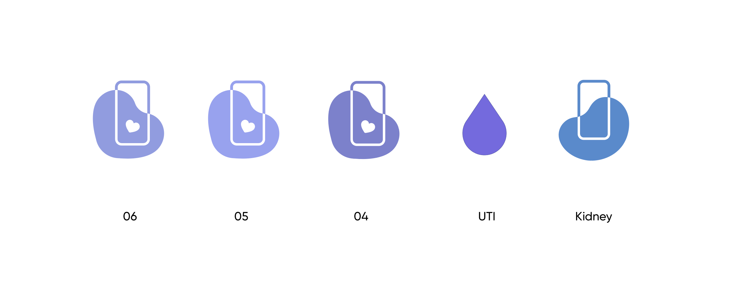
The following slides and designs are the visual attempts to communicate our new story to patients, business partners and other stakeholders. The process began with our key ACR service (early detection of CKD) under its new name - Minuteful Kidney.




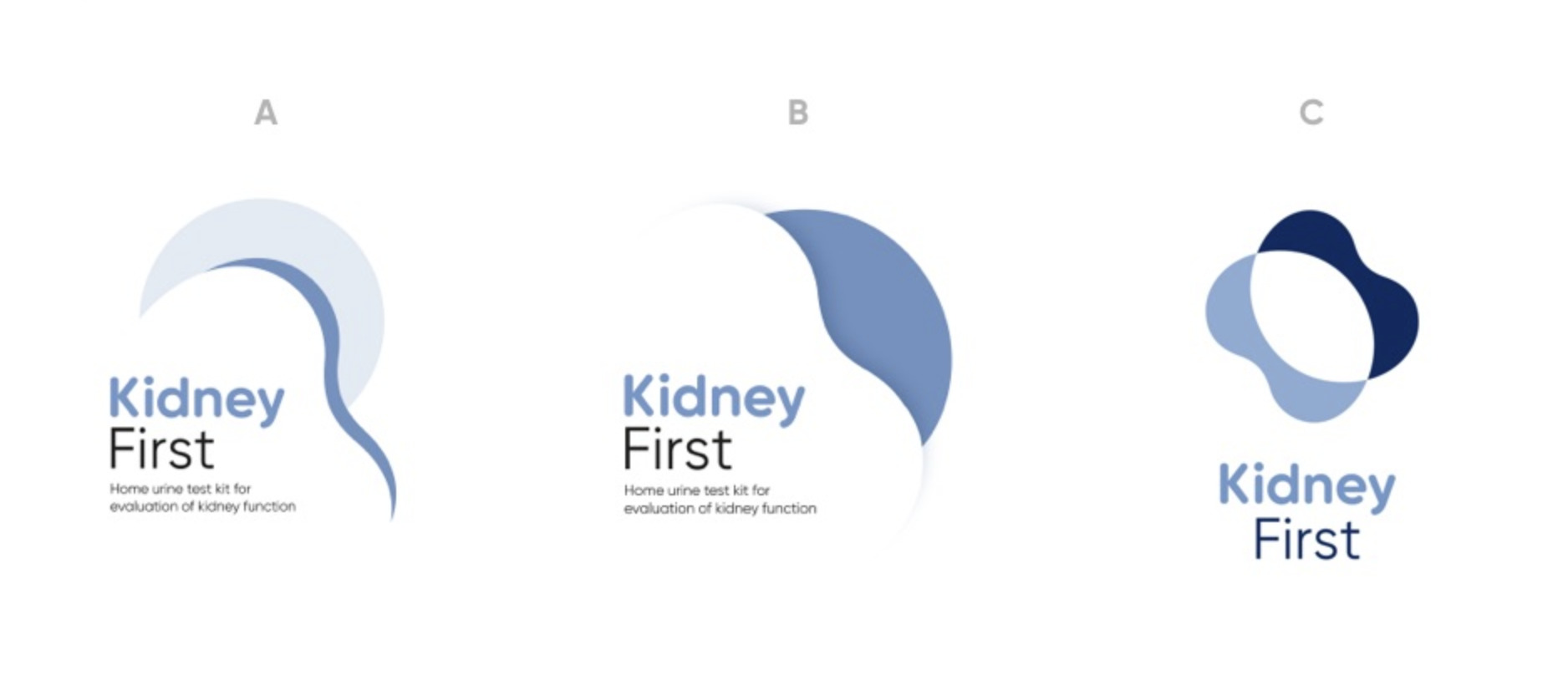
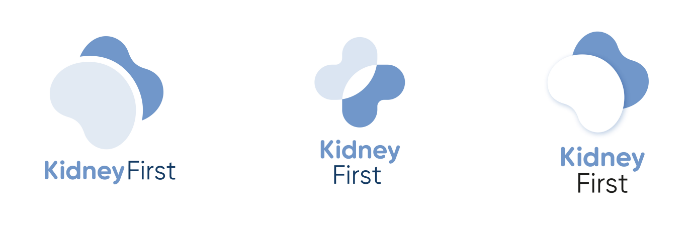


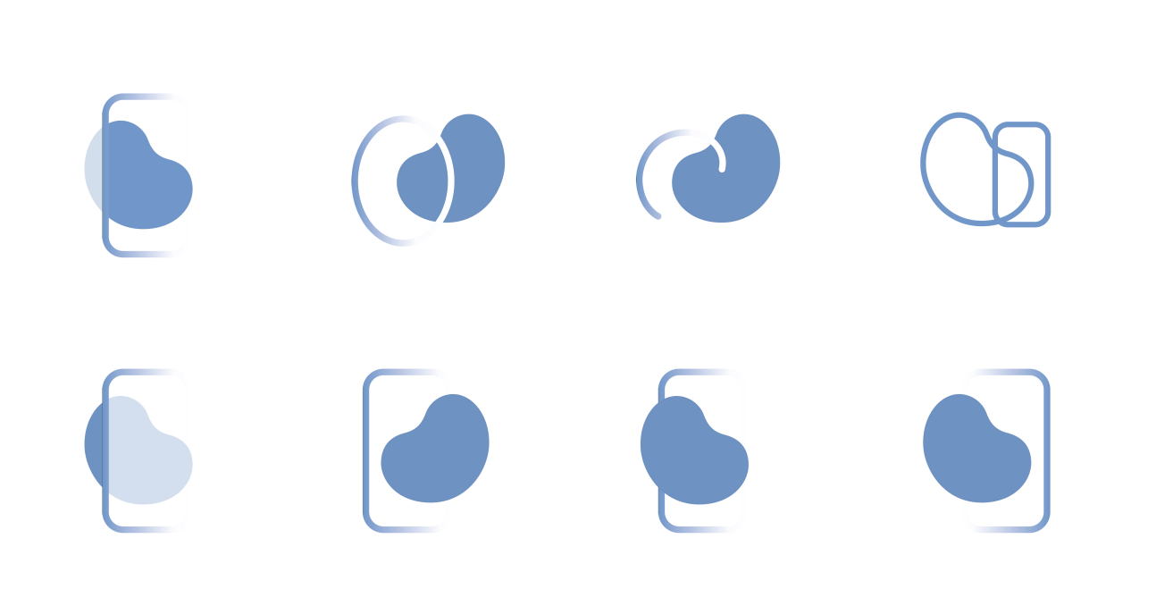

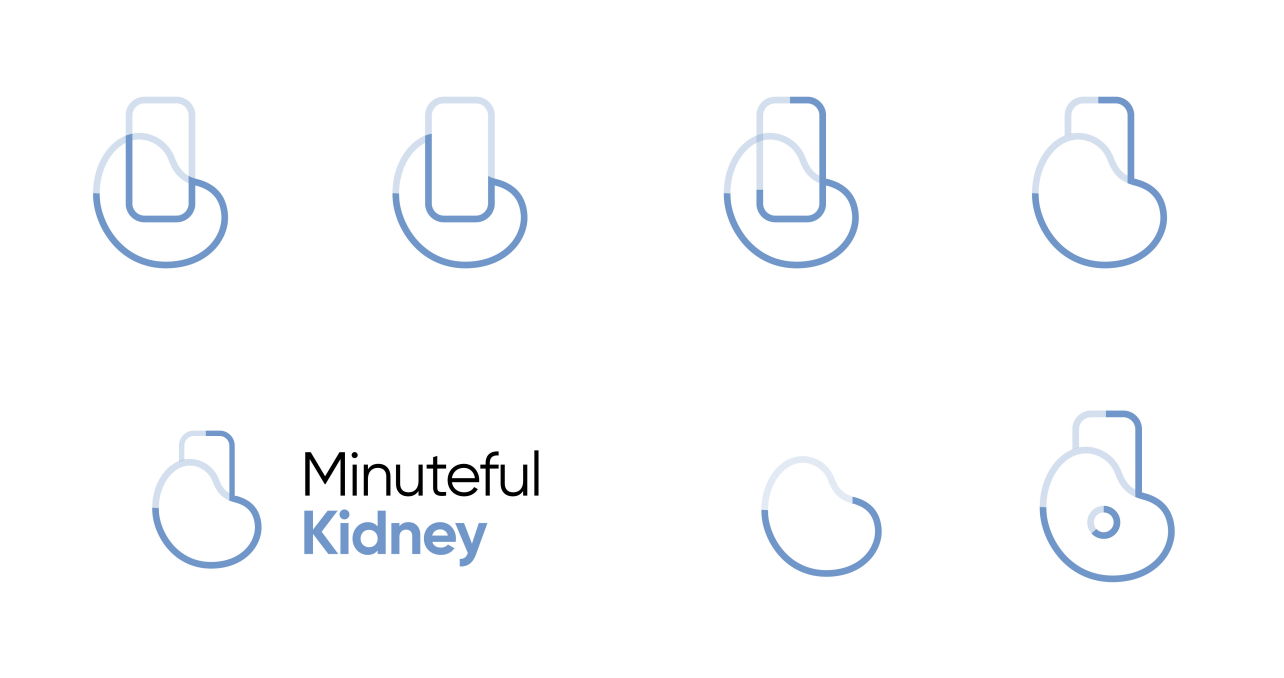
And the winner is...
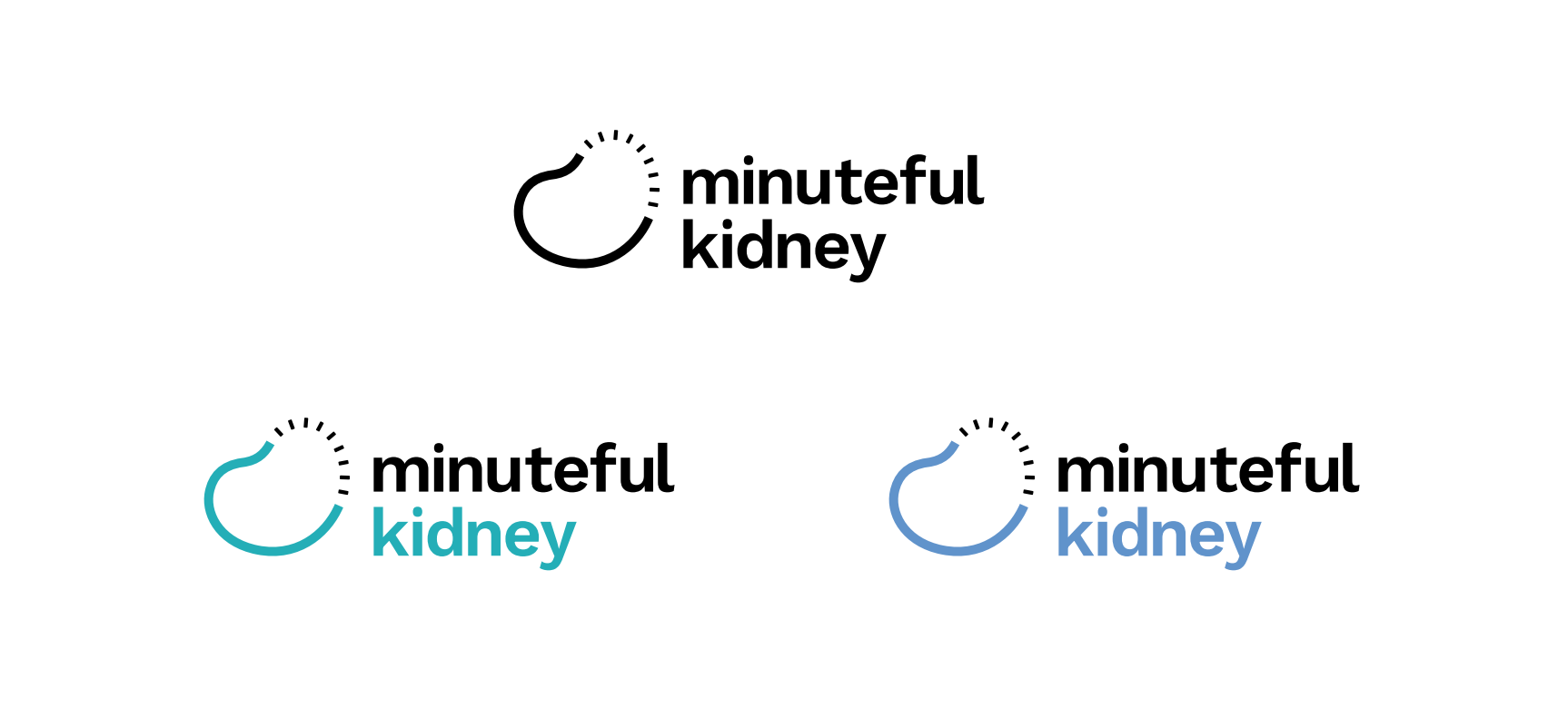
After a couple of months of ideating and various iterations on some of the visual concepts seen above we decided to move forward with the following.
Final design of the Minuteful Kidney logo


Implementation
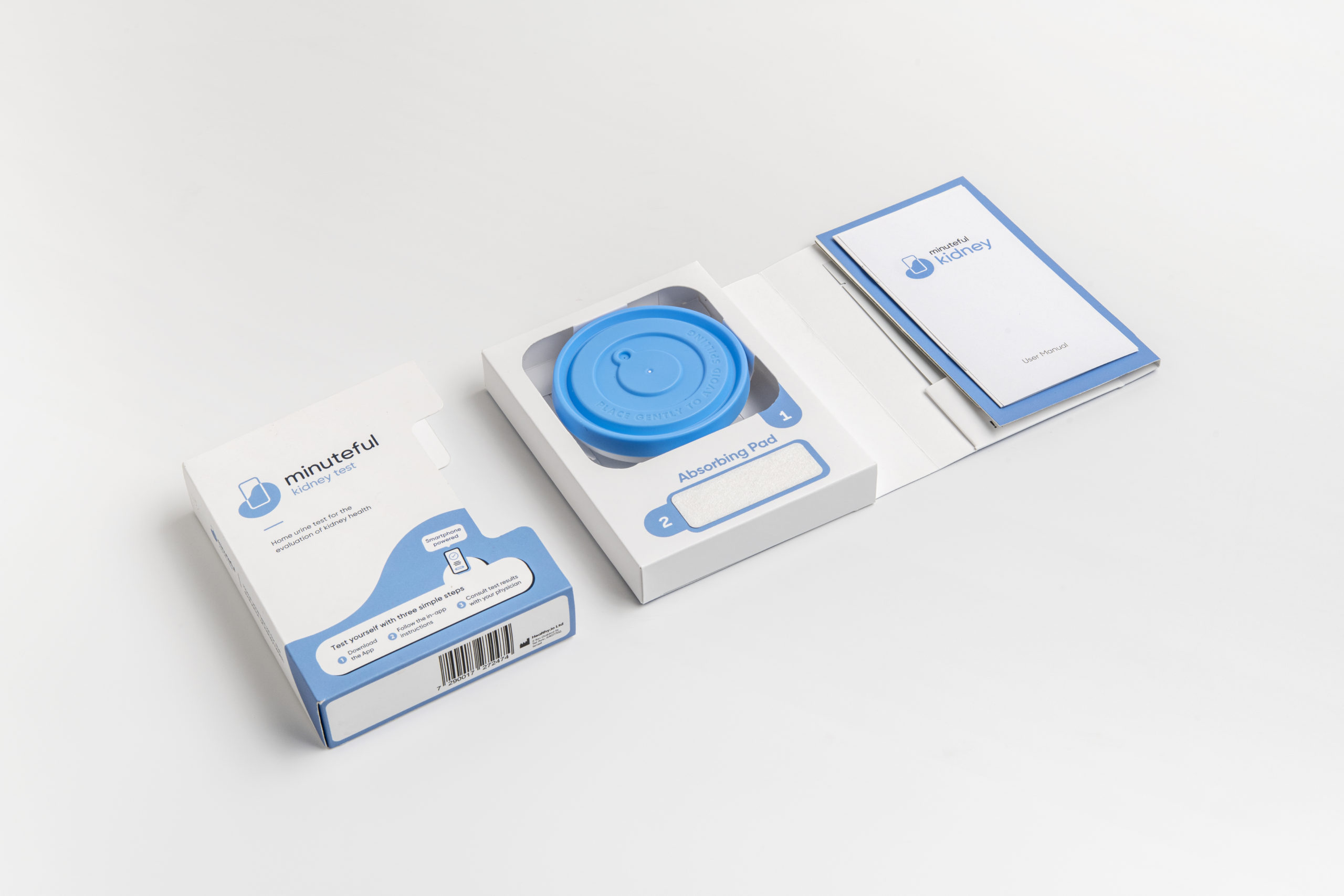
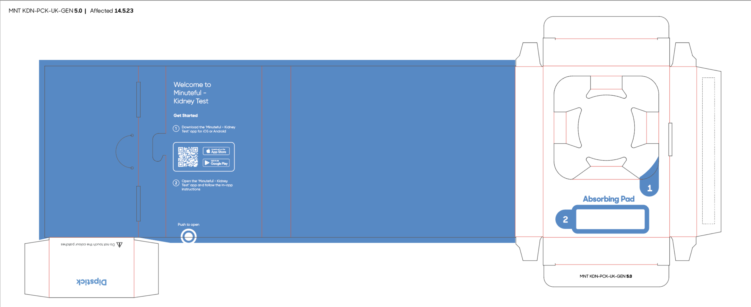
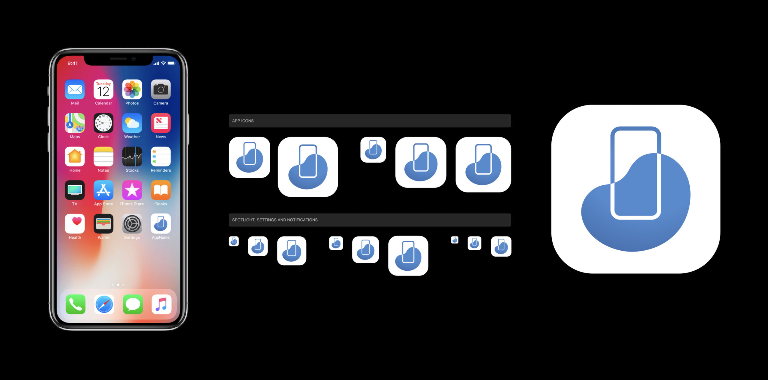
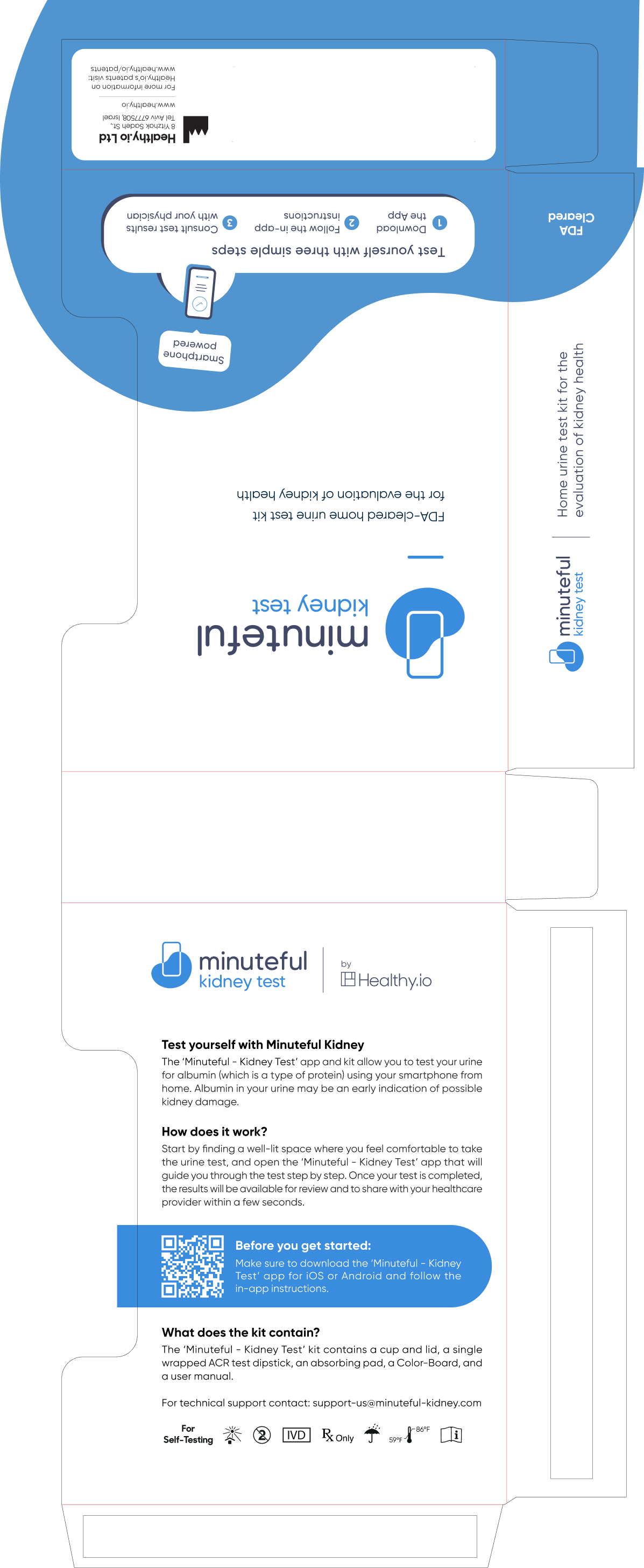
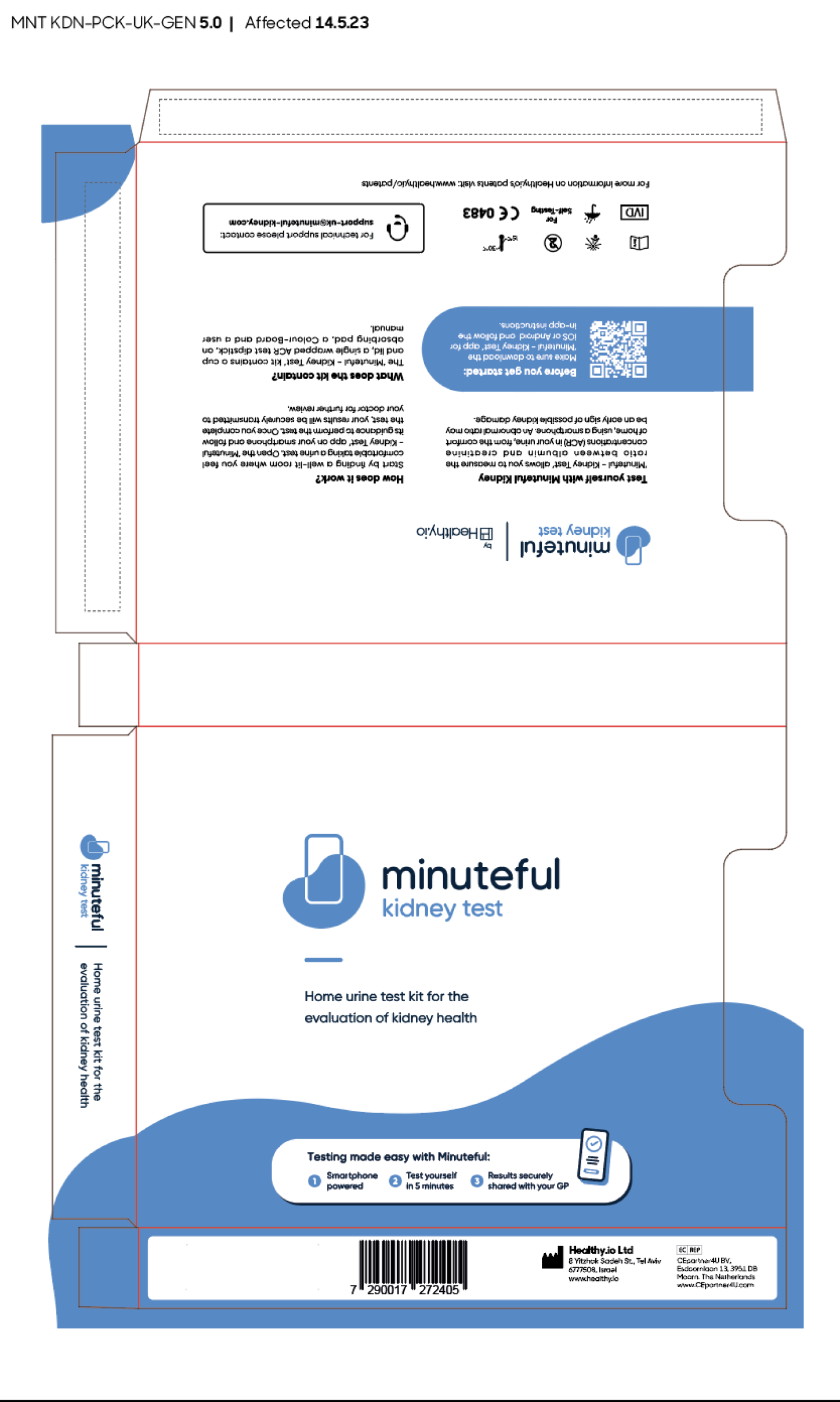
Once we finalized the logo for Minuteful Kidney we were ready to implement it on our digital assets (app, website, landing pages) and our physical assets - the test kit patients recieve in order to complete the urine test.



Expanding the family
Upon the completion of the design for our primary product I went ahead to tackle Minuteful 10, previously known as dip.io - Healthy.io's 1st product - a 10 parameter home urine test.
Our main user cases for this service were pregnant women (who need to perform this test several times throughout their pregnancy) and people with pre-existing medical conditions (diabetic, high blood pressure, etc.) who are required to complete this type of test on a regular basis.
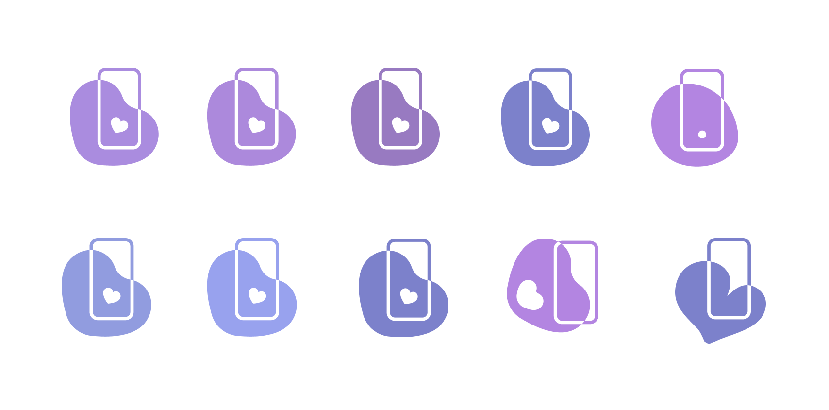
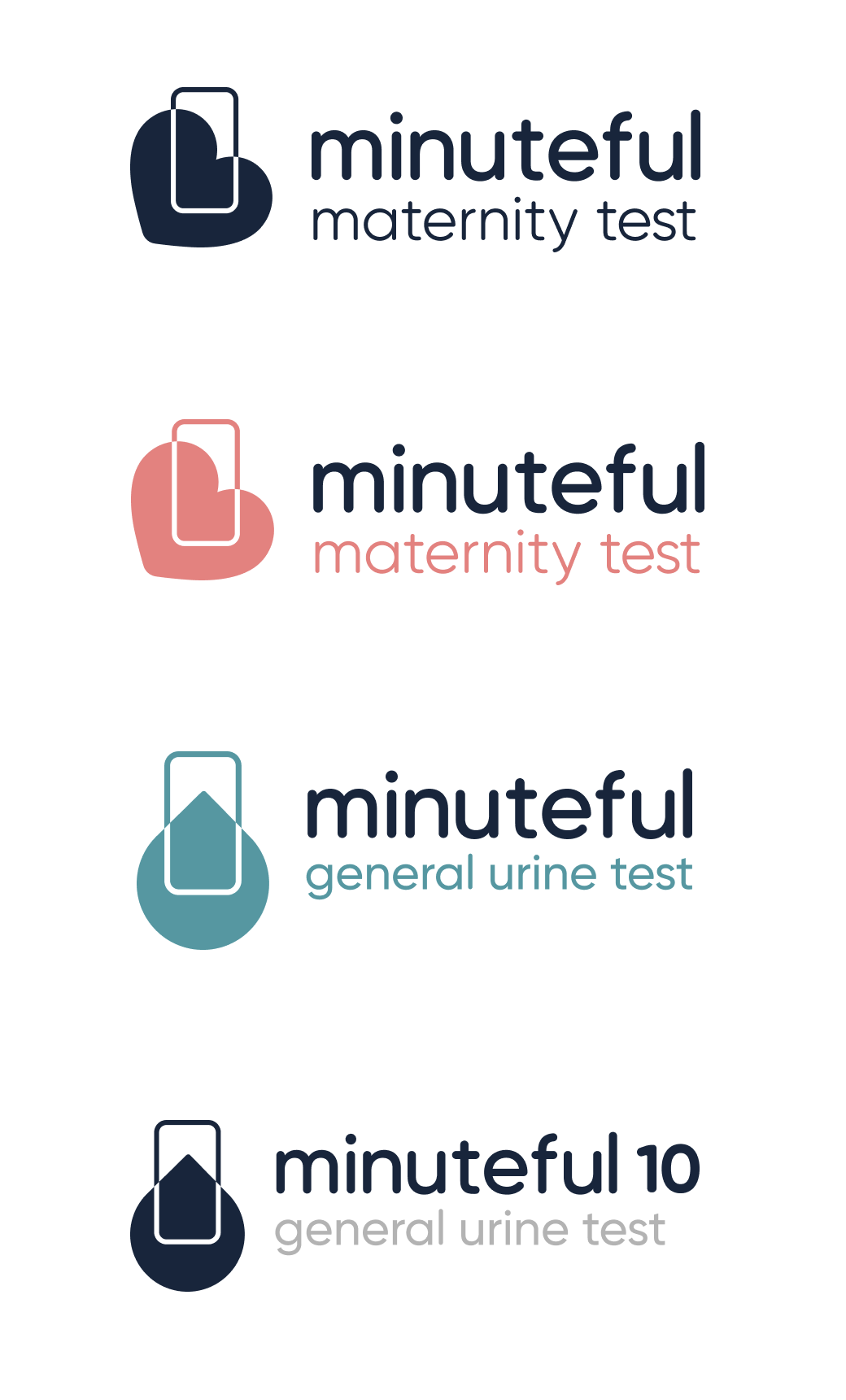
Final design of the Minuteful 10 logo
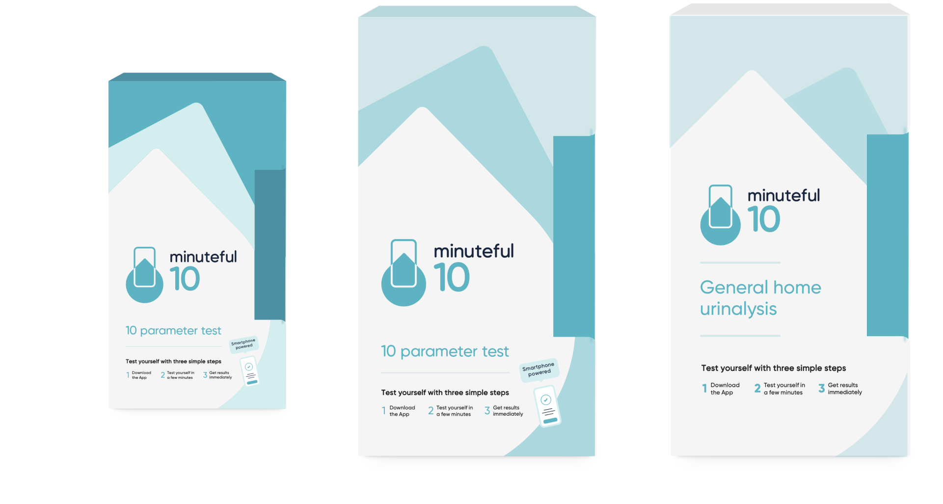
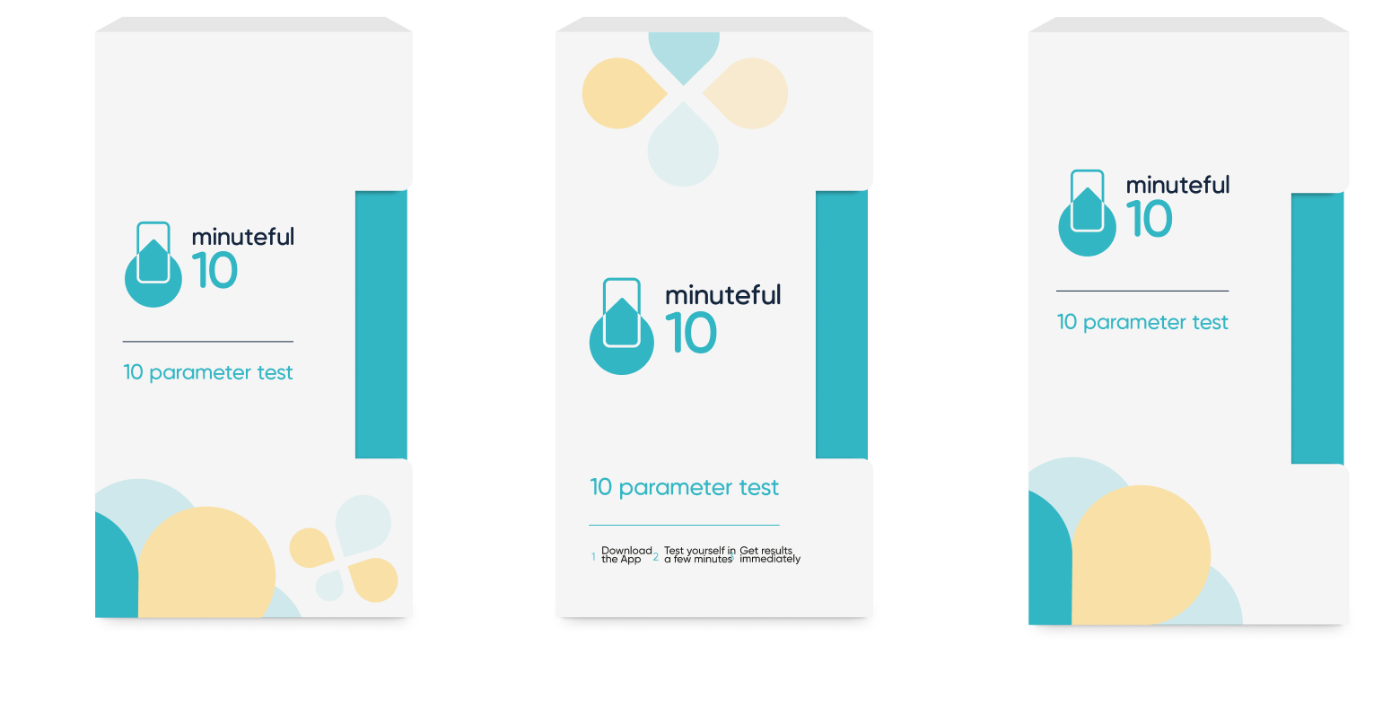
Minuteful 10 kit design
Here are some of the designs and mockups I created for the new kit of minuteful 10, some of them are based on a pattern of shapes I created, using geometric shapes that either reflect certain parts of the test or make a play on the structure of 10 as a shape itself.
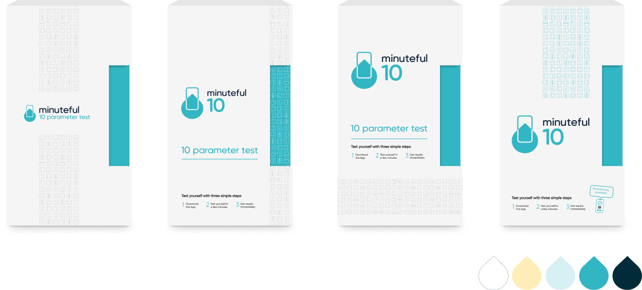
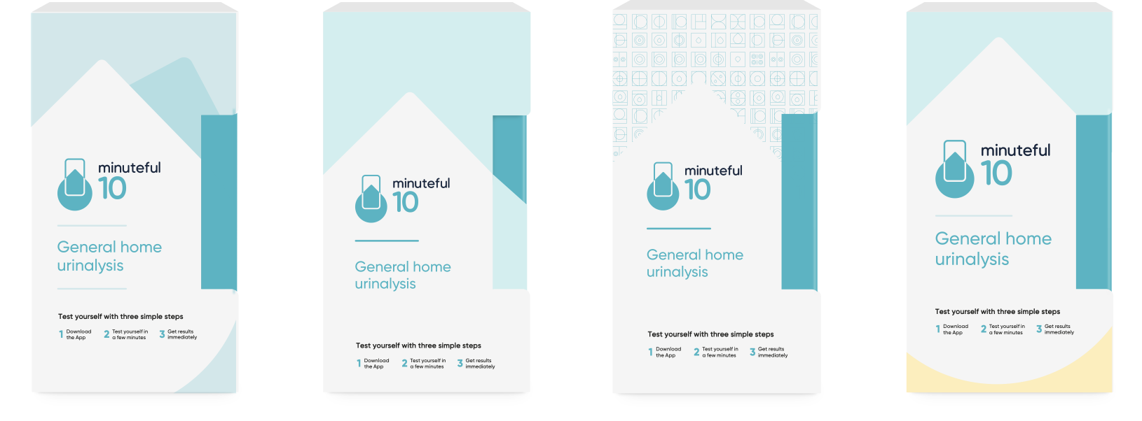

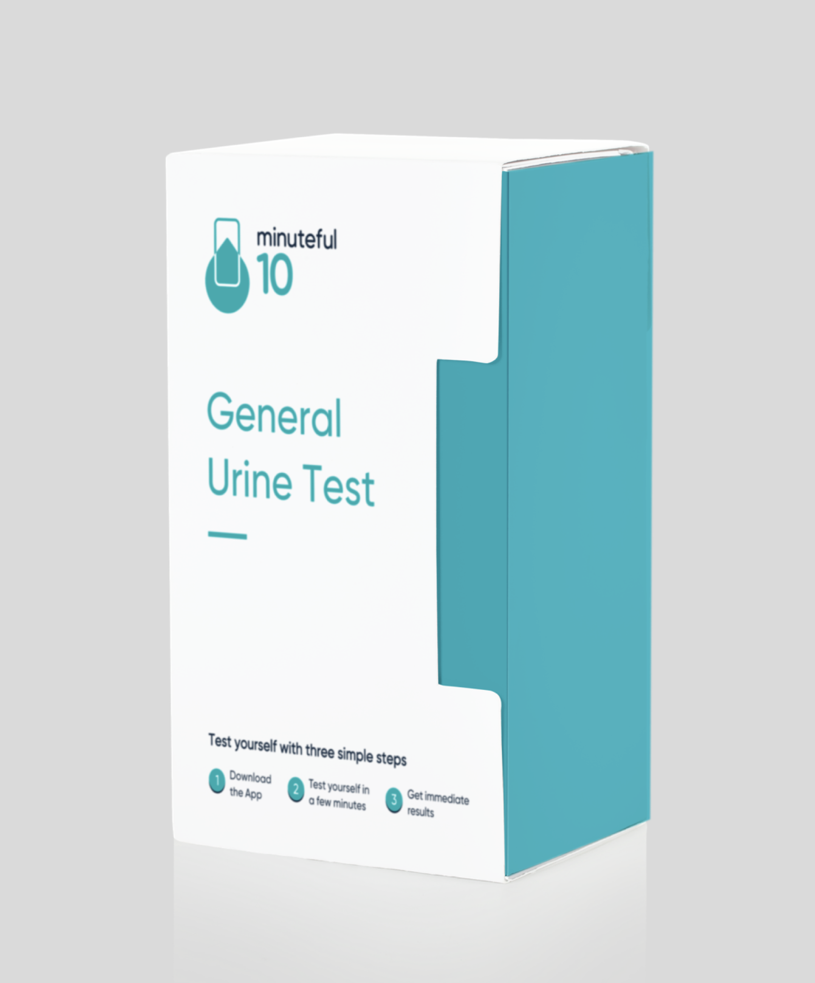
Final design of the Minuteful 10 kit
Minuteful UTI
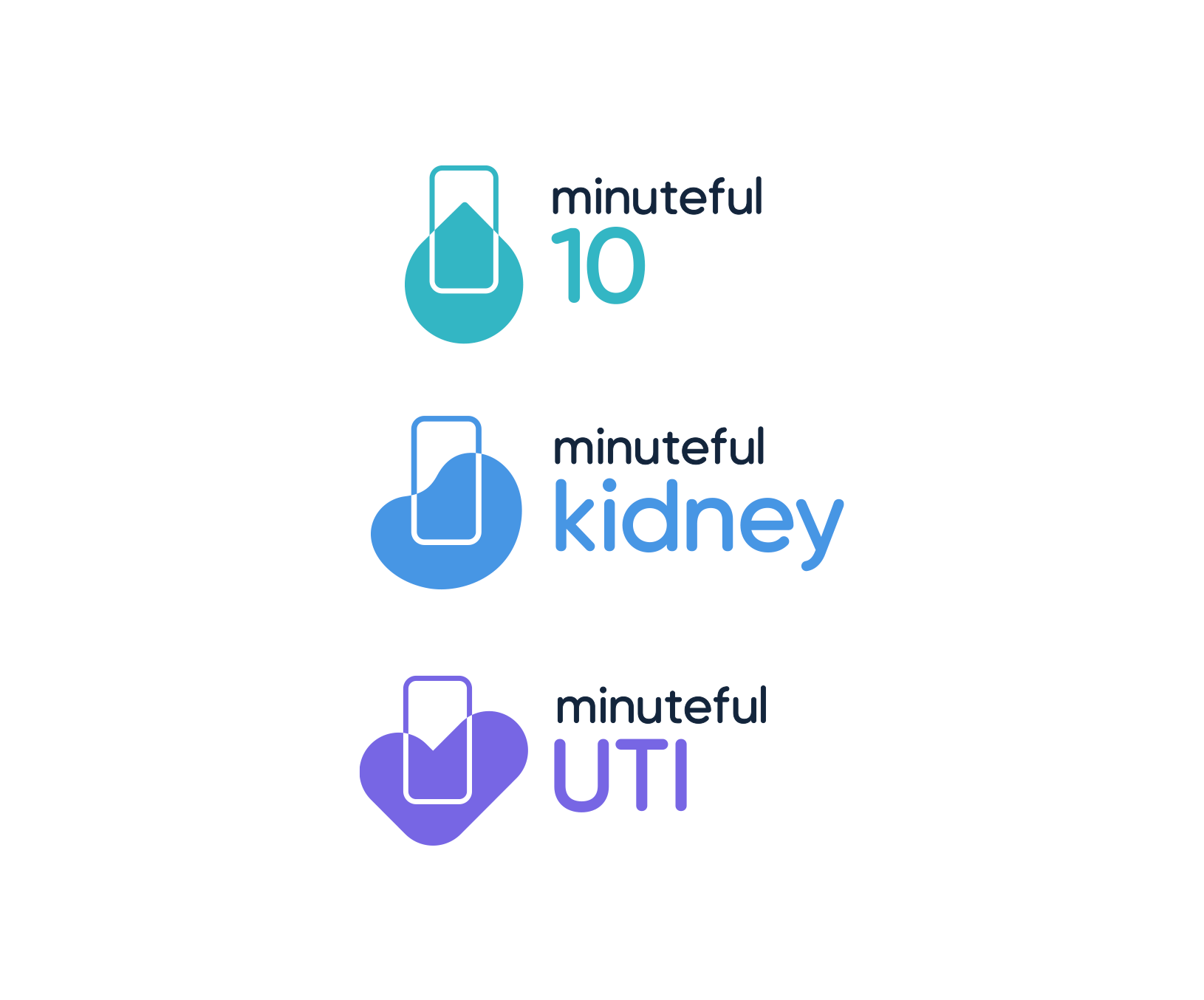
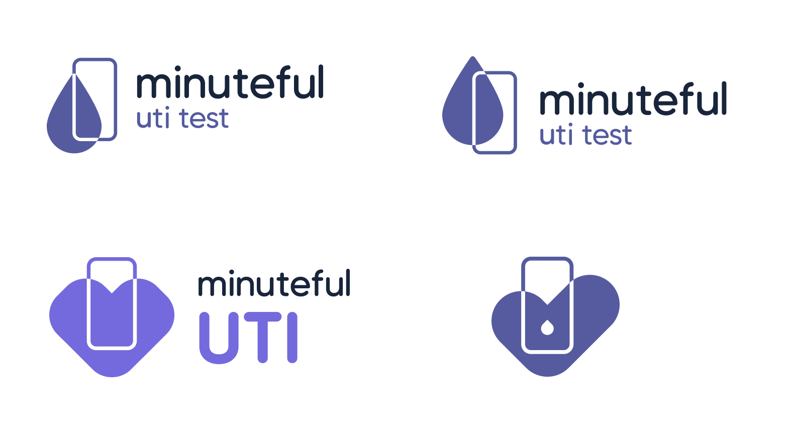
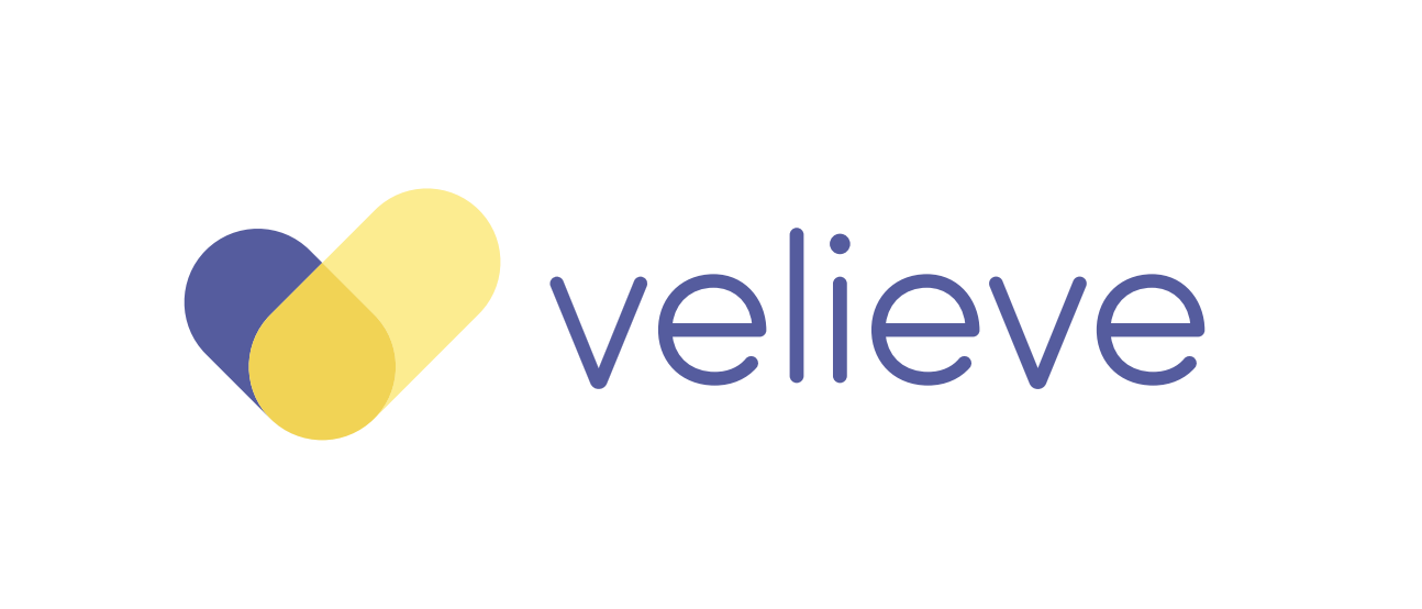
Our existing B2C brand for UTI services (“Velieve”) was next in line for a renaming under the minuteful family of products. Since this was the third product I was redesigning - I already had the graphic anchor to work with for the logo, and we decided to keep the “check” form Velieve for continuity.
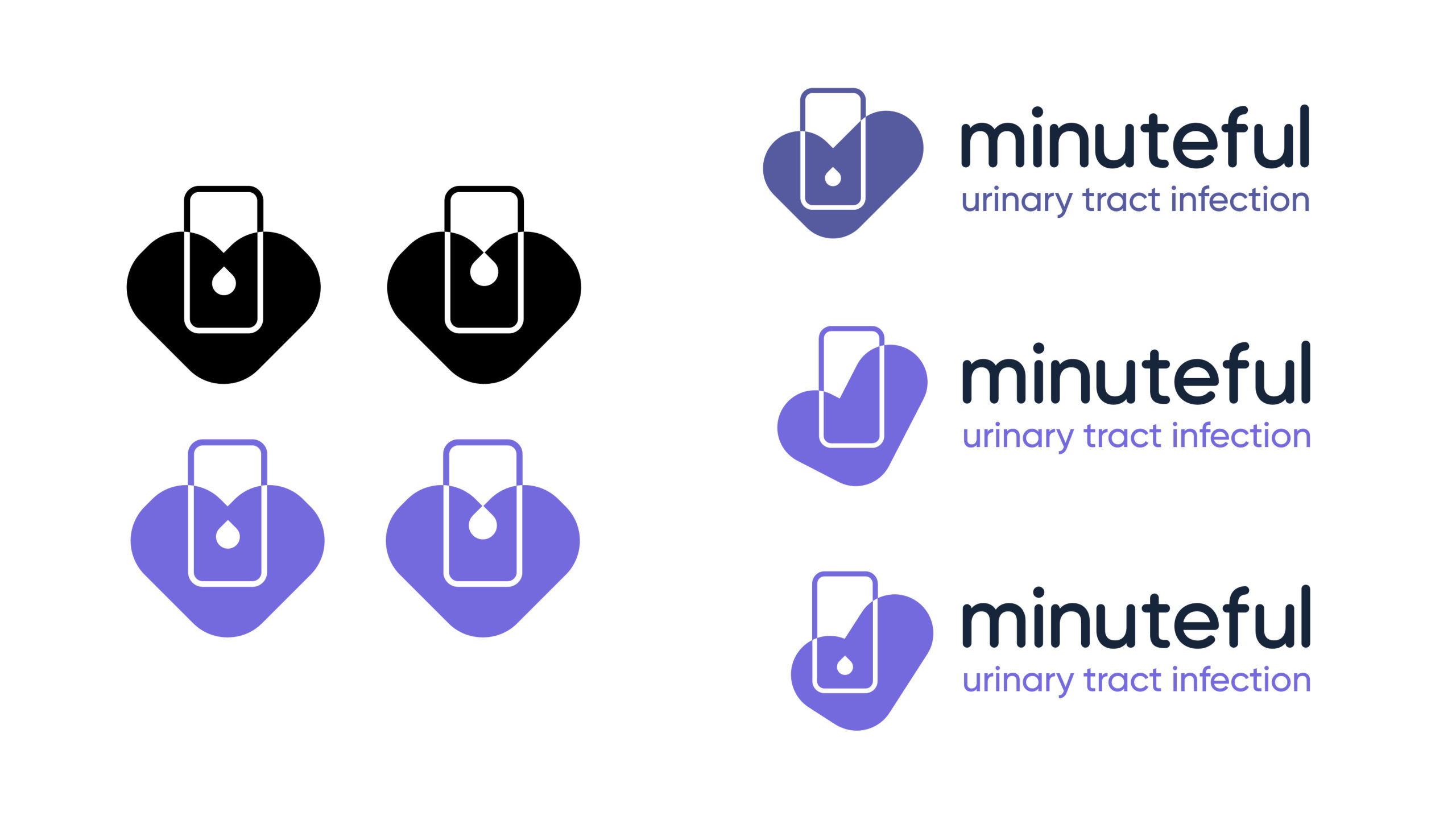
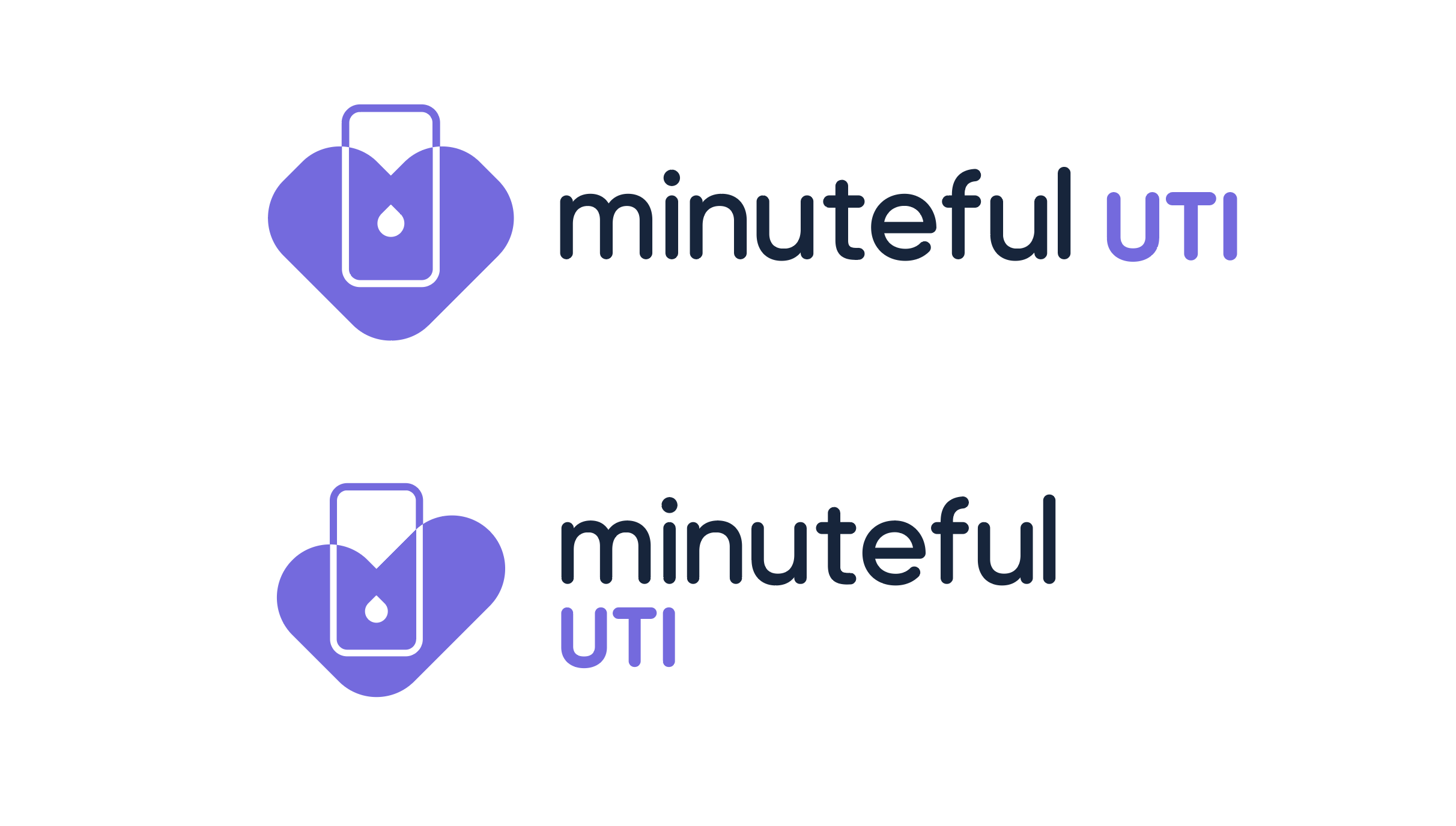
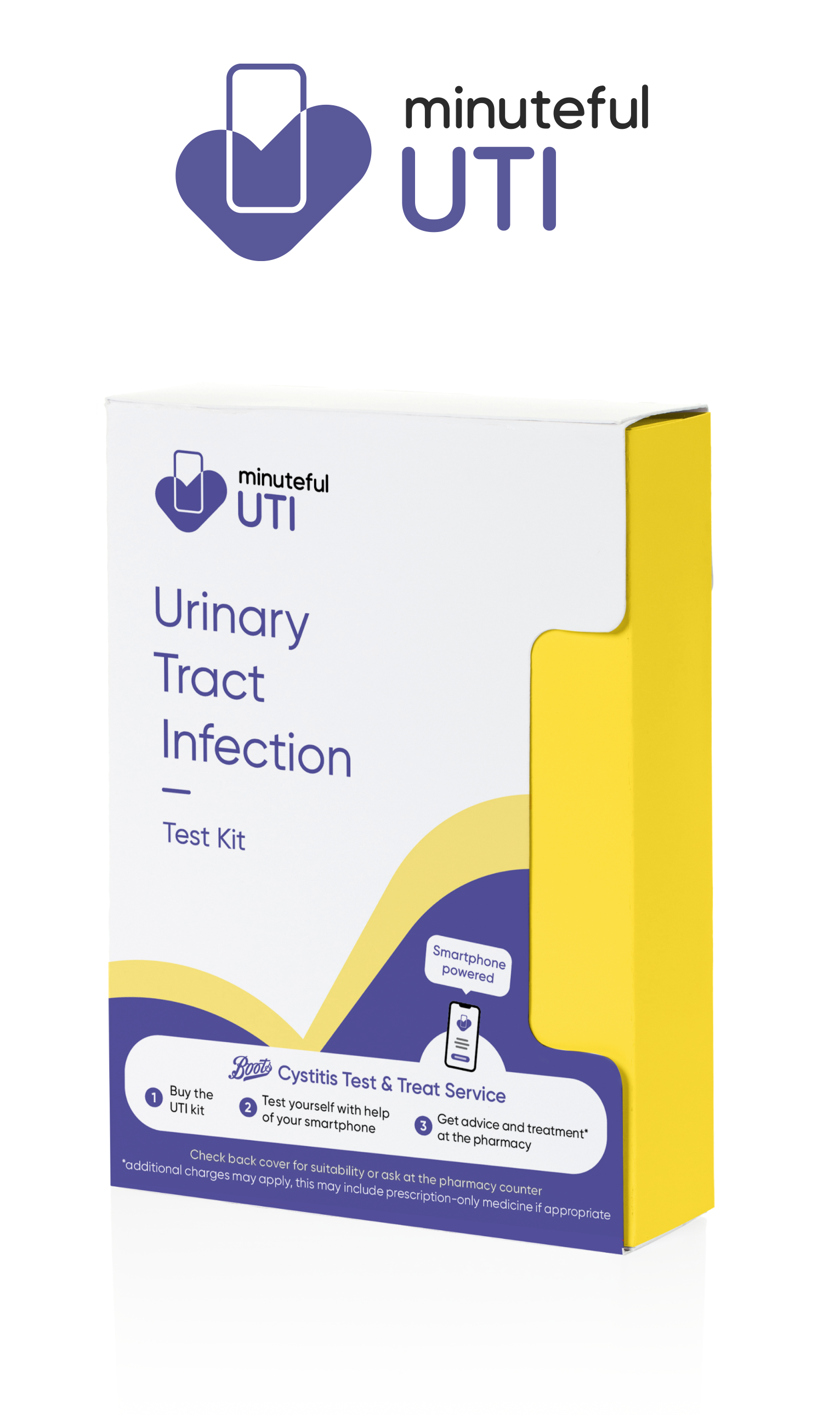
Final design of the Minuteful UTI logo & kit