ParKam, 2017-2020
App redesign
A B2C app which finds and navigates drivers to available parking spots near their destination, using real-time data.
When I joined the company the technology was there, but the design left much to be desired. Entering a competitve market of navigation apps and parking solutions we had to use our leverage (real time data of available parking spots) to create a better experience for drivers around the world.
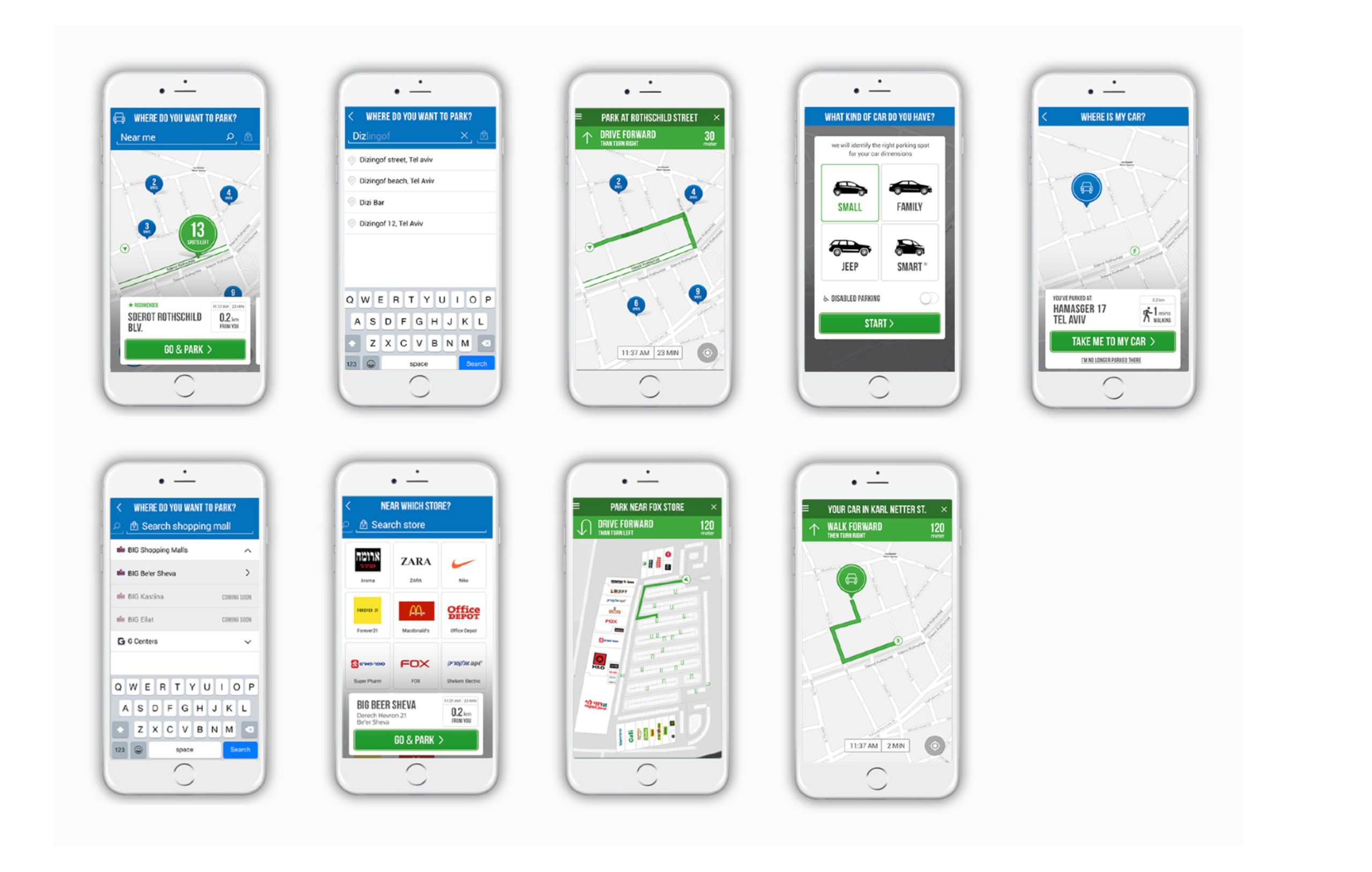
ParKam app POC (2016, before I joined)
Phase 1
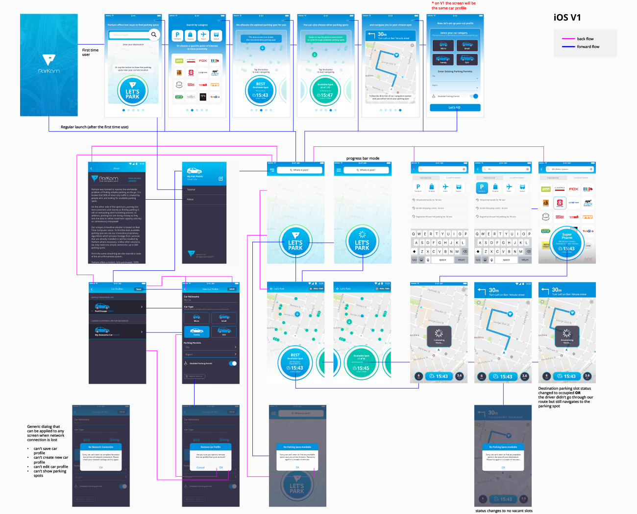
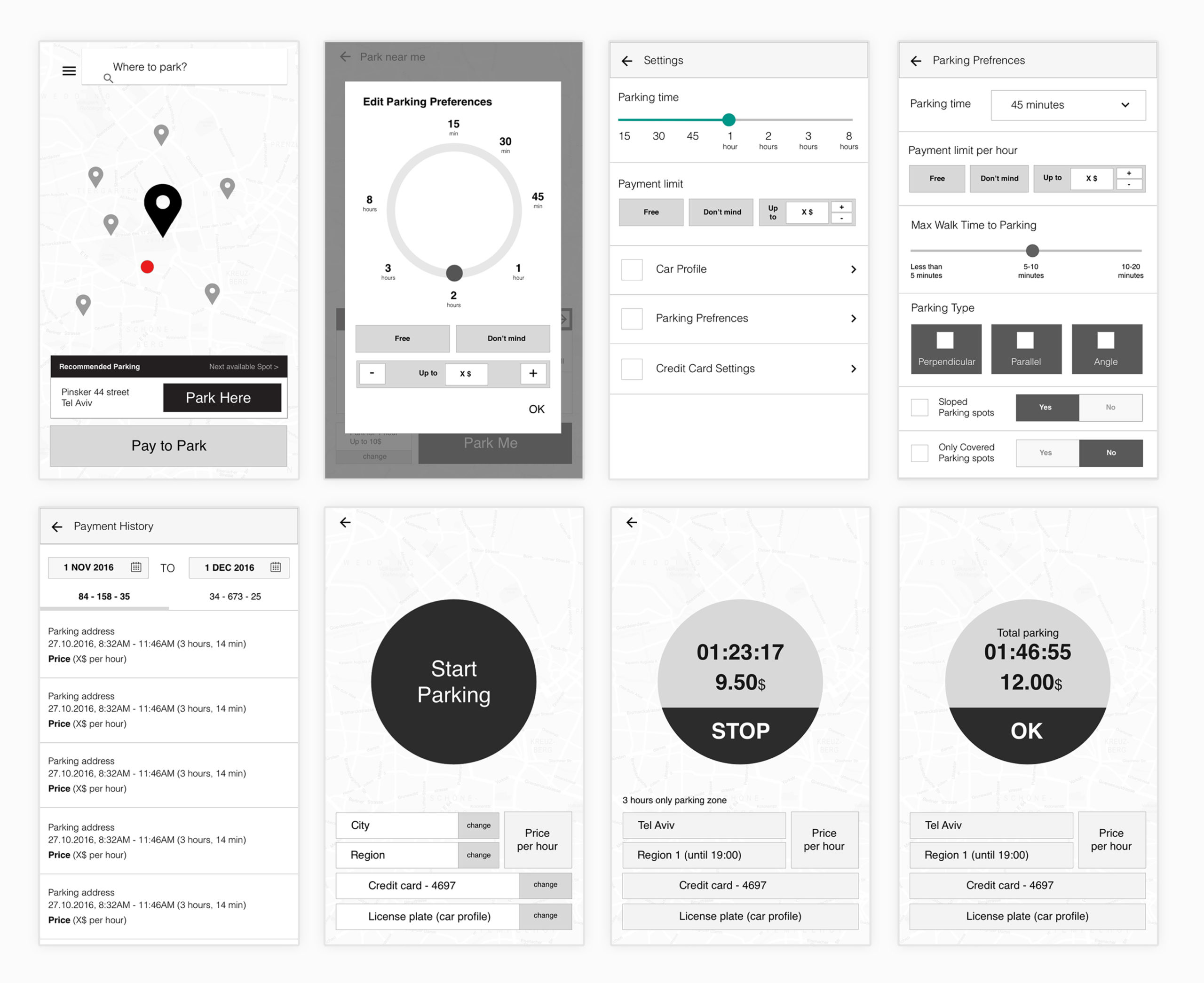
I went back to the drawing board, we set out the main goals of the app, and our basic user journey. We didn't have enough data to test some of the previous assumptions and UX decisions at that time, but we definitely wanted to find a way to communicate our USP to the users. Based on that, I created wireframes and a flow chart that evolved over time.
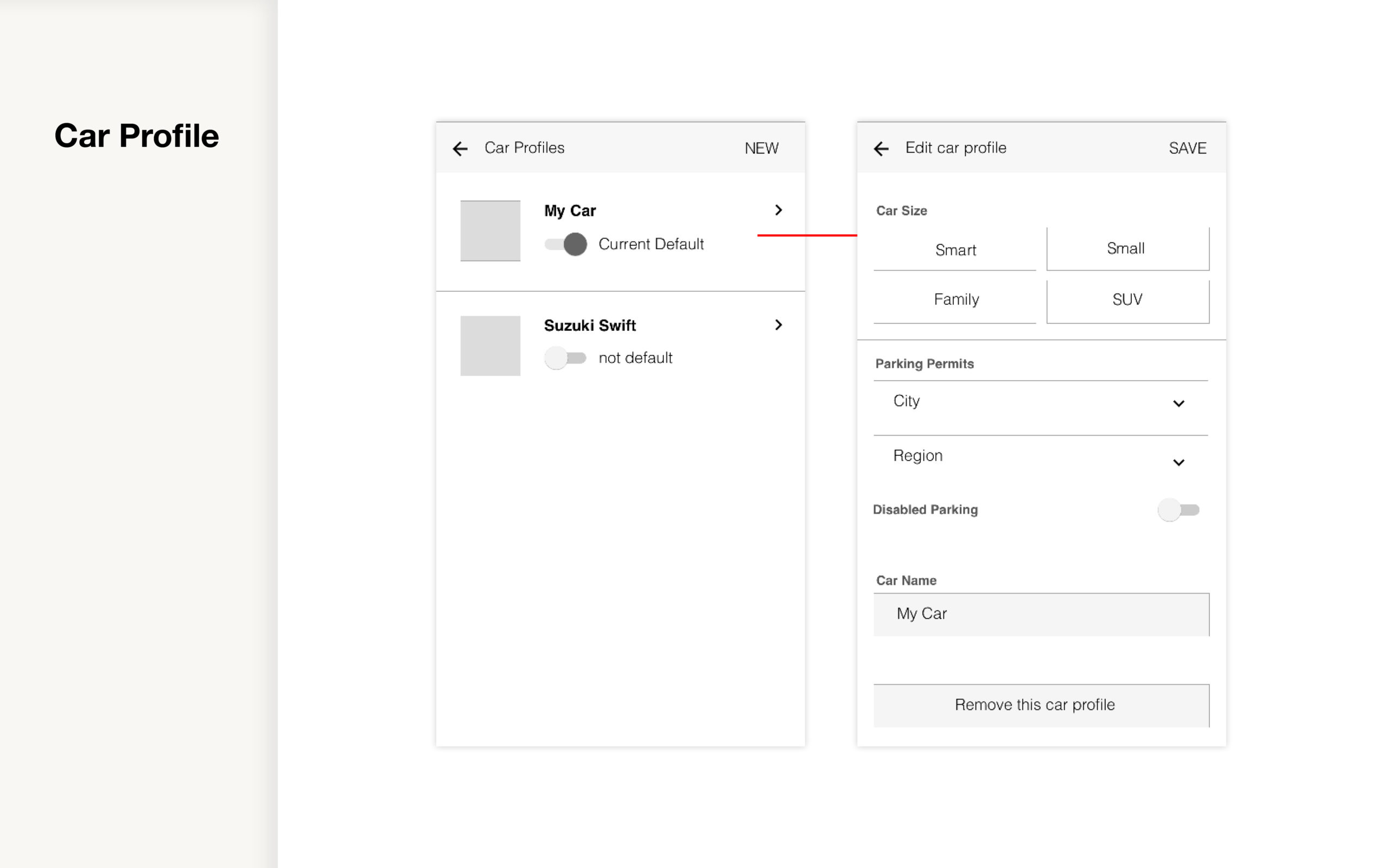
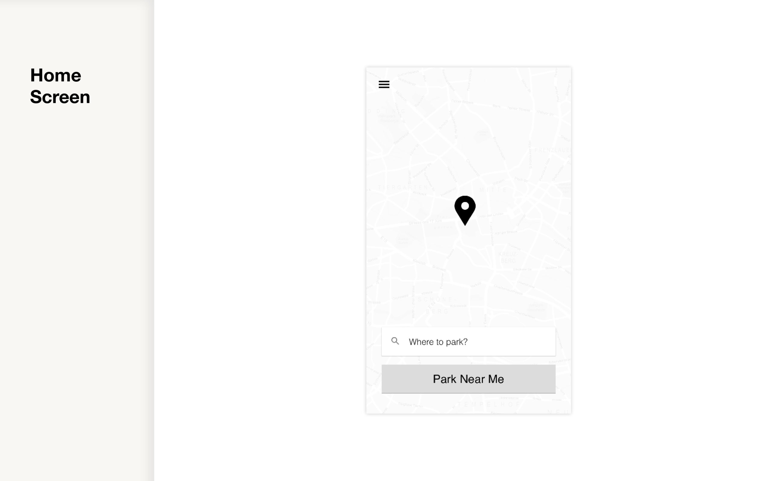
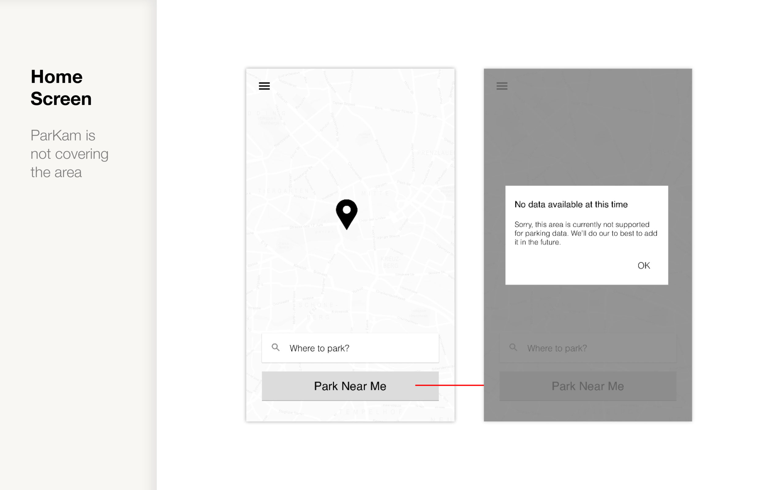
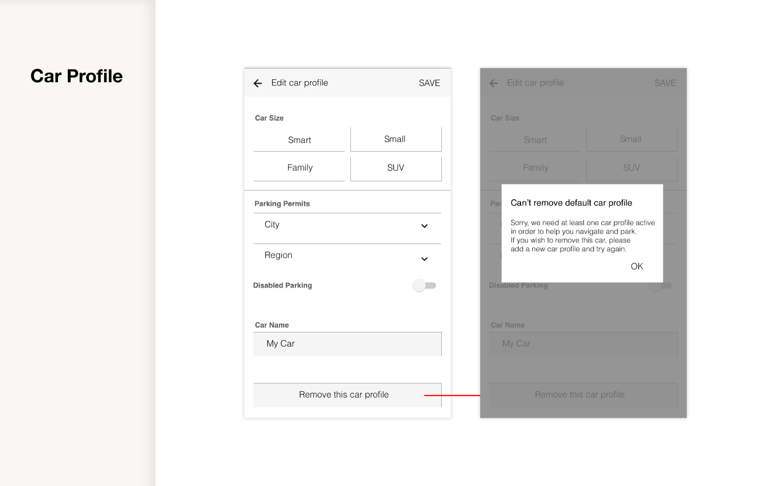
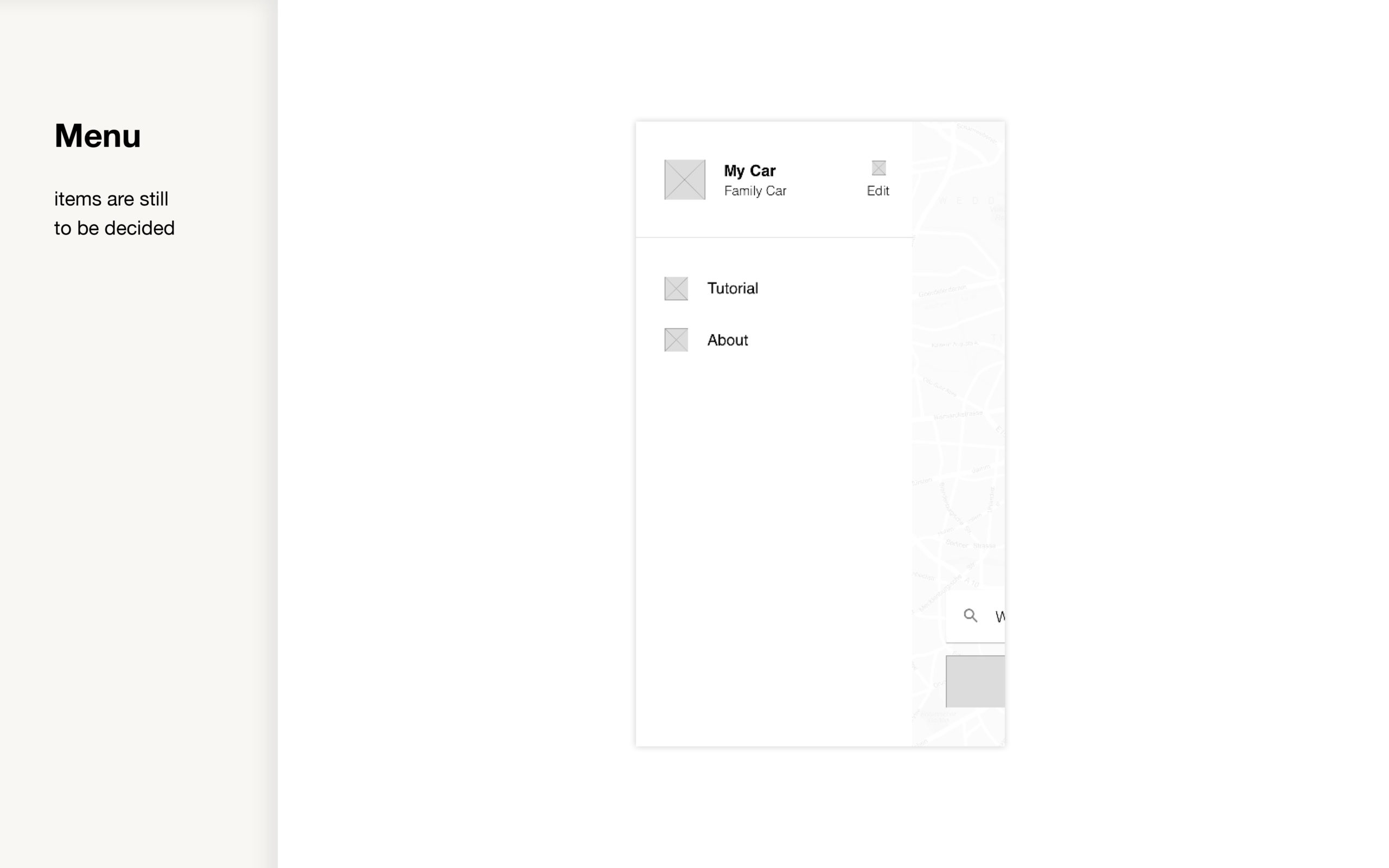
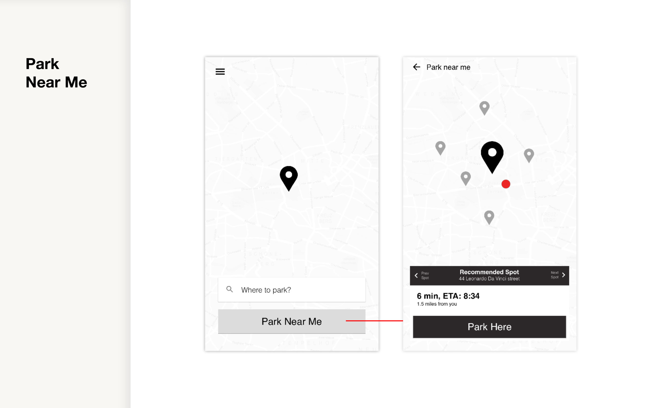
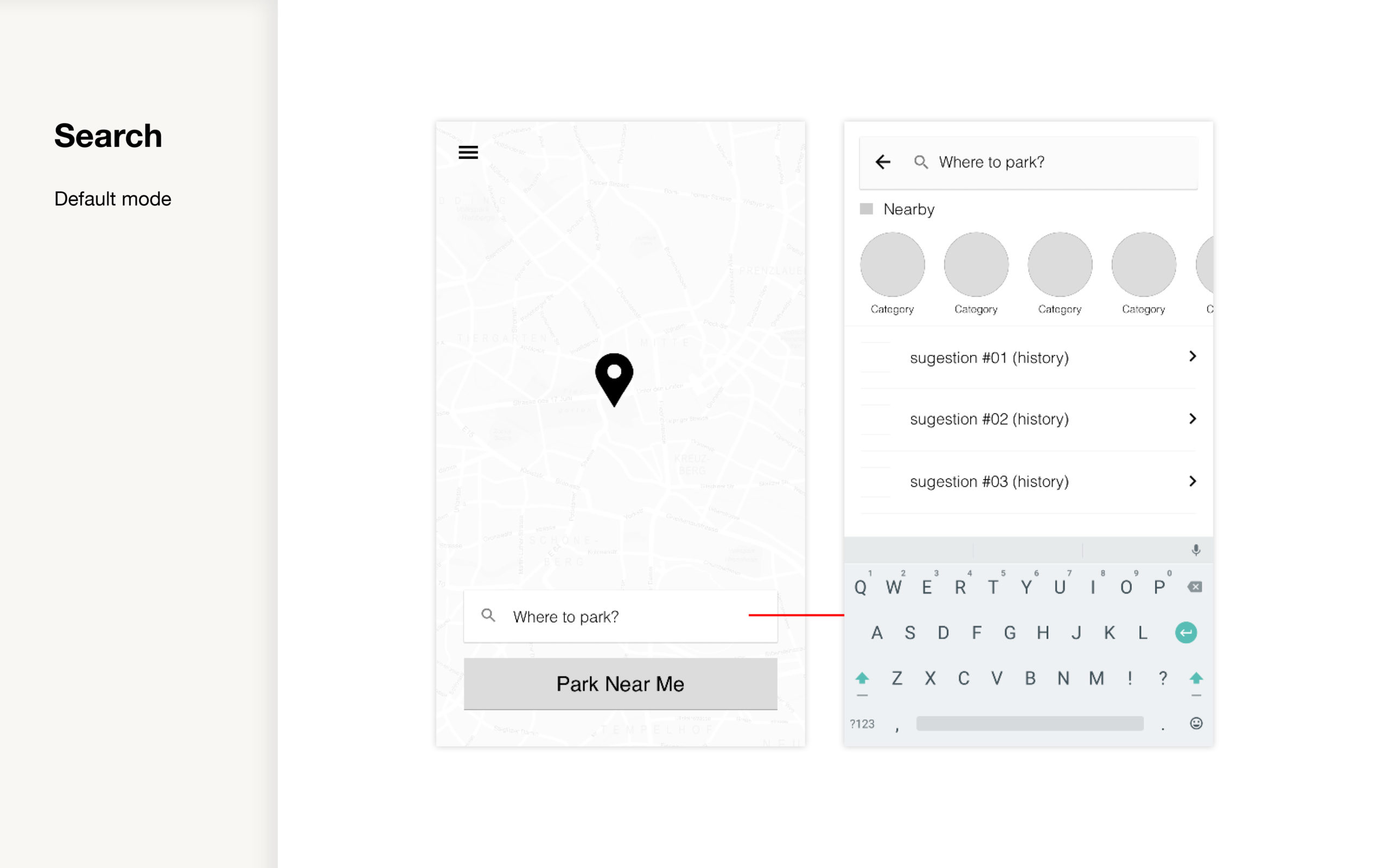
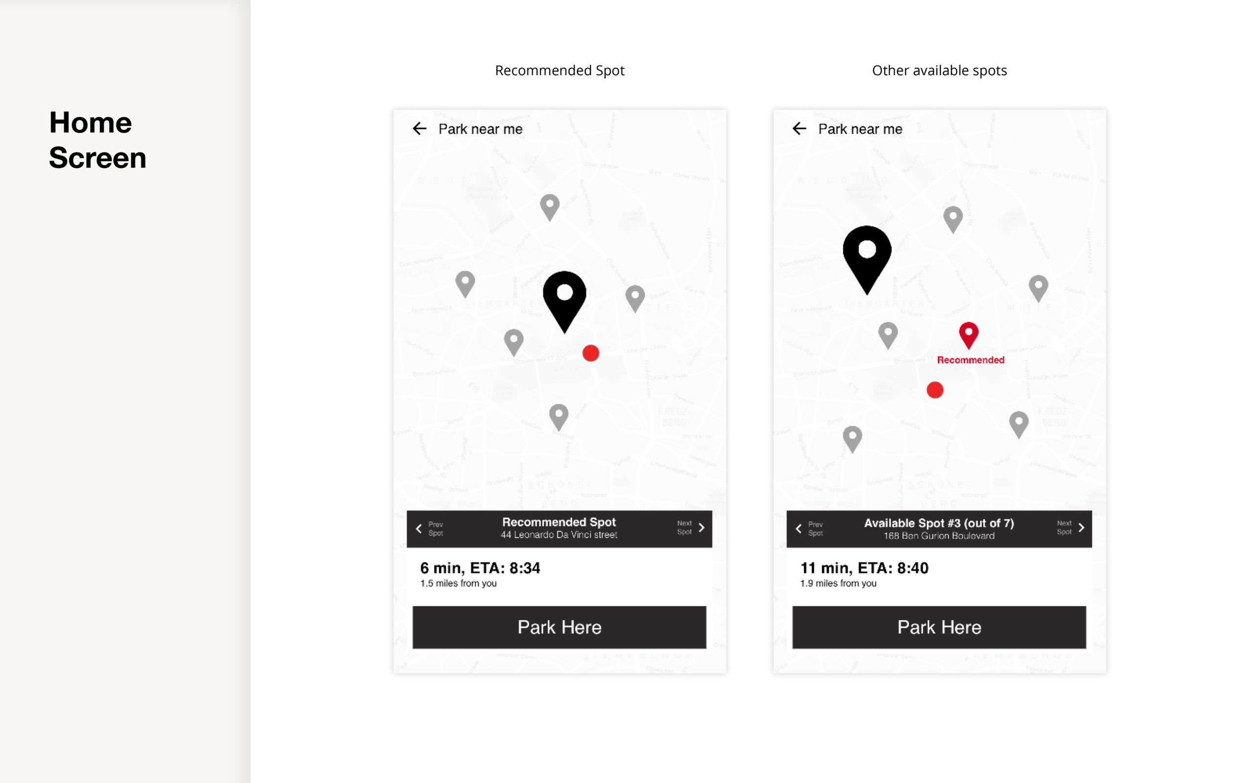
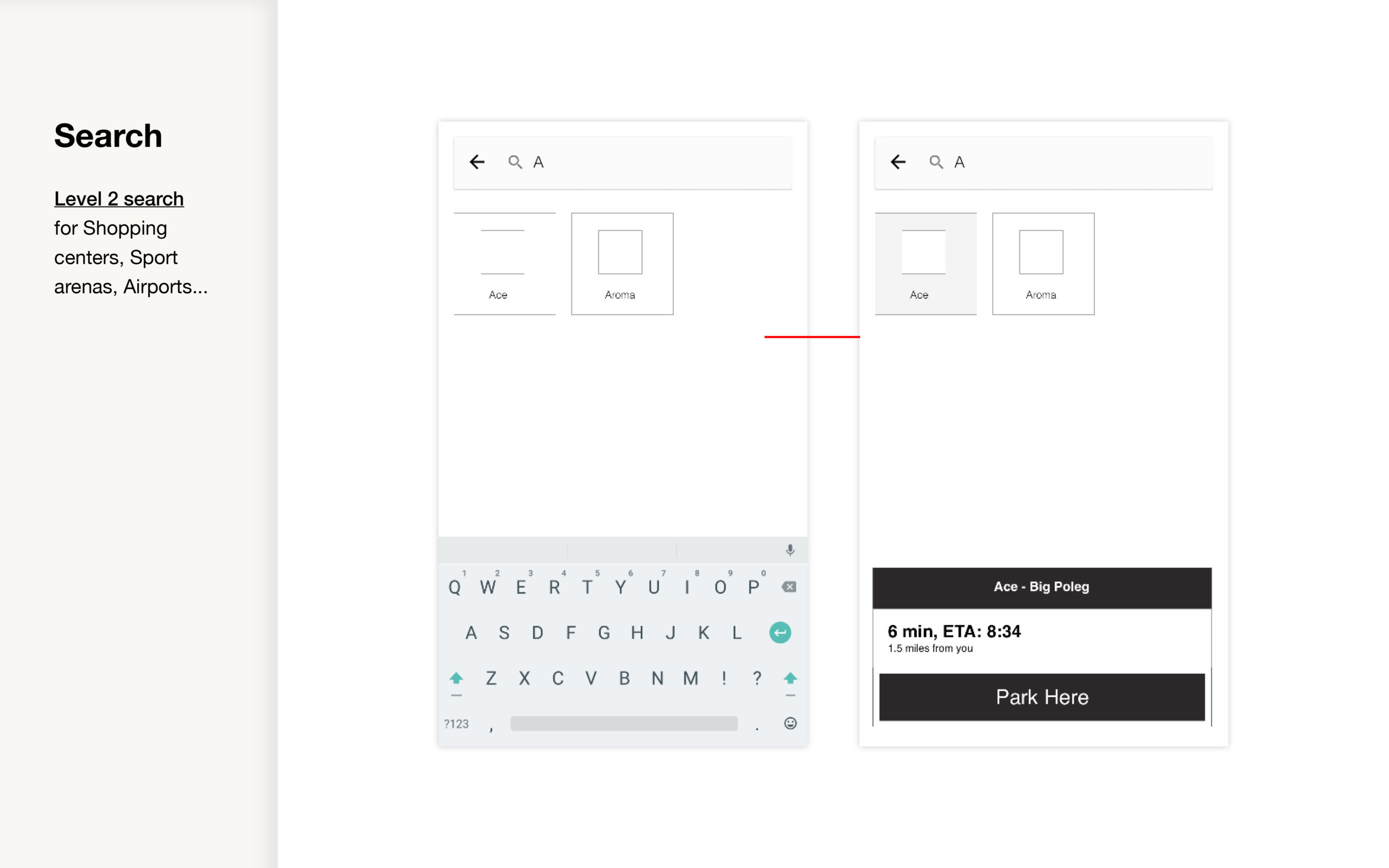
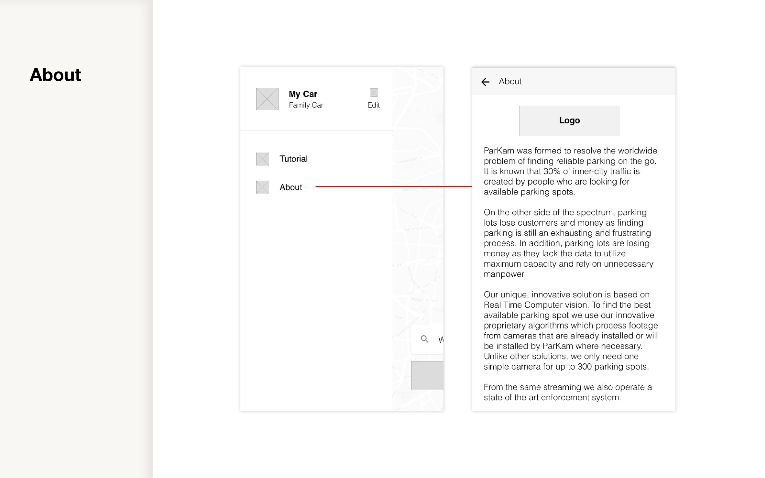
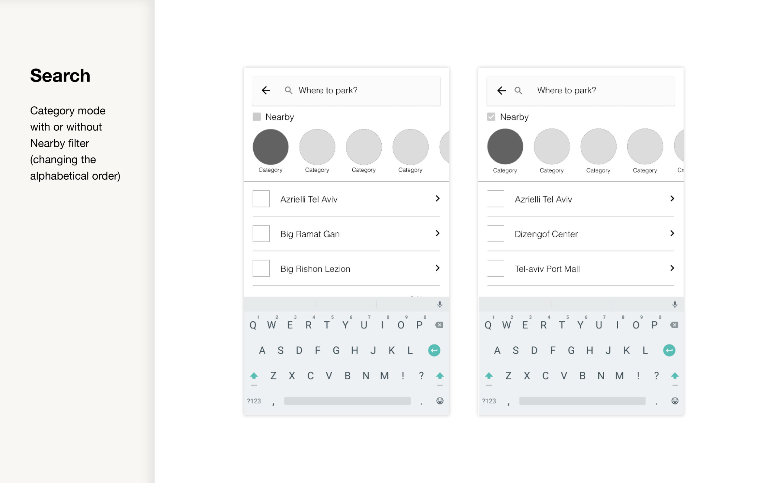
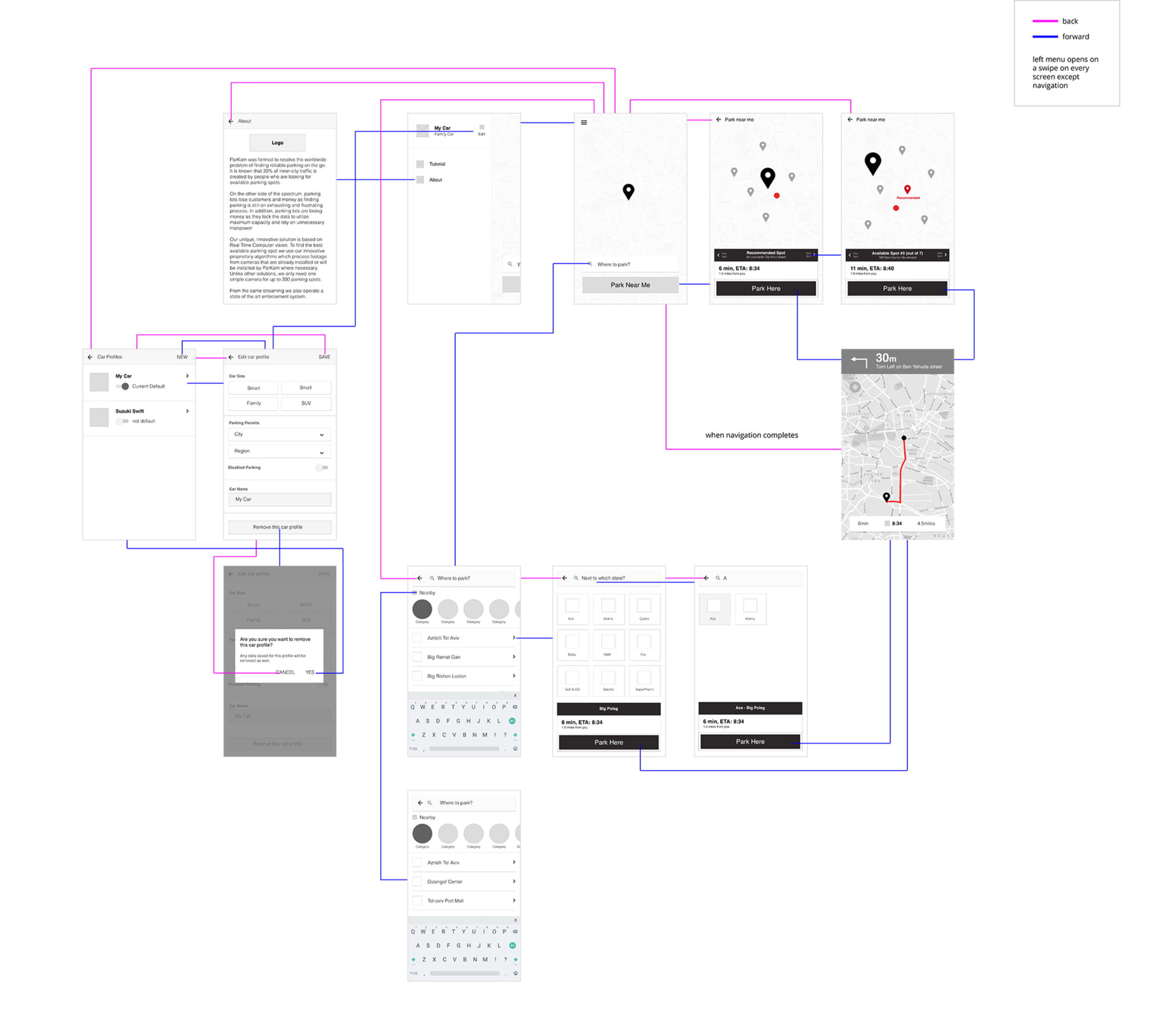
Phase 1 - UI/UX
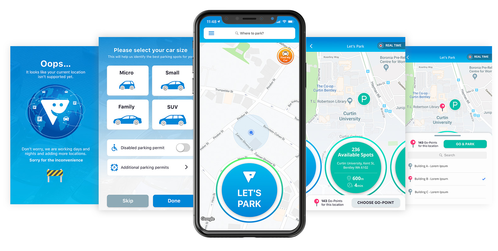
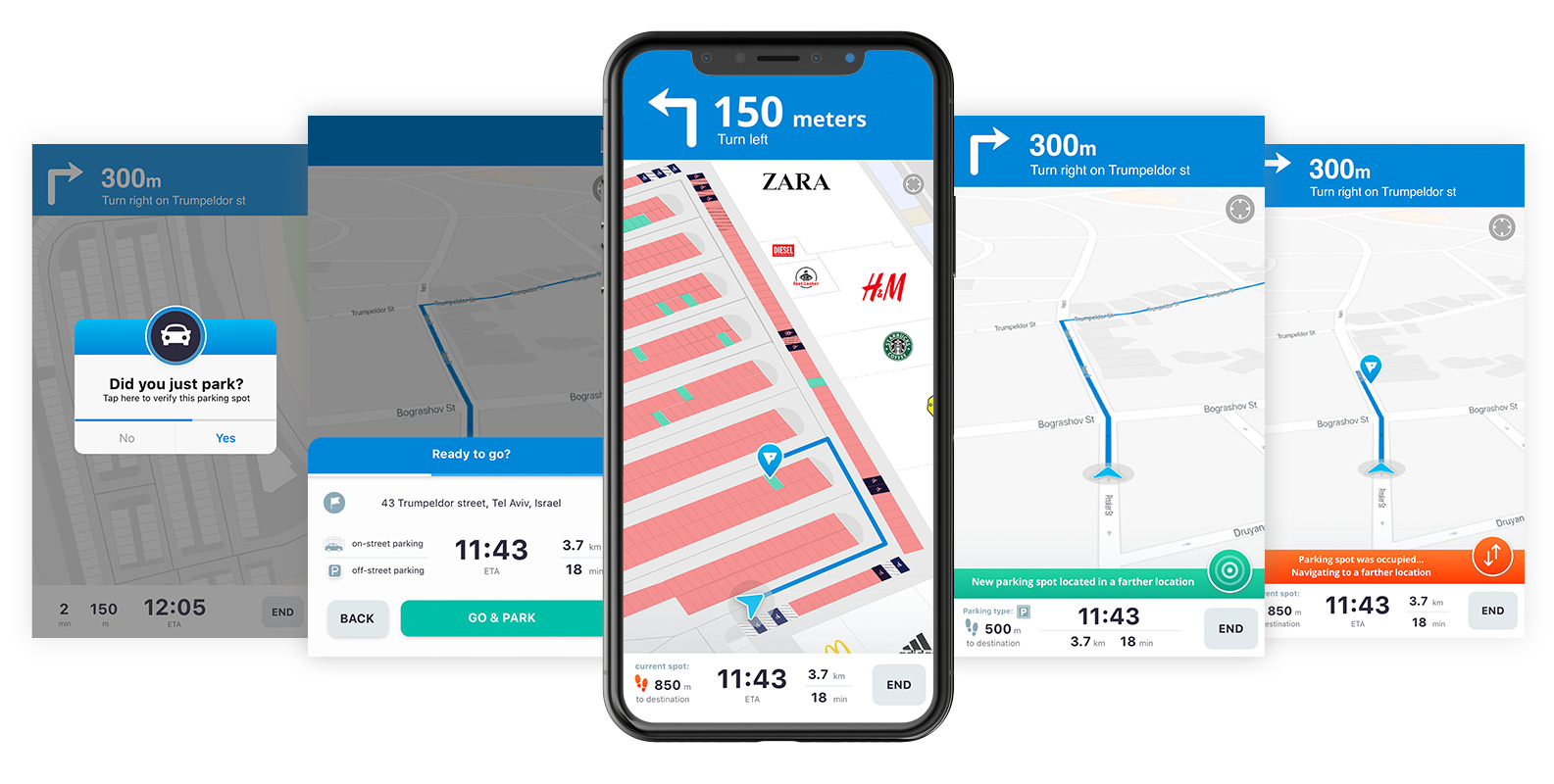
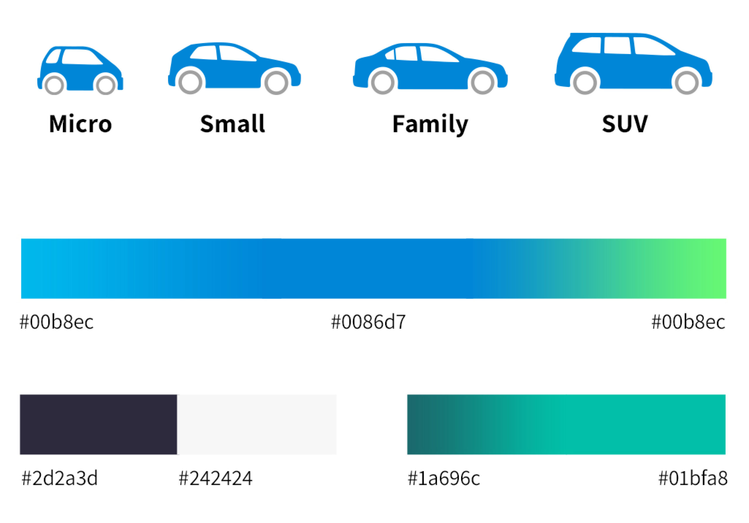
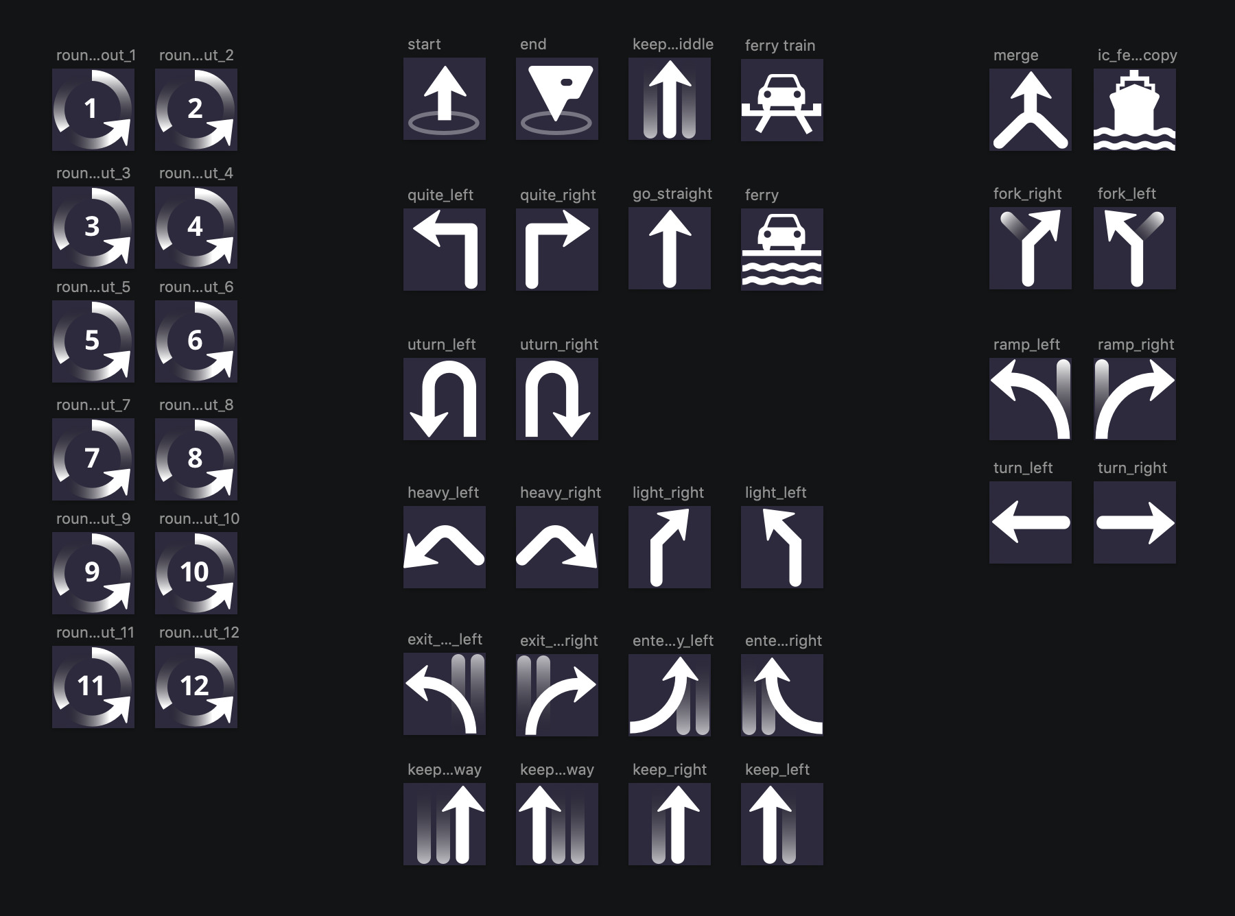
The first version we released included the basic flow of the app, with the new layout, icons, typography, color palette and visual language I designed.
Phase 2 - Iterations & tests
Dark > Light UI
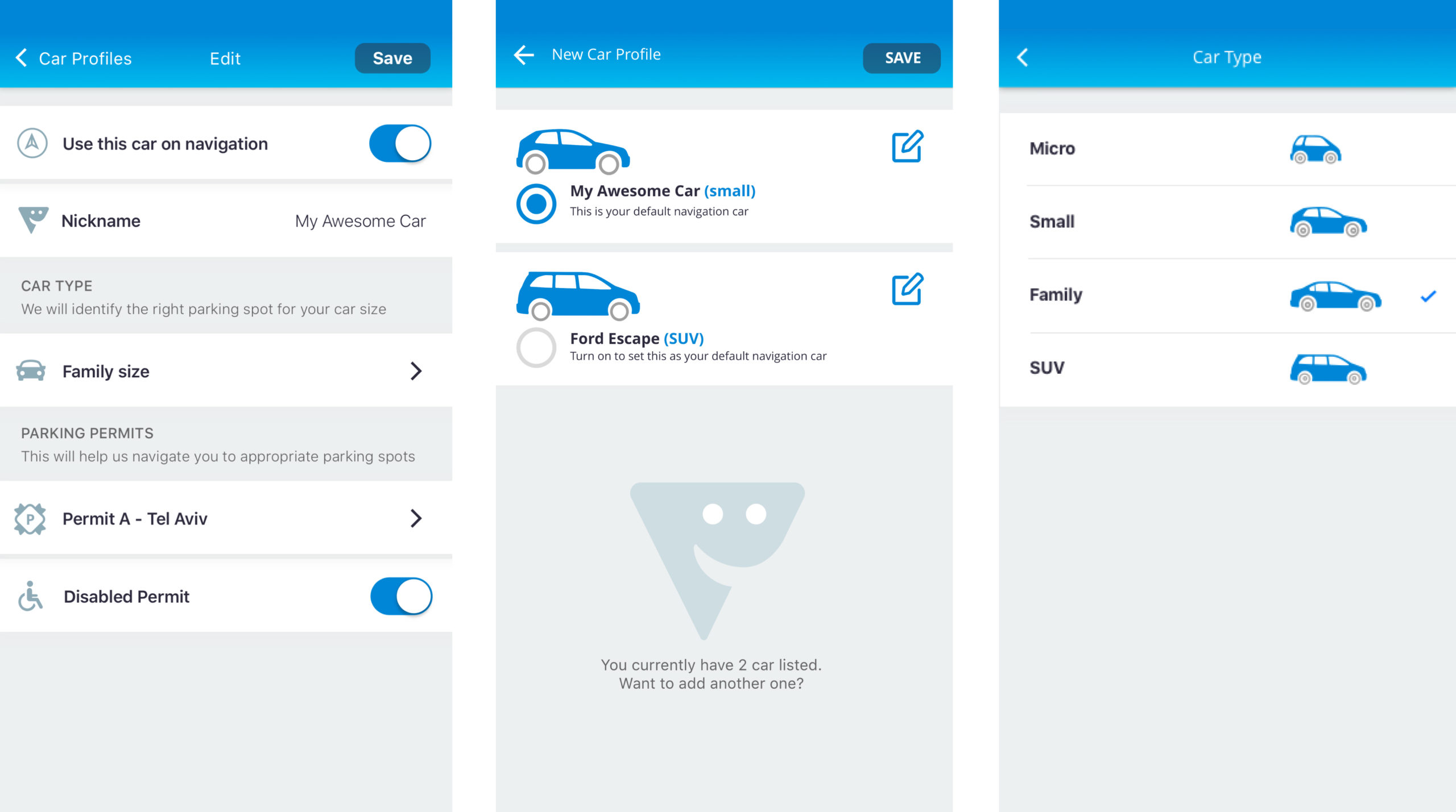
After some user testing and feedback we got from drivers on the use of dark UI patterns in the app we realized it created readability issues.
The new car profile screens used the same icons on a light background that followed the same guidelines as the rest of the app, and also felt more native to the OS.
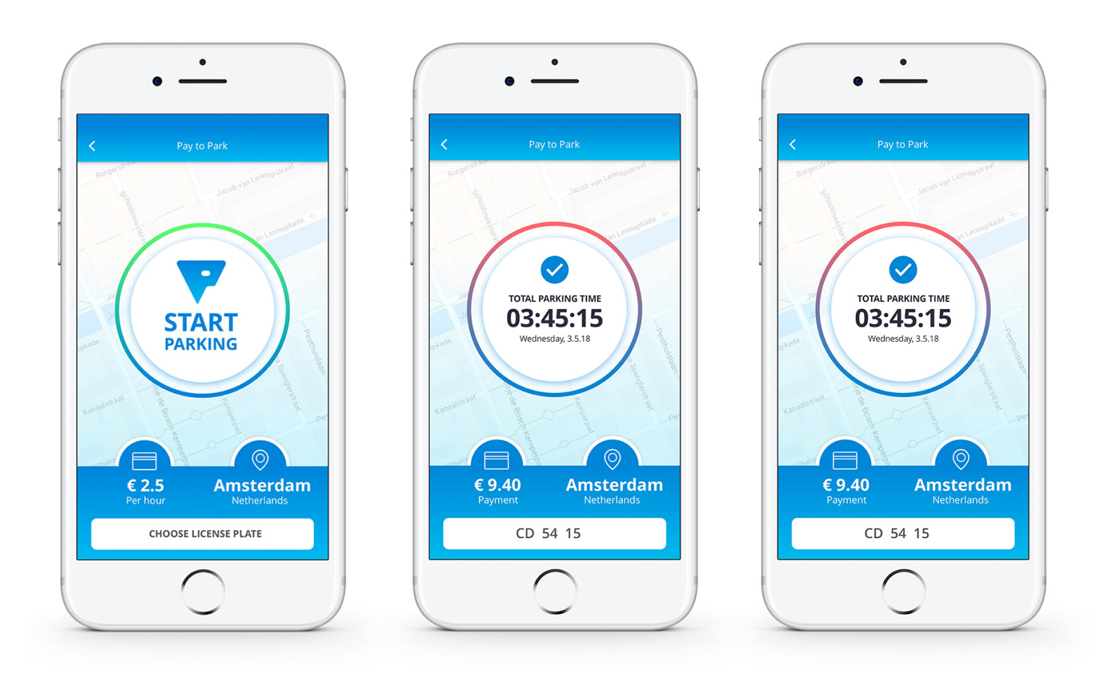
In-app payment
We had a long process of planning and thinking about this feature. I only got to design the first phase for it, but we had plans to expand it once we have more users and data.
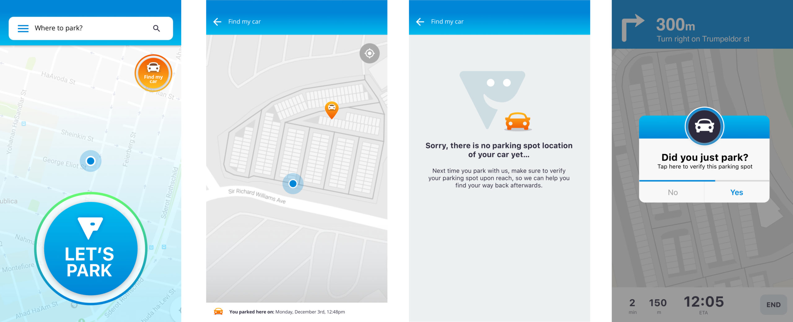
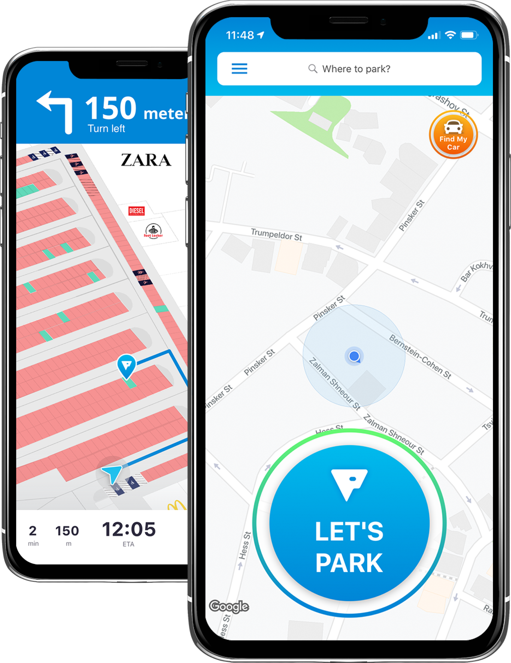
Find my car
Although this feature was a natural for our service, it involved thinking about our home screen, as well as the experience of users who are not yet familiar with this option and have already parked their car.
Search radius
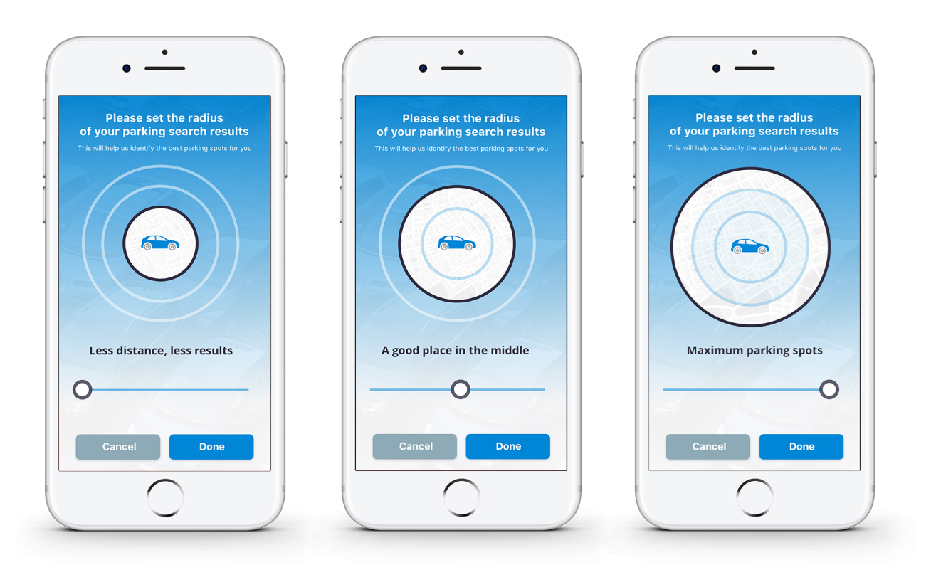
At some point we wanted to allow our users to select the radius of their parking search, and iterated several solutions for this feature.
Eventually, we decided to go with this solution to keep it simple, and reflect in a visual way how the selection will affect the parking results.
Phase 3 - latest UI/UX
