Parkam, 2017-2018
BI Tool redesign
A B2B system showing real-time parking status (availability, violations) and providing insights and reports for parking lot managers and city control rooms.
When I joined the company the tool already had its key features but we faced many usability issues, and the design did not reflect the full strength of our solution to our users.
Dashboard view
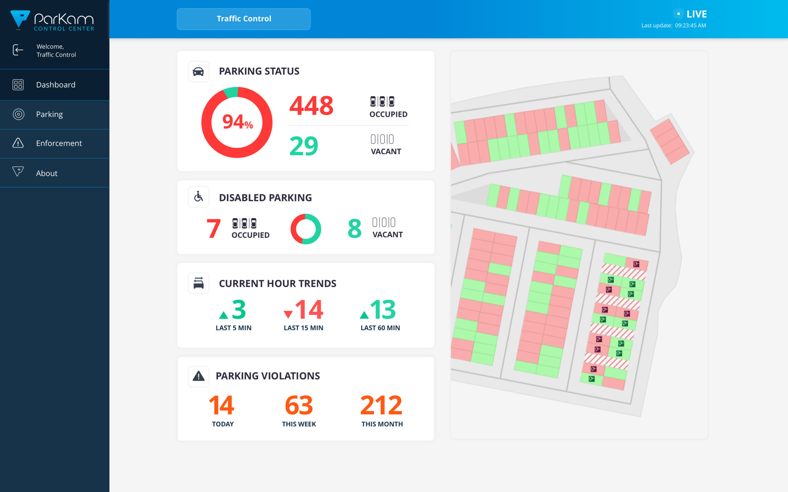
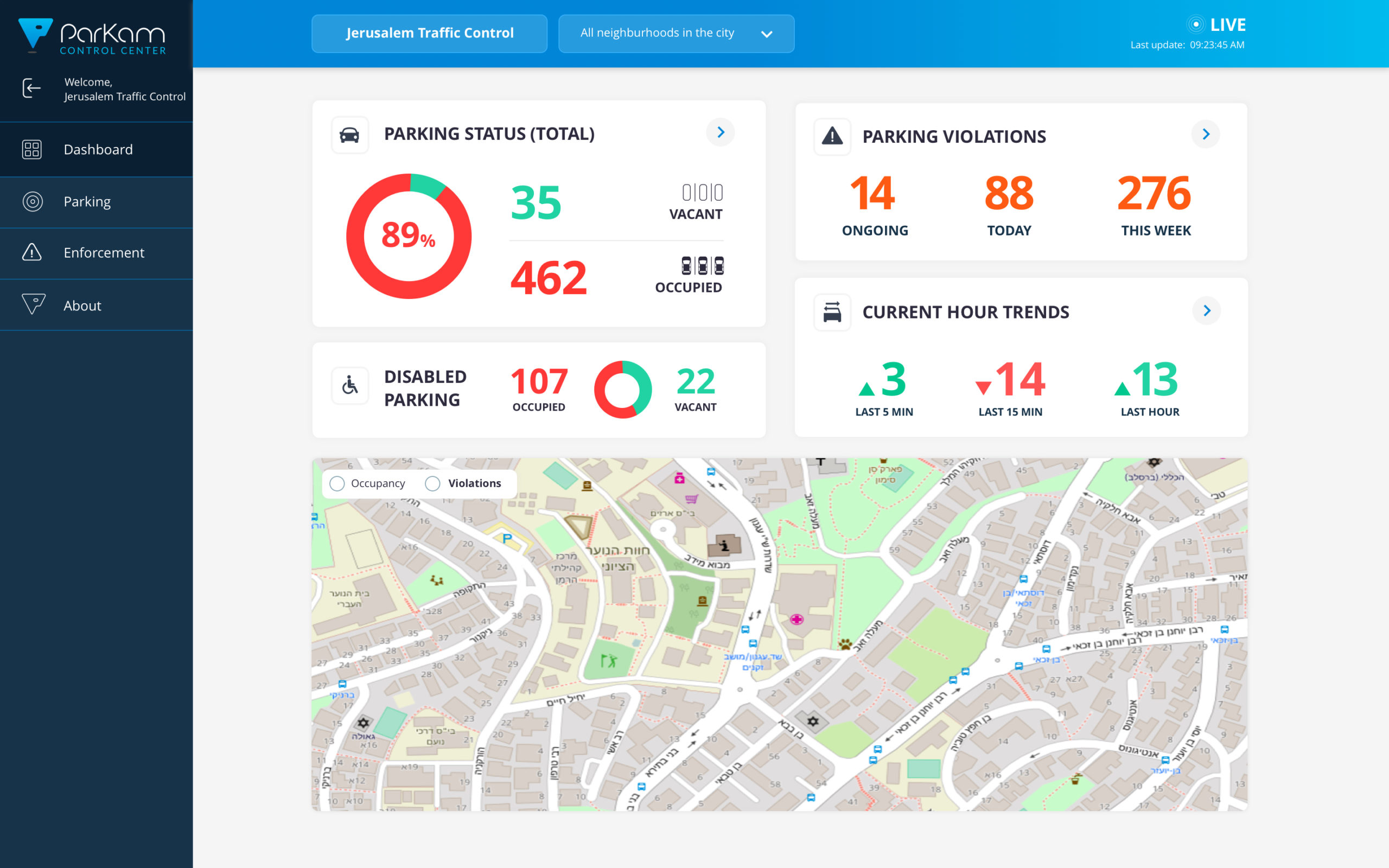
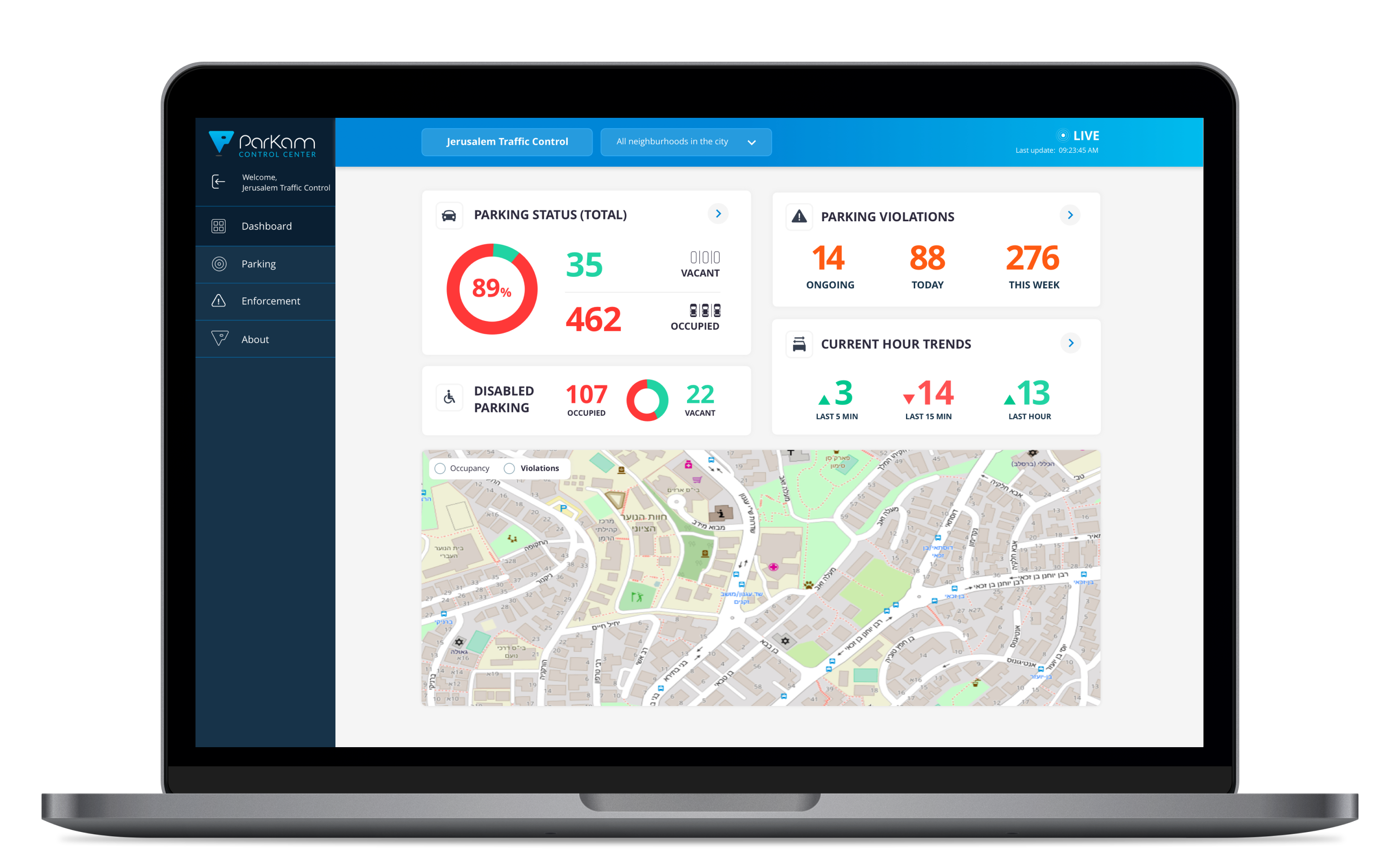
One of the first things I encountered was missing from the initial version was a dashboard view, showing various data types from the different services we were offering.
As a tool that was meant to be seen by parking lot managers and city control rooms it was crucial to create a “homepage” summarizing the status of each data type at any given point.
Navigation
Most of the control center users were managing more than one parking asset, and with the expected growth and potential clients it was clear we had to take that into an account as our primary flow.
Navigation between various views, and between various parking sites had to be simplified.
Information hierarchy
Once we mapped the various data sections and the primary/secondary information in each of them it was easier to understand the new hierarchy.
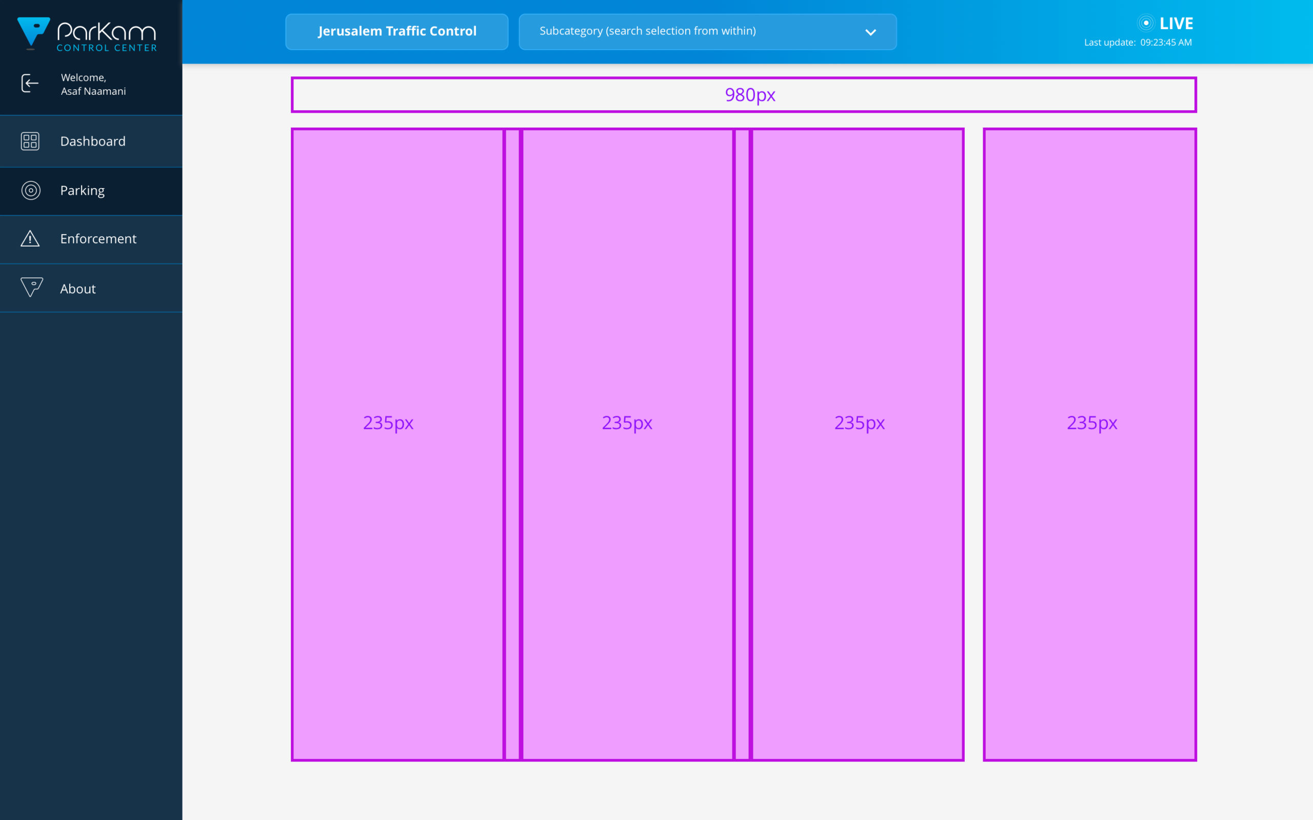
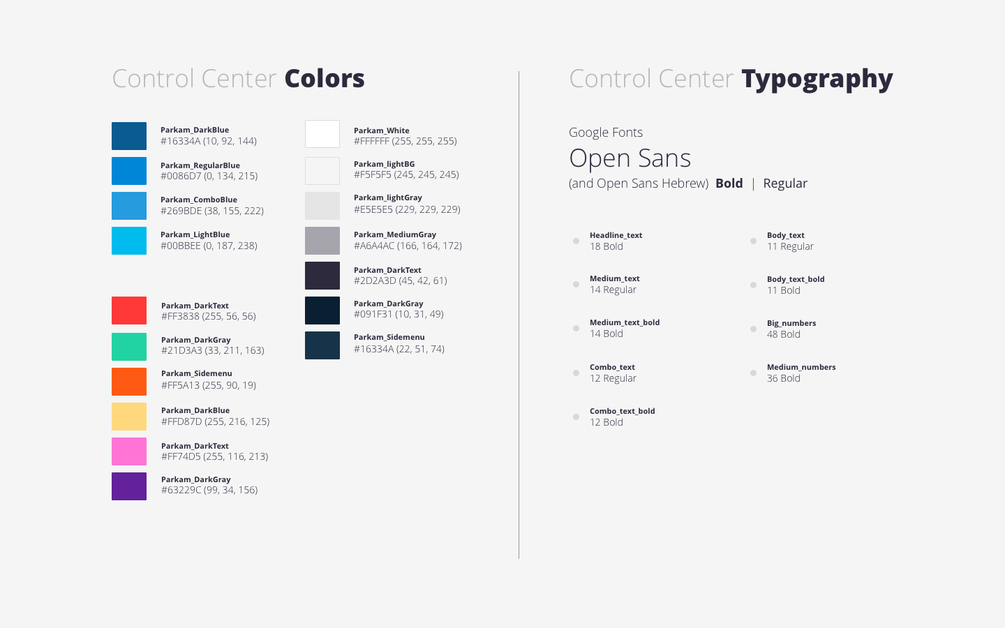
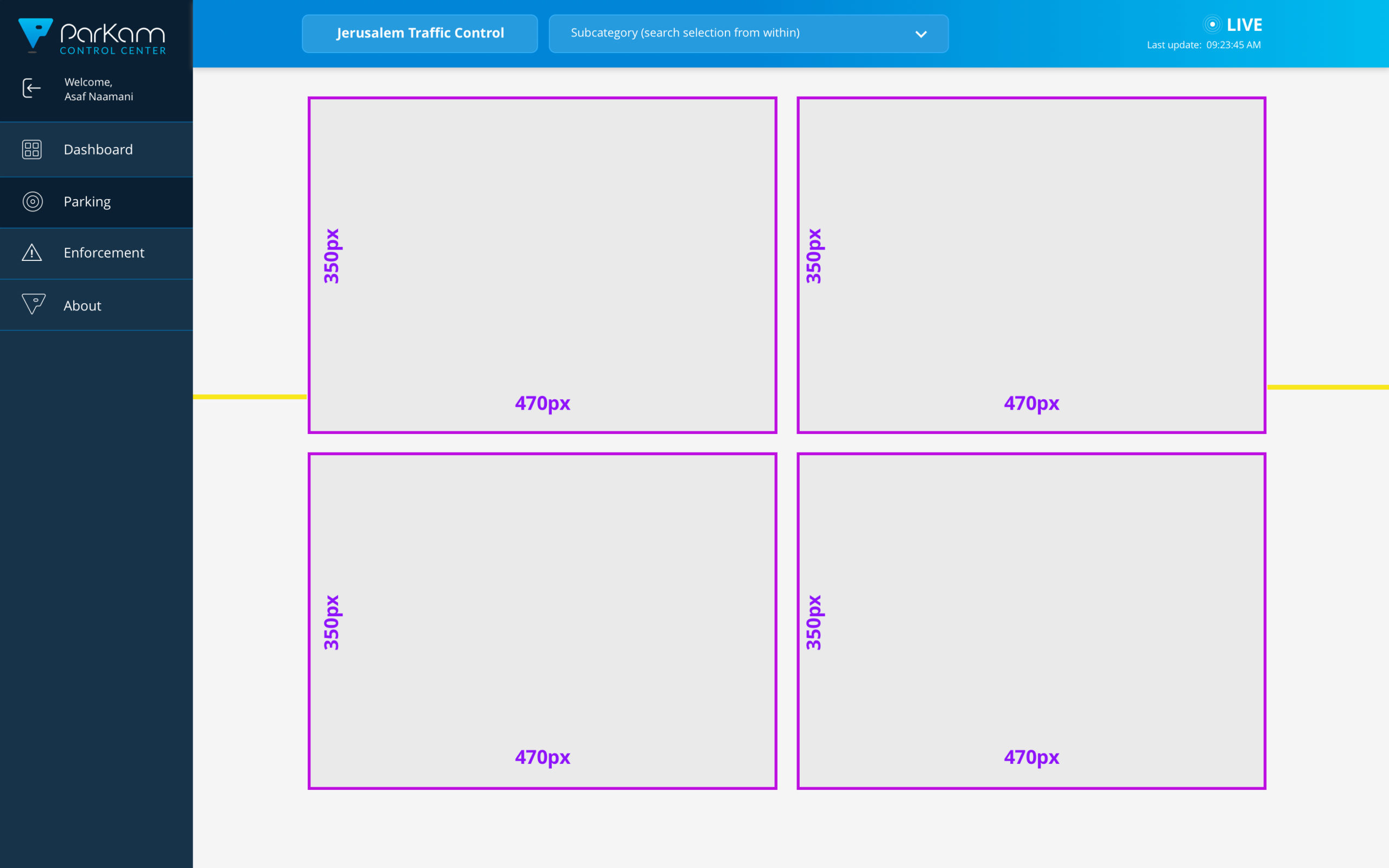
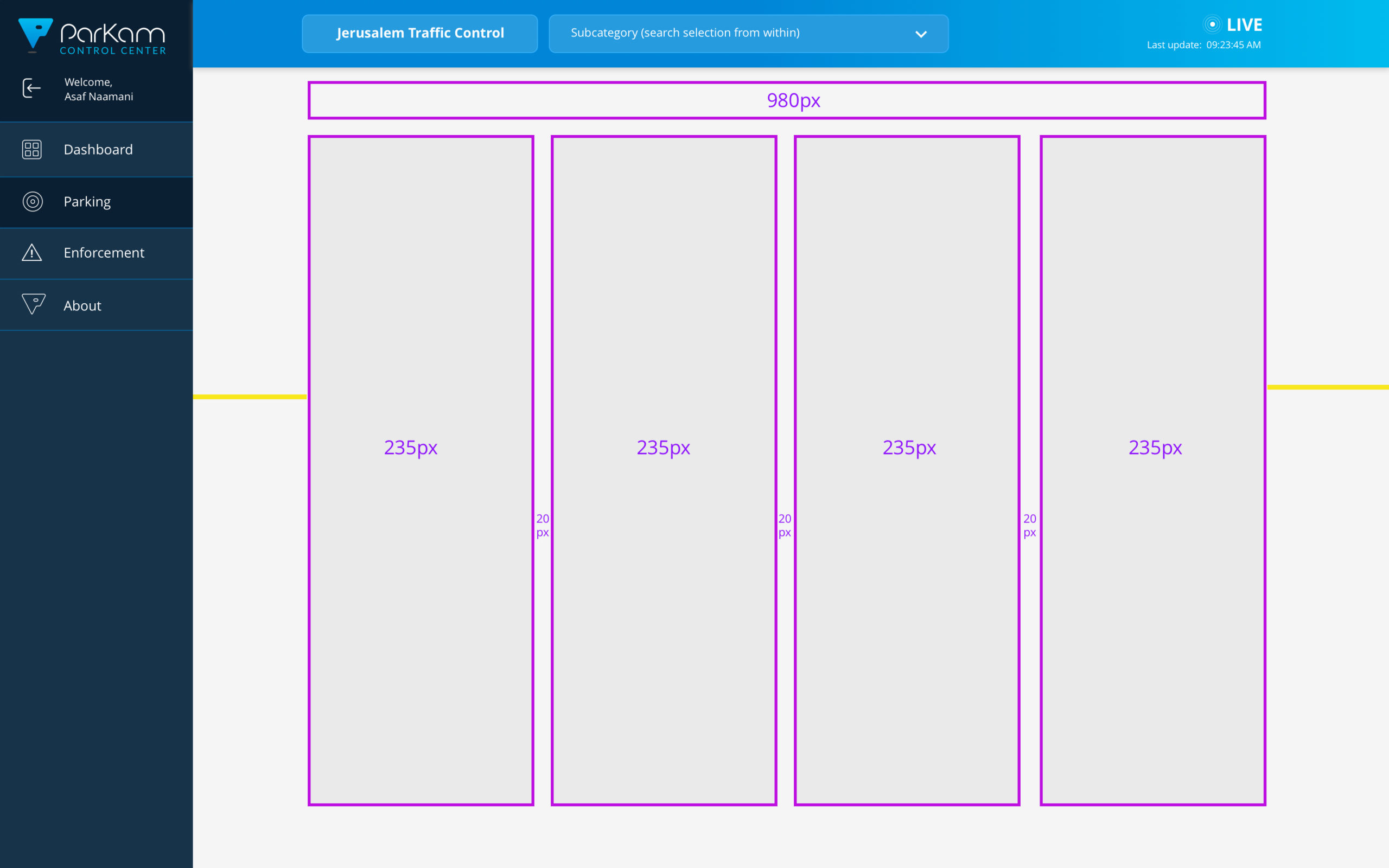
Using a new grid and layout, clear text styles and a new color palette helped give the control center a new structure, and also kept some parts of it dynamic and customisable per partner's needs.
Before & after the redesign
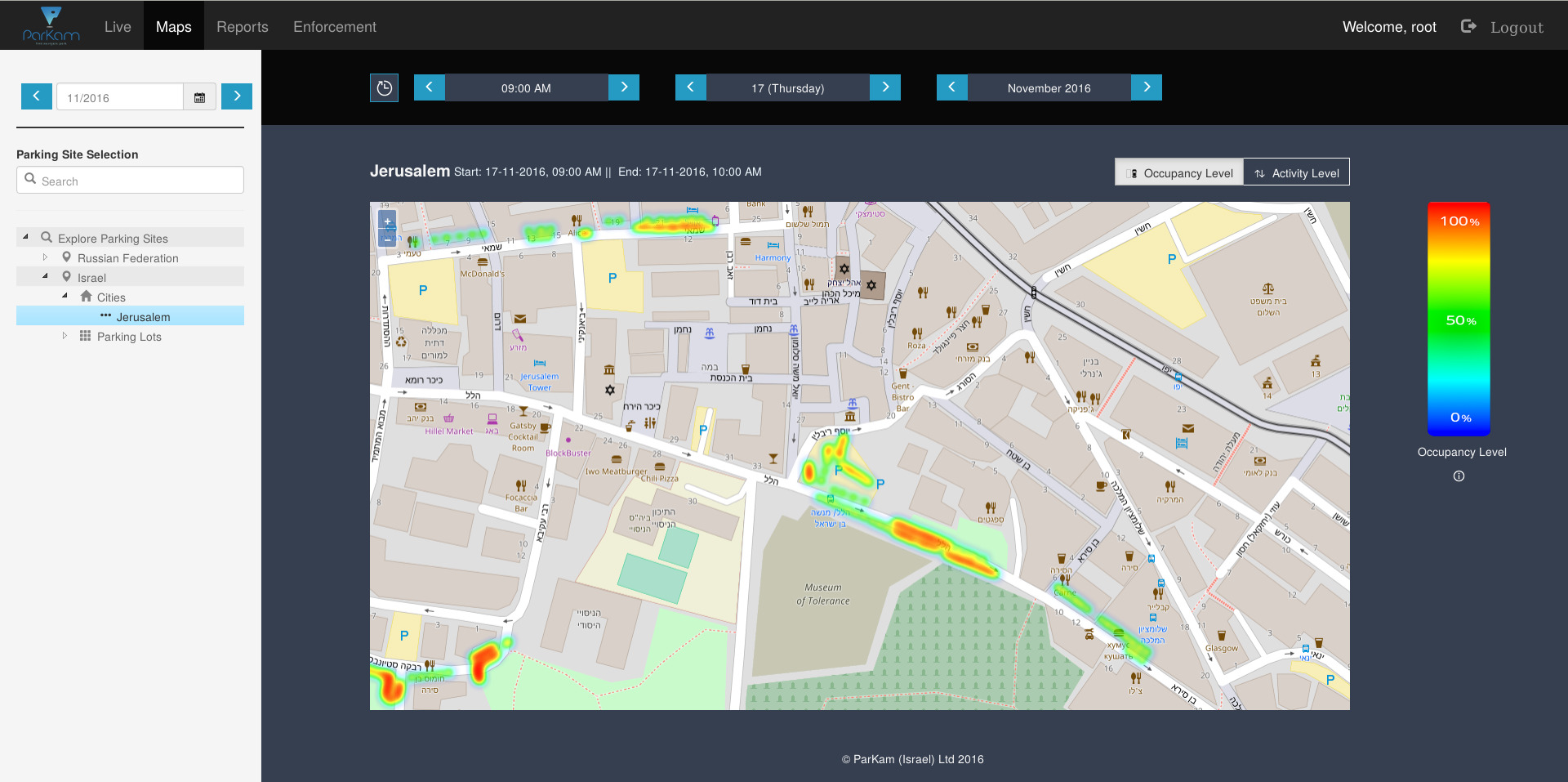

V1 (2016-2017)
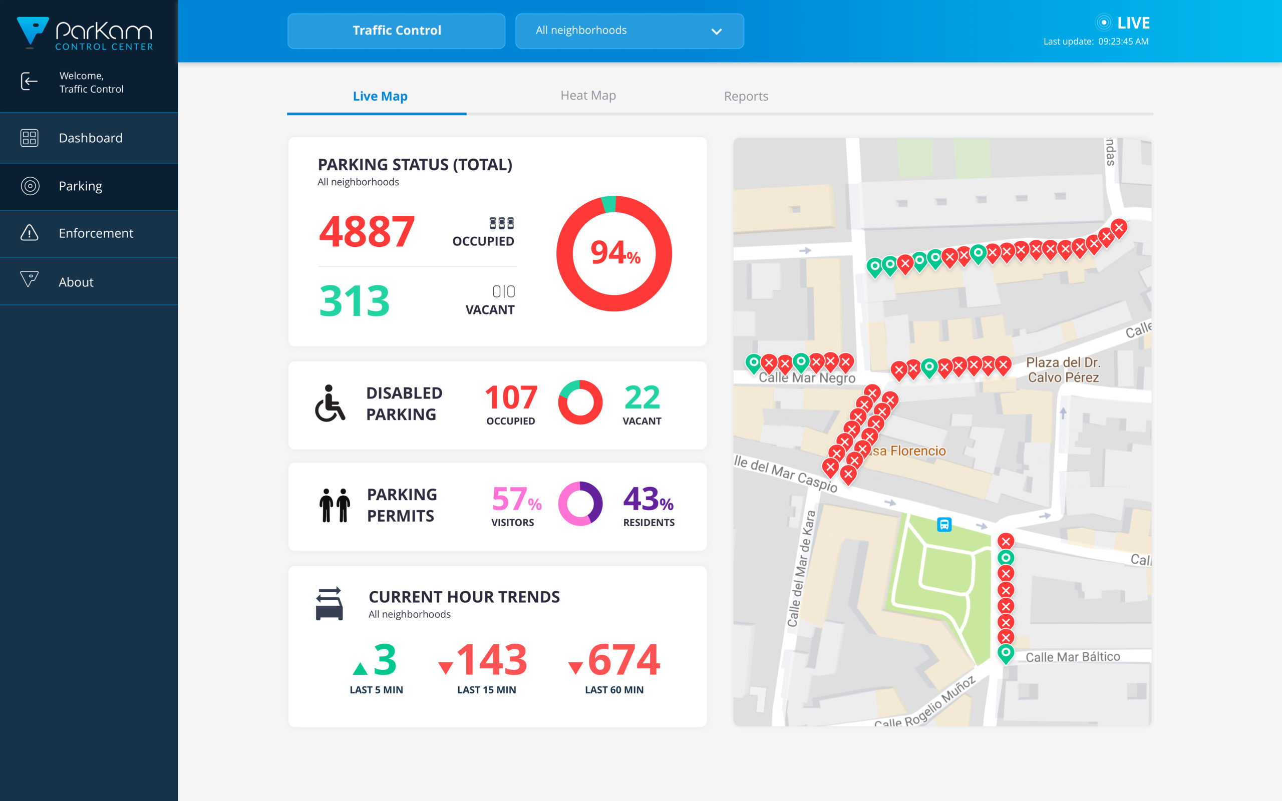
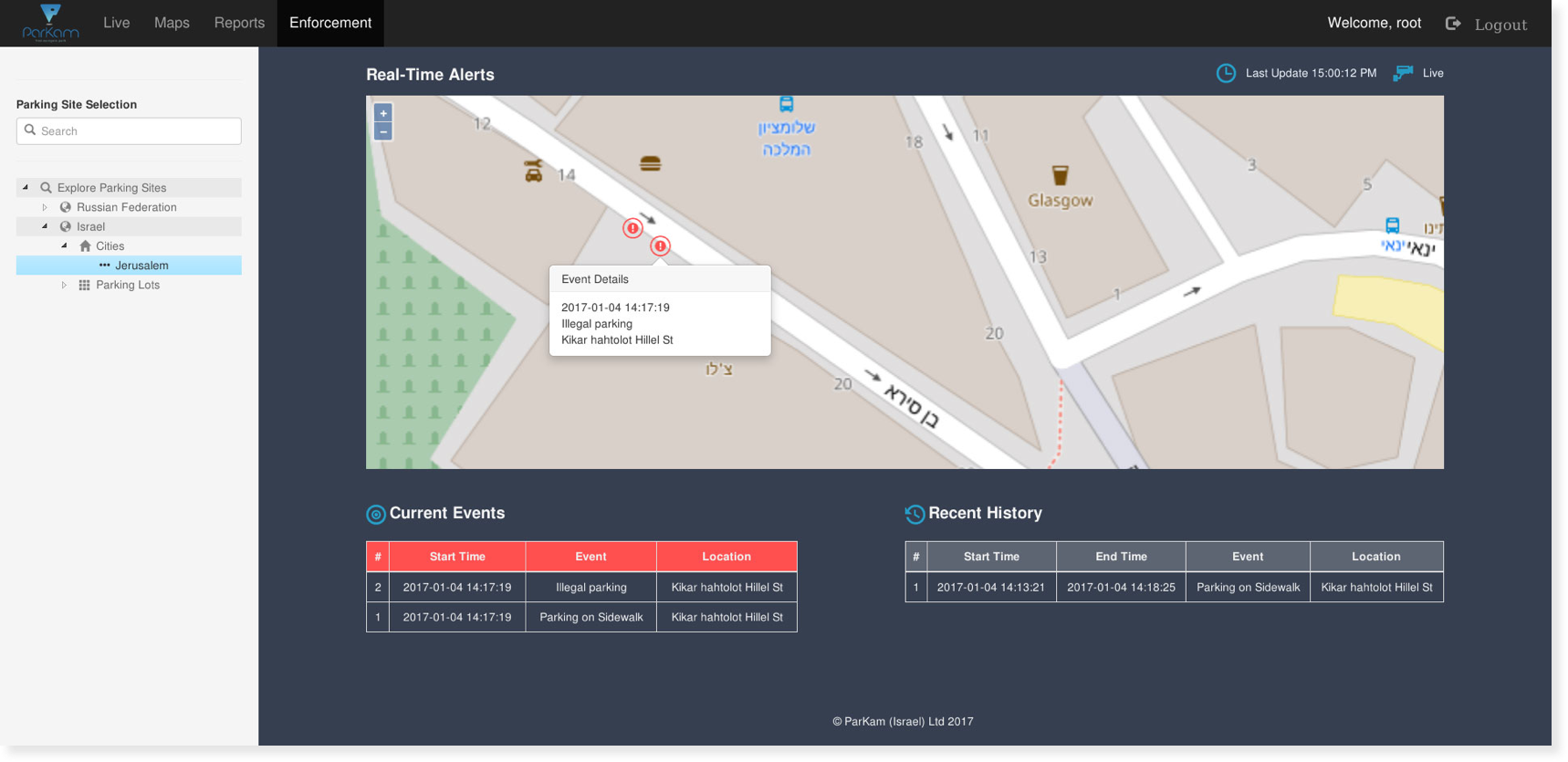
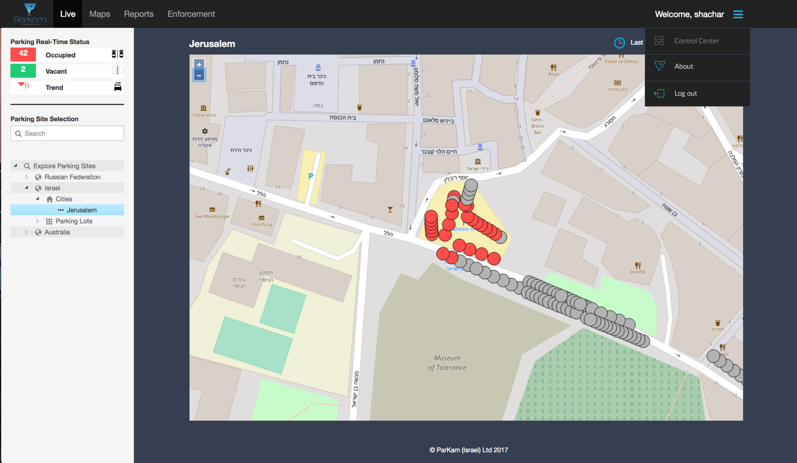
These screenshots are from the early version of the product, with some tweaks I suggested we make after I joined the company. This version was mainly meant to prove the concept of the service and show the technical abilities of the solution, but hardly took into account the user’s experience.
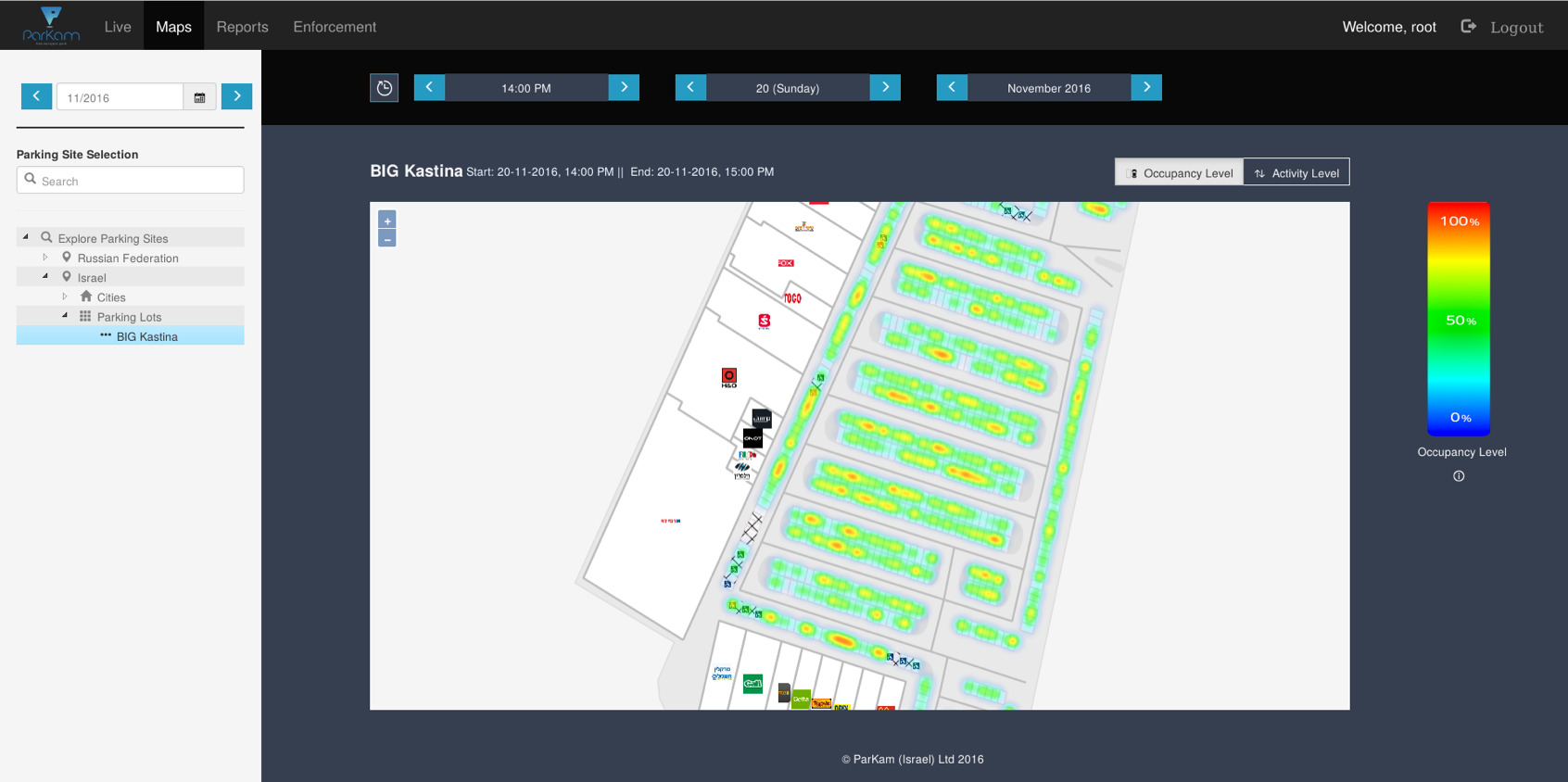

V2 (2017-2018)
The redesign process included a structural change of the navigation and the various actions users can make on each view of the control center.
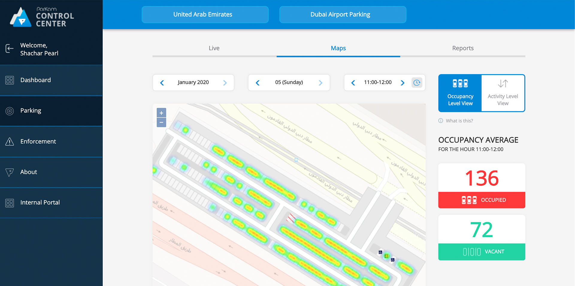
This is the result of the redesign process, after various iterations and attempts to find the right balance between usability and UI reflection of the products’s value to its users.
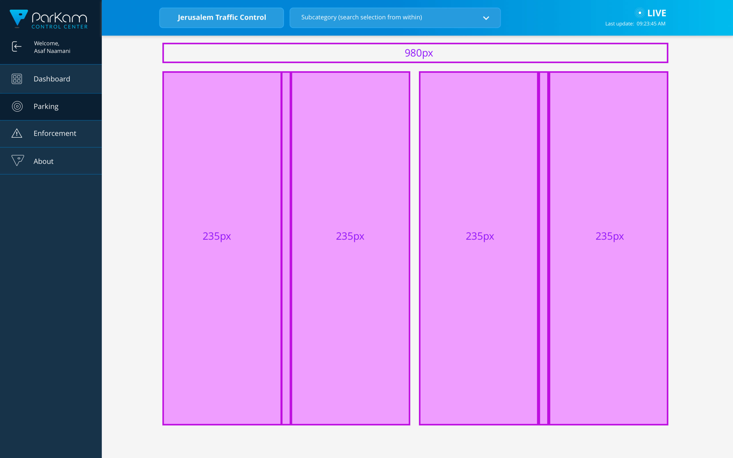
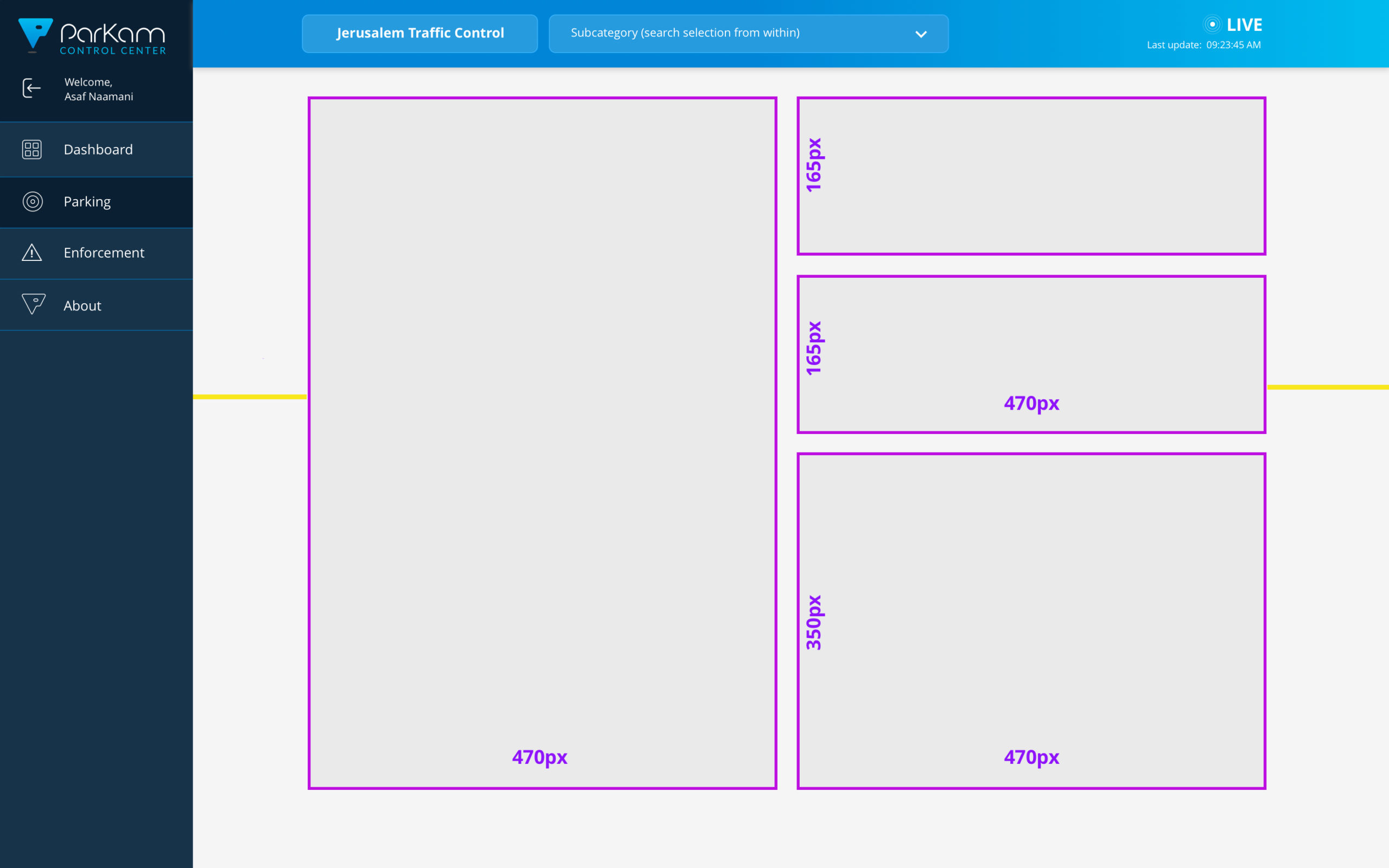

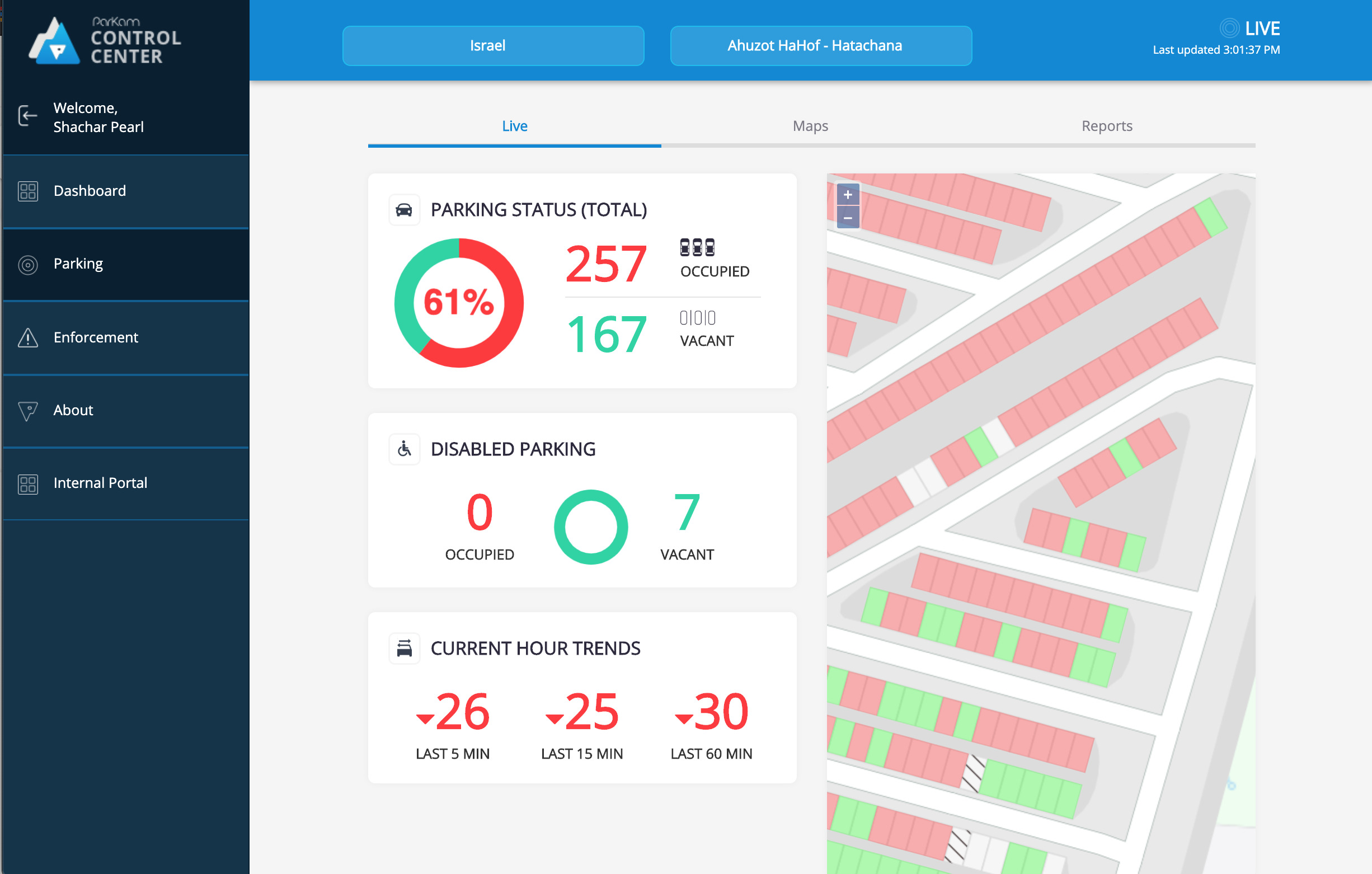
The new dashboard view had multiple states, with various data cards, depending on the partners' needs and parking asset

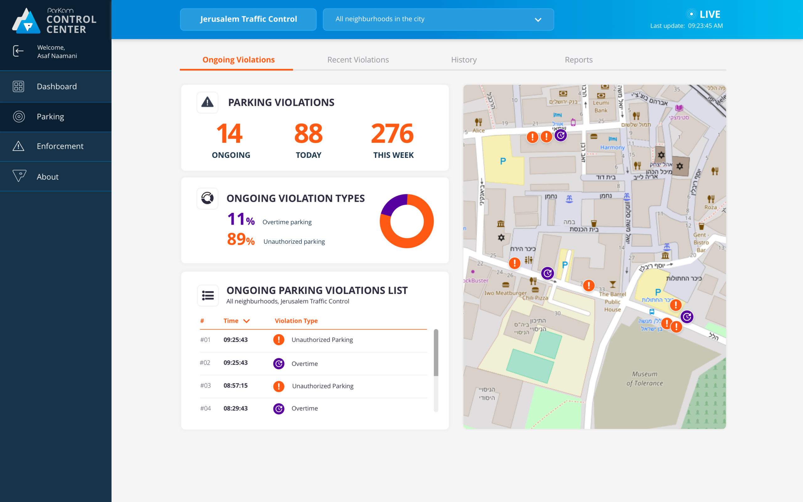
Each card featured a live summary of a section within the control center, which could be reached and explored directly from the dashboard or the side menu.

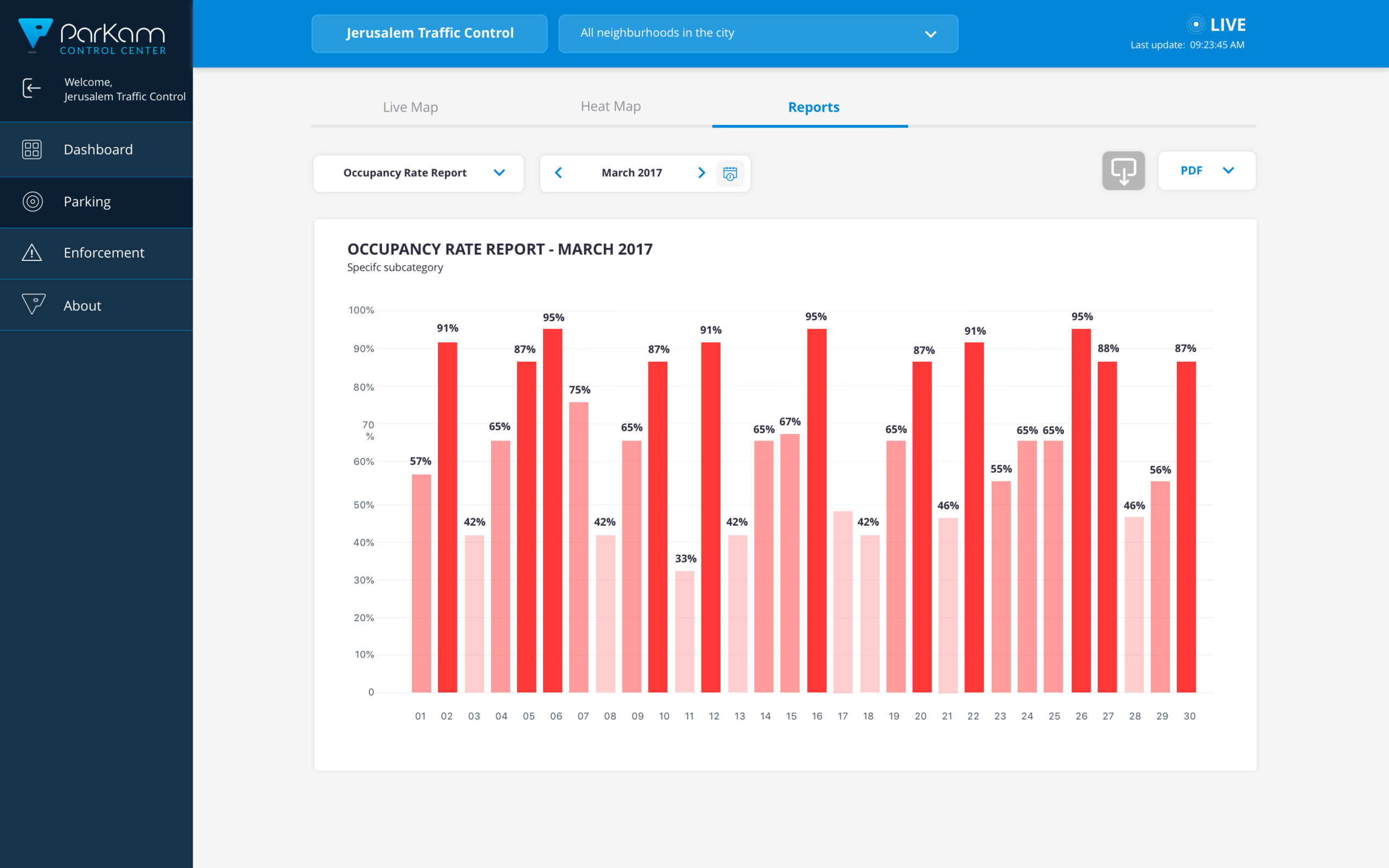
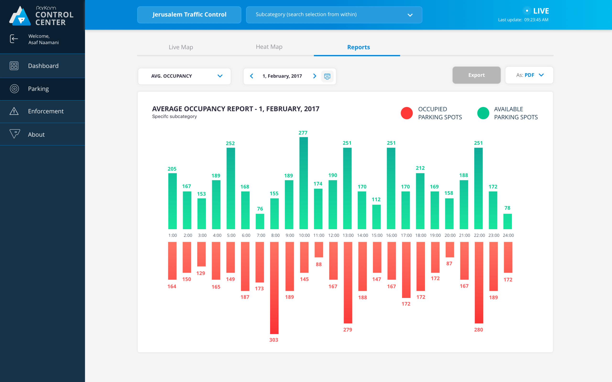
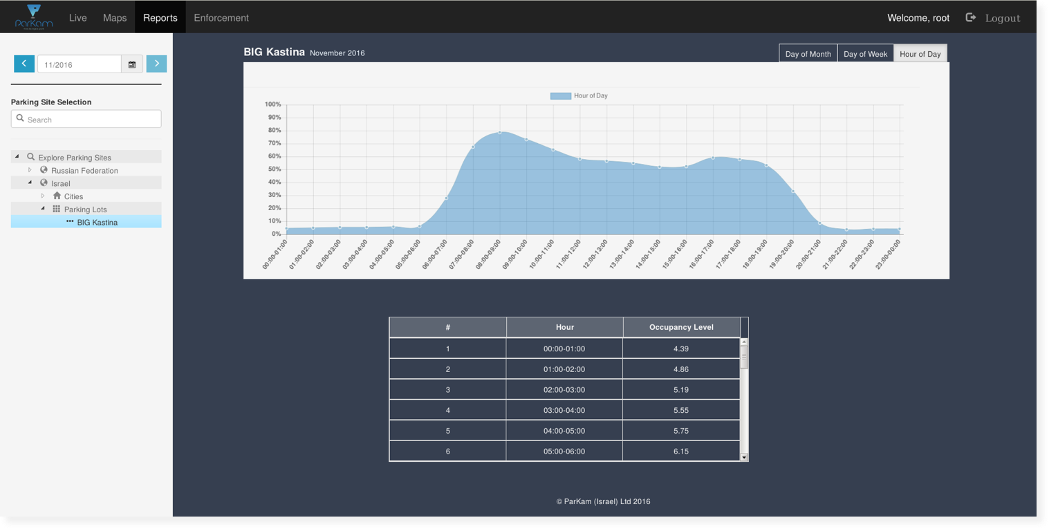
The control center produced various types of reports, such as average occupancy per day, week or month
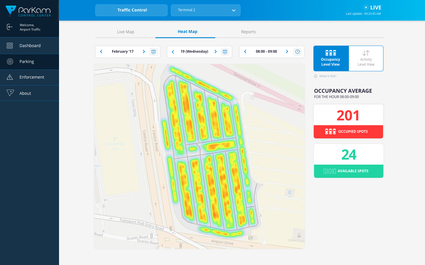
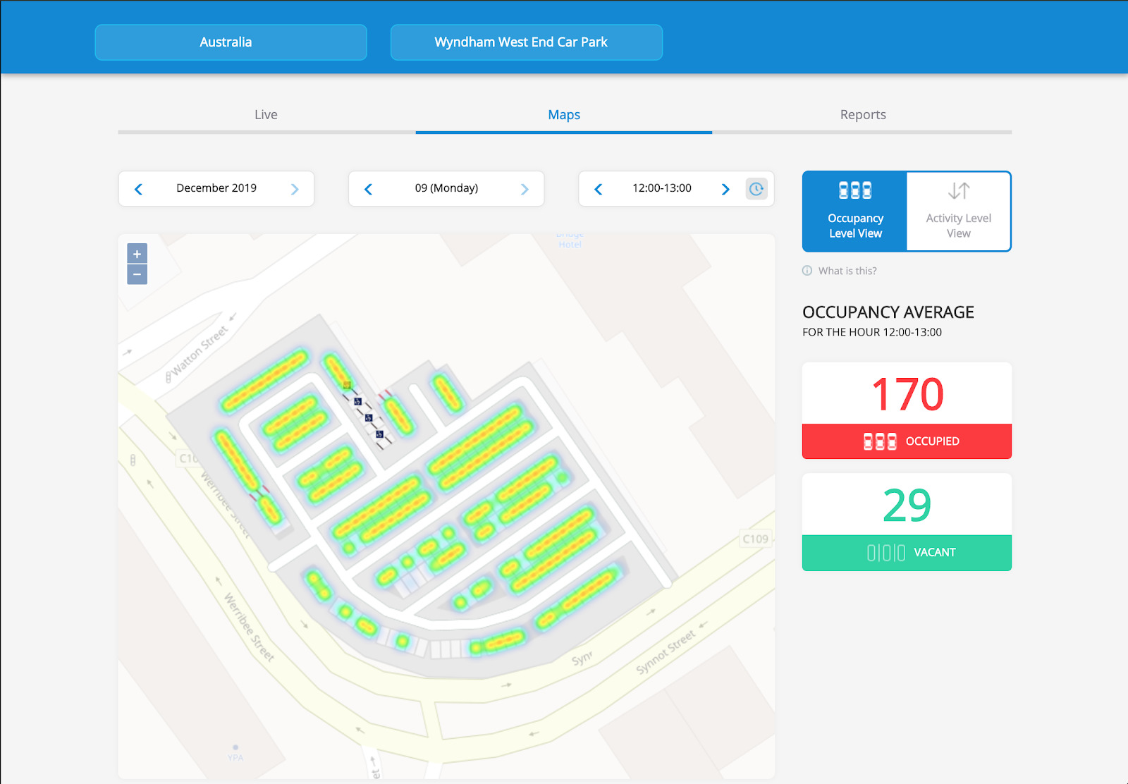
A live heatmap visualizing the data from our cameras showed parking occupancy per hour, day or month

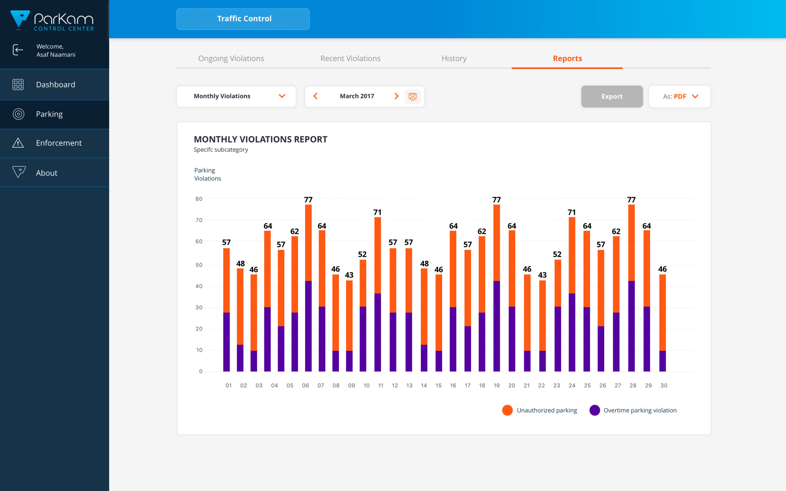
Parking violations, such as parking overtime, or illegal parking was also customized per partner's needs (city permits vs parking lot resticted areas)

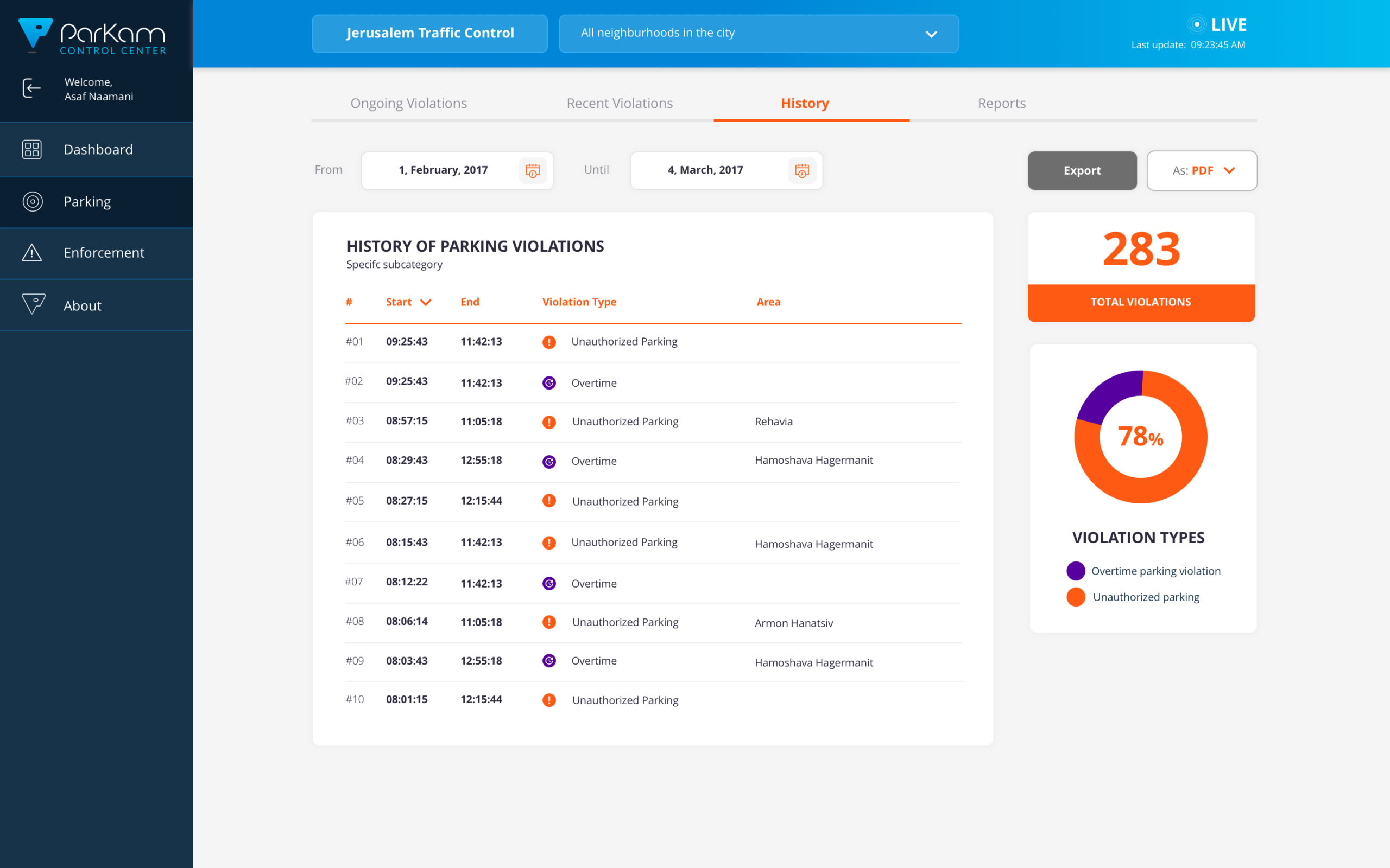
Besides a live status of parking enforcement, the system also producted reports and showed data history
